
Have you ever stepped into a compact room and instantly felt overwhelmed by its tightness? You’re not alone. Small interiors often come across as confined, stuffy, and sometimes even a bit gloomy. However, the right color palette can completely transform that sensation. With thoughtful color choices, your petite space can evolve into a welcoming sanctuary, a stylish retreat, or an airy haven. No need for expensive renovations or major structural changes-just a splash of paint, some imagination, and perhaps a little online shopping spree. Curious how to achieve this? Let’s explore!
The Power of Color in Compact Spaces
Understanding the impact of color is essential when working with limited square footage. Colors influence how we perceive space-they can make a room appear larger, cozier, brighter, or more inviting. In small rooms, the right hues can:
- Expand the visual boundaries by creating an illusion of spaciousness
- Establish the atmosphere whether calming, invigorating, or snug
- Express your individuality ensuring the room feels authentically yours
Whether you’re sprucing up a tiny bedroom, a snug living area, or a bathroom that doubles as storage, these 10 thoughtfully curated color schemes will help you maximize your space’s potential. Let’s jump in!
1. Timeless Neutral Tones
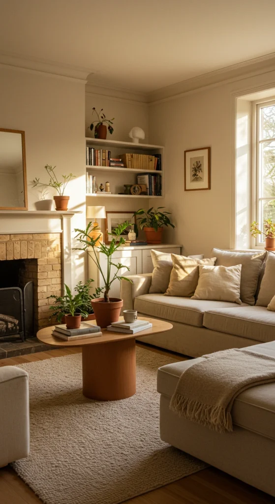
- Palette: Soft whites, warm beige, gentle grays, creamy off-whites
- Why it’s effective: These hues act like a calming balm, reflecting natural light and visually enlarging the room. Their understated elegance ensures your space remains fresh and inviting for years to come.
- Pro tip: Incorporate varied textures-think plush throws, woven baskets, or linen curtains-to add depth. Introduce greenery or vibrant art pieces for a splash of life.
2. Delicate Pastel Shades
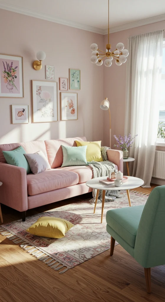
- Palette: Soft blush, minty green, lavender haze, pale buttery yellow
- Why it’s effective: Pastels gently infuse color without overpowering, creating a light, airy ambiance that lifts the mood and opens up the space.
- Pro tip: Limit your palette to one or two pastel tones to avoid a nursery-like feel. Pair with crisp whites or light wood finishes for a balanced look.
3. Monochrome Elegance
- Palette: Multiple shades of a single color, such as sky blue to deep navy
- Why it’s effective: Layering tones of the same color adds dimension without clutter, lending sophistication and a sense of spaciousness.
- Pro tip: Paint walls in the lightest shade, furnish with mid-tones, and use the darkest hues for accent pieces or decor.
4. Earthy Greens Inspired by Nature
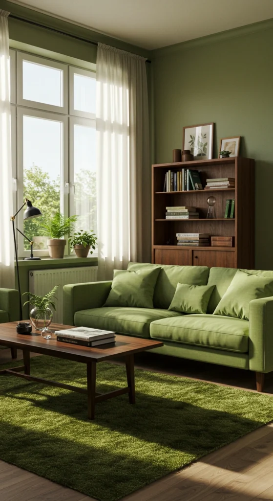
- Palette: Sage, olive, moss green, complemented by warm browns or creamy neutrals
- Why it’s effective: Green hues evoke tranquility and a connection to the outdoors, making confined spaces feel more open and serene.
- Pro tip: Apply green on walls or statement furniture. Enhance the natural vibe with wooden or rattan accents for added warmth.
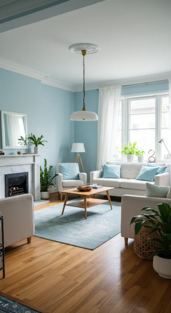
5. Serene Blues for Relaxation
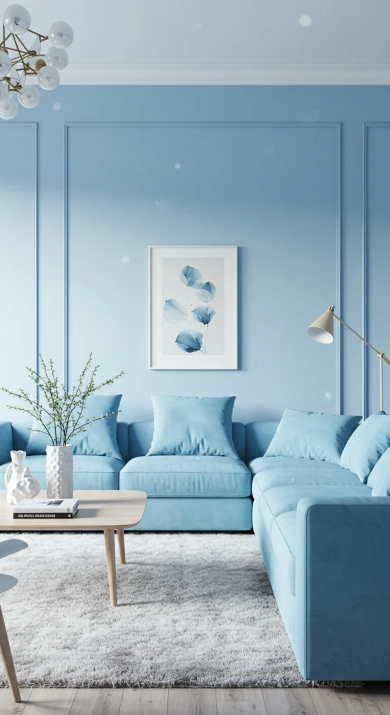
- Palette: Soft sky blue, turquoise, deep navy, paired with white or gray
- Why it’s effective: Blue tones soothe the senses and visually expand the room, ideal for bedrooms or bathrooms seeking a spa-like atmosphere.
- Pro tip: Use lighter blues on walls and reserve darker shades for furnishings or decor. Metallic accents like brushed brass or silver add a touch of elegance.
6. Inviting Warm Hues
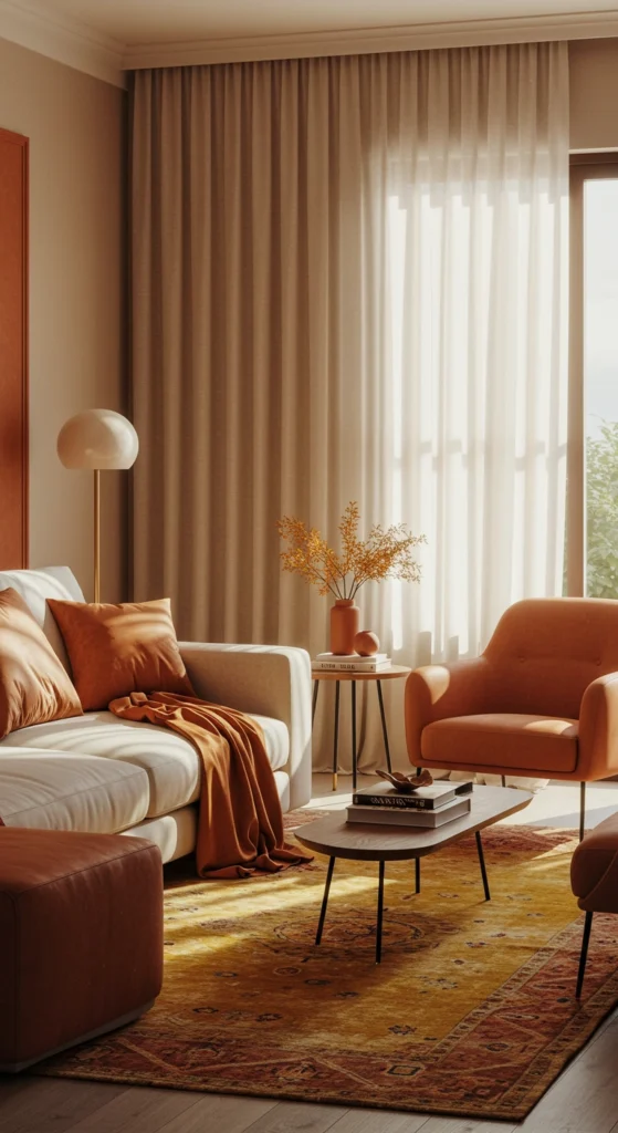
- Palette: Terracotta, mustard yellow, burnt orange, softened with cream or beige
- Why it’s effective: These warm shades create a snug, welcoming environment, perfect for cozy corners or intimate dining spaces.
- Pro tip: Highlight an accent wall or incorporate warm tones through textiles like cushions, rugs, or curtains. Balance with neutrals to maintain harmony.
7. Striking Color Pops
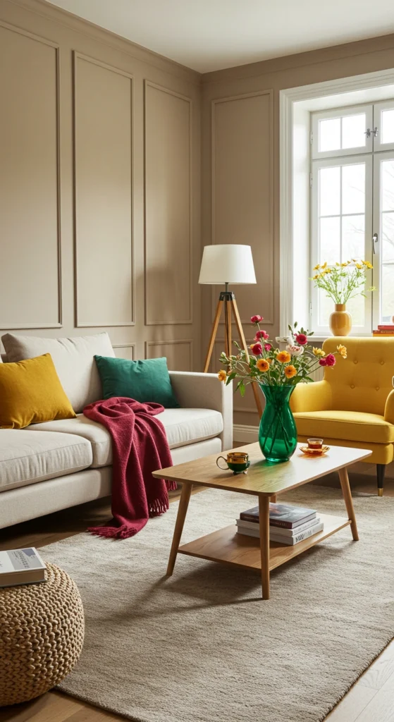
- Palette: Neutral base with vibrant splashes like ruby red, sunny yellow, or emerald green
- Why it’s effective: A neutral foundation keeps the space airy, while vivid accents inject personality and energy, creating visual interest without overwhelming.
- Pro tip: Introduce bold colors sparingly-through throw pillows, artwork, or a standout chair. Remember, subtlety is key.
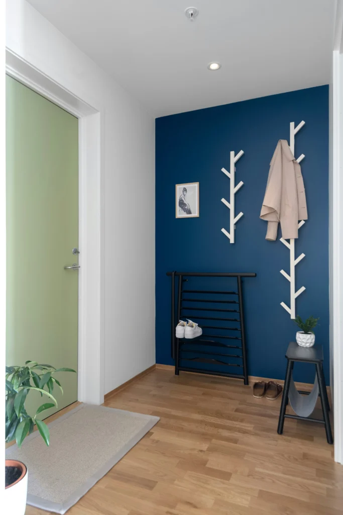
8. Deep and Dramatic Shades
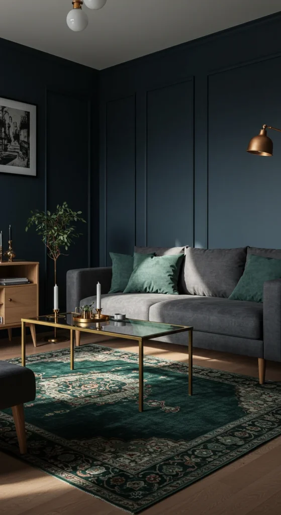
- Palette: Rich navy, charcoal gray, deep forest green, accented with metallics or light wood
- Why it’s effective: While it may seem counterintuitive, dark colors add depth and a luxurious feel, turning a small room into an intimate retreat.
- Pro tip: Ensure ample lighting-combine floor lamps, sconces, and reflective surfaces like mirrors to prevent the space from feeling enclosed.
9. Vibrant and Uplifting
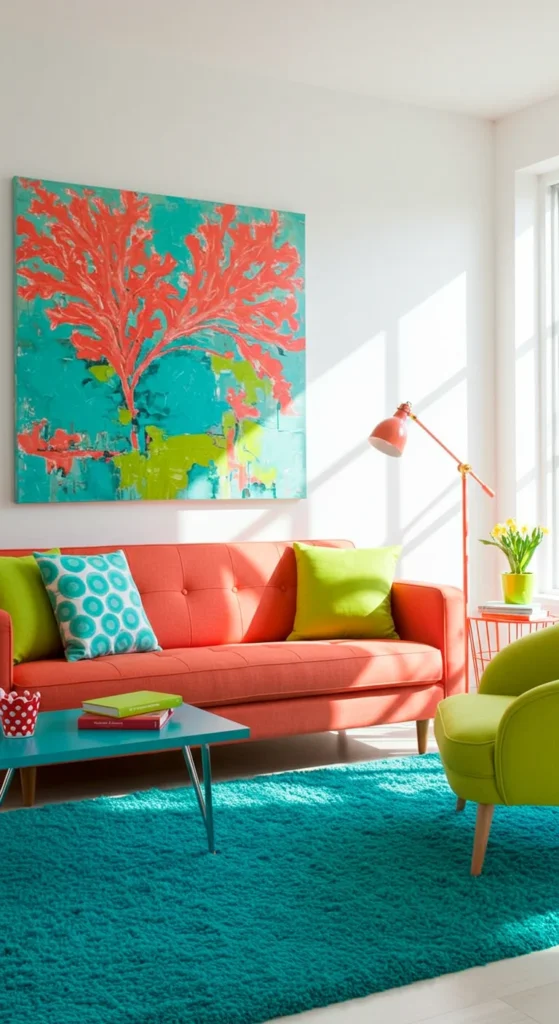
- Palette: Energetic hues like coral, turquoise, lime green, set against a crisp white backdrop
- Why it’s effective: This lively combination injects positivity and vibrancy, perfect for spaces that need a cheerful boost.
- Pro tip: Keep walls white or light to avoid visual chaos. Stick to a unified color theme, such as jewel tones or pastels, for cohesion.
10. Eclectic and Personalized
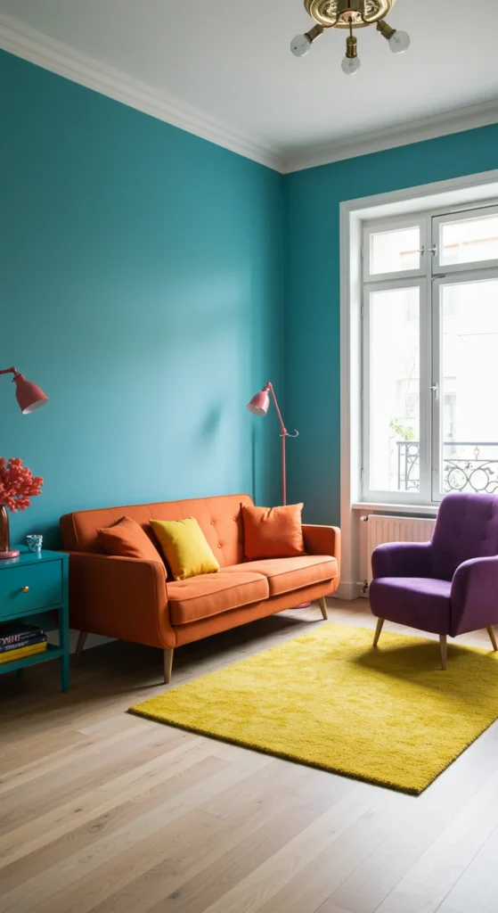
- Palette: Unexpected duos like teal with coral or violet paired with mustard yellow
- Why it’s effective: An eclectic mix showcases your unique style, making the room feel truly yours and full of character.
- Pro tip: Choose colors with similar saturation levels to maintain harmony. Use patterned elements like striped rugs or floral curtains to unify the look.
Final Thoughts: Embrace Creativity and Confidence
Armed with these 10 dynamic color schemes, you’re ready to reinvent your small room into a space that reflects your personality and meets your needs. Whether you gravitate toward soft pastels, bold highlights, or a quirky mix, there’s a palette here to inspire you. Remember, paint is a flexible medium-you can always refresh your walls if you want a change. So take the plunge, experiment boldly, and watch your compact space blossom into a stylish, inviting haven.