
When it comes to creating a dining space that exudes both grace and understated charm, neutral designs have a timeless appeal that never goes out of style. In this carefully curated list, we explore 25 neutral dining room ideas that masterfully balance elegance with simplicity. Whether you’re seeking inspiration for a serene retreat or aiming to craft a versatile setting that effortlessly complements any occasion, these designs offer practical insights and aesthetic harmony. From soothing colour palettes to thoughtful décor choices, prepare to discover how subtle tones can transform your dining area into a welcoming haven of refined comfort.
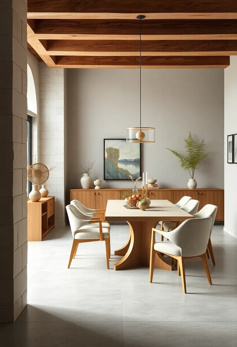
Classic Beige Elegance: Soft beige walls paired with white trim create a warm, inviting canvas for wooden dining furniture, exuding timeless sophistication
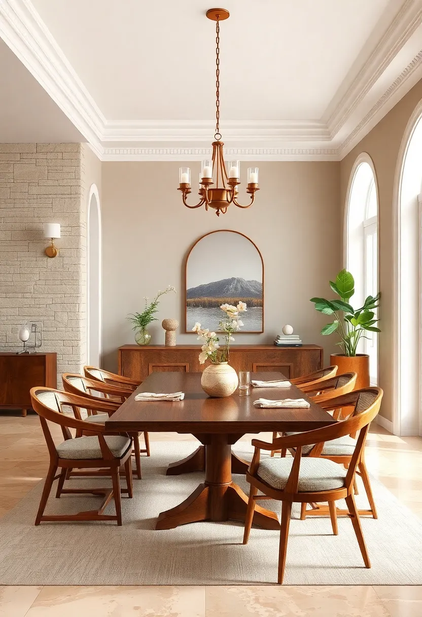
Soft beige walls offer a subtle warmth that envelopes your dining room in an inviting glow, creating the perfect backdrop for a variety of wooden furniture styles. When paired with crisp white trim, the space gains a refined contrast that emphasizes architectural details without overpowering the senses. This delicate balance sets the stage for wooden tables and chairs to shine, their natural grains and tones elevated against the neutral canvas. Whether you prefer the rustic charm of reclaimed wood or the sleek lines of modern finishes, this color pairing effortlessly complements each piece, resulting in a space that feels both timeless and thoughtfully curated.
To enhance the elegance of this neutral palette,consider incorporating accents that celebrate texture and simplicity. Woven placemats, linen napkins, and muted ceramics introduce layers that engage the eye without competing with the overall harmony. For lighting,go for soft white bulbs in classic fixtures like wrought iron chandeliers or minimalist pendants,allowing the warmth of the beige to glow softly throughout the evening. below is a rapid guide to pairing wood tones with this neutral duo for maximum impact:
| wood Tone | Effect | Recommended Décor |
|---|---|---|
| Light Oak | Brightens and adds a casual air | Natural linen curtains, glass vases |
| Walnut | Rich, creates a cozy, inviting feel | Earth-toned ceramics, leather accents |
| Cherry | Warm red undertones bring elegance | Soft gold fixtures, cream upholstery |
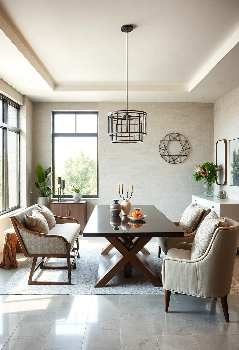
monochrome Minimalism: Shades of grey from charcoal to dove blend seamlessly, offering a sleek yet cozy dining environment
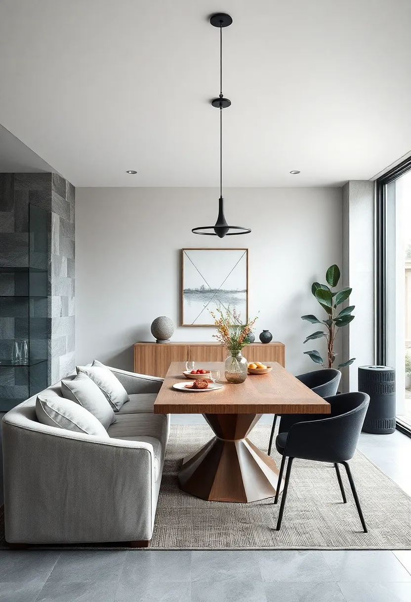
Embracing a palette that spans from deep charcoal to delicate dove, this approach masterfully blurs the line between modern sleekness and inviting warmth. The interplay of various grey tones creates depth without the need for bold colors, allowing natural textures like matte stone, soft wool, and smooth leather to take center stage. Layering these muted hues generates a harmonious backdrop that feels both polished and lived-in, ideal for intimate dinners or casual gatherings alike.
Design details often spotlight subtle contrasts — from the stark geometry of charcoal pendant lights to the plush comfort of dove-grey upholstered chairs.Such nuanced selections enhance the dining experience by fostering a serene atmosphere free from distraction. To elevate the setting further, consider:
- Incorporating brushed metal accents in silver or gunmetal for a refined edge
- Choosing natural wood elements in light greys to warm up the space
- Adding tactile textiles like knitted throws or linen napkins in varying grey scales
Scandinavian Simplicity: Crisp white walls and natural oak accents evoke clean lines and understated charm, perfect for casual gatherings
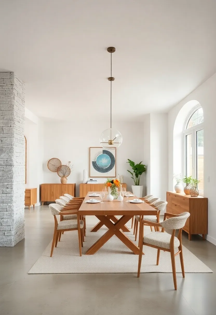
Embodying effortless elegance,this design style pairs the pristine purity of white walls with the warm,organic texture of natural oak accents. The interplay between these elements brings a harmonious balance that whispers simplicity while inviting intimate, casual gatherings. White walls create a light-filled backdrop that enhances the room’s openness, while the oak—a staple of Scandinavian interiors—offers grounding warmth through furniture, flooring, or delicate trim details. Together, they form a timeless duo that champions clean lines and subtle sophistication without the need for elaborate décor.
To replicate this look, consider furnishing your dining room with sleek oak chairs or a modest table with minimalist silhouettes. Keeping accessories minimal and functional—such as a simple ceramic vase or linen napkins—maintains the understated charm characteristic of Scandinavian design. Here’s a quick guide to key elements that elevate the style:
- Natural Materials: Oak wood elements for furniture and flooring.
- neutral Palette: Dominantly white, with soft shades of beige or grey.
- Textural Contrast: Linen textiles and matte ceramics for tactile interest.
- Clean Lines: furniture with simplistic, angular forms.
Warm Taupe Harmony: Taupe walls combined with cream textiles enhance warmth without overpowering, crafting a serene dining experience
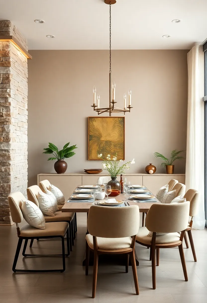
Embracing taupe walls sets a sophisticated and grounding canvas that immediately welcomes you into a space of understated elegance. When paired with cream textiles—think plush cushions, flowing curtains, and soft upholstery—the room gains a subtle glow that lifts the atmosphere without overshadowing the natural charm of taupe. This thoughtful pairing cultivates a warm, inviting aura, perfect for long, leisurely dinners where comfort and style blend seamlessly.
To elevate this harmonious duo, consider incorporating textures that add depth and tactile interest. A mix of linen table runners, velvet seat covers, and cotton napkins in varying shades of cream creates an interplay of softness against the smooth backdrop, enhancing the sensory experience. Warm metals like brushed brass or matte gold accents in lighting fixtures or cutlery further amplify the cozy sophistication. The result is a dining room that feels balanced, serene, and effortlessly chic—ideal for both intimate gatherings and everyday family meals.
| Element | Material | Benefit |
|---|---|---|
| walls | Matte Taupe Paint | warm, grounding backdrop |
| Textiles | Cream Linen & Velvet | Softness and layered texture |
| Accents | Brushed Brass | Subtle luxury and warmth |
Linen and Light: Natural linen upholstery on dining chairs paired with pale wood tables brings airy softness and tactile contrast
Infusing your dining space with the gentle charm of natural linen upholstery creates a subtle yet impactful statement of comfort and style. linen’s breathable, textured weave offers an inviting softness that beautifully complements the sleekness of pale wood dining tables. Together, they form a harmonious balance between tactile diversity and visual lightness, making the room feel open, relaxed, and effortlessly elegant. The muted palette of neutral linens paired with warm, understated wood grains brings a timeless appeal that easily adapts to both contemporary and classic interiors.
To maximize this serene aesthetic, consider these styling tips:
- Mix and match textures: Add woven placemats, ceramic dishware, and glass accents to reinforce the contrast between soft and solid materials.
- Keep colors subtle: Use shades like soft ivory, taupe, or blush for cushions and napkins to enhance the airy feel without overpowering the natural undertones of linen and wood.
- Play with natural light: position your dining set near windows or beneath warm pendant lighting to accentuate the linen’s softness and highlight the pale wood’s grain.
stone and Wood Fusion: Cool stone textures complement rich wood grains, balancing rustic elements with refined neutrality
Bringing together the rugged charm of stone with the organic warmth of wood creates a dining atmosphere that feels both grounded and inviting. Think weathered stone tabletops paired with rich, walnut chairs, where the cool, tactile surface contrasts beautifully against smooth, earthy grains. This blend serves as an elegant anchor for neutral palettes—soft greys, warm beiges, and creamy whites—that elevate rustic allure without overwhelming the senses. The tactile interplay encourages a sense of balance, where natural imperfections become assets that enrich the space rather than detract from it.
design elements to embrace in this fusion include:
- Textured stone backsplashes or accent walls alongside wooden cabinetry featuring minimal hardware for understated sophistication.
- Mixed wood tones layered with stone accessories such as coasters, candle holders, or sculptural centerpieces to build depth without clutter.
- Subtle matte finishes and organic shapes that mirror natural forms, nurturing a cohesive flow across materials.
| Material | Texture | Design Tip |
|---|---|---|
| Honed Marble | Smooth, muted | Pair with distressed oak for contrast |
| Chiseled Slate | Rough, rugged | Use as backsplash behind walnut buffet |
| Reclaimed Wood | Grain-rich, textured | Balance with polished granite surfaces |
Soft Greige Sophistication: A blend of grey and beige sets a subtle backdrop that enriches both contemporary and traditional dining sets
Embracing a nuanced palette that bridges the coolness of grey with the warmth of beige creates a canvas both chic and inviting.This versatile shade acts as a silent orchestrator in dining spaces, allowing furnishings to shine without overwhelming the senses. Whether paired with sleek metallic accents or rich wooden textures, it creates a harmonious environment that evokes understated luxury. The subtle undertones of greige make it an ideal choice for those seeking balance—offering depth without sacrificing serenity.
Consider these styling tips to enhance your dining area with this elegant hue:
- Layered Textures: combine linen drapes with matte ceramic dishes to add tactile interest.
- Accent Lighting: Soft amber bulbs enhance the warmth within the greige framework.
- Eclectic Seating: Blend upholstered chairs with distressed wood benches for a lived-in charm.
| Design Element | Effect | Pairing Idea |
|---|---|---|
| Matte Grey Walls | Subtle sophistication | Brass pendant lighting |
| Beige Upholstery | Soft warmth | Dark wood tables |
| Neutral Rugs | Cozy foundation | Textured cushions |
Muted Earth Tones: Clay, sand, and soft brown hues create a grounded, earth-inspired room that feels both organic and elegant
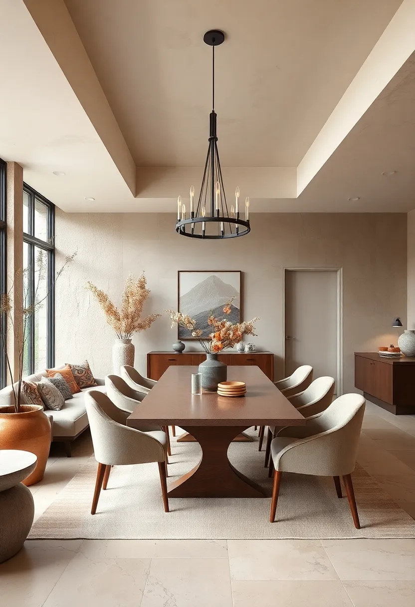
Embracing a palette of clay, sand, and soft brown hues invites a sense of calm and grounded elegance into your dining space. These muted earth tones effortlessly echo the natural world, transforming your room into a serene retreat where simplicity meets sophistication. Layer textures like woven linen linens, matte ceramics, and reclaimed wood furniture to enrich the tactile experience while keeping the aesthetic understated and warm.
To balance this organic vibe with subtle flair, consider incorporating elements such as:
- Brass or matte black fixtures for a touch of modern contrast
- Soft, ambient lighting to enhance the warmth of earthy shades
- Natural fiber rugs that add texture without overpowering the color story
| Element | Purpose |
|---|---|
| Clay Pottery | Adds rustic charm and authenticity |
| Sand-colored Walls | creates an open, airy, and neutral backdrop |
| Soft Brown Upholstery | Introduces coziness and visual warmth |
Subtle Stripes: Neutral striped wallpaper adds gentle visual interest without disrupting the room’s calm ambiance
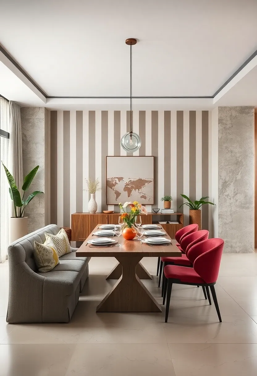
Incorporating subtle stripes in neutral tones offers an understated elegance that quietly elevates your dining space.These gentle lines create a soft rhythm on the walls, enhancing depth without overpowering the room’s serene foundation. whether vertical,horizontal,or even faintly textured,the stripes guide the eye with a graceful flow,allowing furnishings and decor to breathe while maintaining a cohesive look. Opt for muted shades like soft greys, beiges, or creamy whites to ensure the wallpaper acts as a whisper rather than a shout, perfectly balancing style with calm.
Beyond aesthetics,striped wallpaper can cleverly manipulate spatial perception. Vertical stripes can elongate low ceilings, while horizontal ones broaden narrower rooms, making the dining area feel both inviting and expansive. For those seeking versatility,pairing subtle striped walls with natural wood finishes or minimalist metal fixtures creates a timeless interplay of textures. consider combining the wallpaper with these key elements:
- Matte or satin finishes to enhance the softness without reflective glare
- Neutral-toned textiles—linen, cotton, or wool—to complement the calm palette
- Minimalist artwork that preserves the wallpaper’s gentle charm
Textured Neutrals: Incorporating woven baskets, jute rugs, and textured textiles builds depth while maintaining simplicity
Bringing natural textures into a neutral dining room instantly elevates the space without overwhelming its understated elegance. woven baskets serve as both functional storage and captivating decor pieces, adding an organic touch that softens crisp lines.Jute rugs ground the room with their earthy tones and intricate weaves, providing tactile richness that invites you to linger longer at the dining table. Complement these with textured textiles—think linen napkins, fringed table runners, or boucle cushions—to introduce subtle contrasts that play beautifully with smooth wood and matte ceramics.
Simple elements combine to create visual intrigue:
- Wicker pendant lamps casting warm shadows
- Layered textiles in varying weaves and fibers
- Neutral color palette with varying shades of beige, cream, and taupe
- Natural fiber accessories enhancing tactile appeal
| element | Texture | effect |
|---|---|---|
| Woven Baskets | Coarse & Natural | Warmth & Functionality |
| Jute Rugs | Rough & Earthy | Grounds Space & Adds Comfort |
| Textured Textiles | Soft & Layered | Depth & Visual Interest |
Off-White Opulence: Creamy off-white walls combined with alabaster accents exude understated luxury
The subtle harmony of creamy off-white walls paired with delicate alabaster accents creates a dining space that whispers sophistication without overwhelming the senses. This color duo acts as a perfectly blank canvas, allowing natural textures and minimalist furnishings to take center stage. The soft warmth of the off-white walls enhances daylight, making the room feel airy and inviting, while touches of alabaster in light fixtures, tableware, or decorative molding add a polished, almost sculptural elegance. Together, these elements cultivate a sense of serenity, making every meal feel like a refined yet relaxed occasion.
Incorporating this palette encourages a seamless blend of materials and styles.Consider mixing sleek matte ceramics with soft linen textiles to introduce tactile depth, or balance smooth alabaster table lamps against rustic wooden dining tables for a sophisticated contrast. The timeless neutrality of these hues also pairs wonderfully with pops of muted metallics,such as brushed gold or antique brass,perfect for enhancing visual interest without sacrificing simplicity. This design approach remains effortlessly chic—ideal for those who appreciate subtle luxury and understated charm.
Blush Neutrals: A hint of dusty blush intertwined with beige tones infuses subtle warmth into a neutral palette
Incorporating dusty blush with soft beige hues creates a refined yet cozy ambiance that gently elevates any dining room. This subtle blend adds a whisper of warmth without overpowering the serene vibe that neutral spaces strive for. The dusty blush acts as a delicate infusion of color, breathing life into minimalist designs while complementing natural textures such as linen drapes, light wood finishes, and stone accents.It’s an ideal choice for those who appreciate understated elegance combined with a touch of inviting softness.
To achieve this harmonious balance, consider pairing blush-toned velvet cushions or a linen table runner in muted beige against creamy walls or furniture. Accents in soft gold or brushed brass can further enhance this look, creating layers of interest and warmth. Elements to include might be:
- Blush-hued ceramic vases or candleholders
- beige woven rugs with subtle patterns
- Soft pink florals as centerpieces
- Textured beige placemats
| Element | Benefit | Style Tip |
|---|---|---|
| Dusty Blush Cushions | Adds soft color without loudness | Choose matte or velvet textures |
| Beige Linen Tablecloth | Introduces natural warmth | Keep it wrinkle-free for crispness |
| Gold Accents | Provides understated luxury | Use sparingly to avoid overpowering |
Matte Black Accents: Neutral dining rooms with matte black table legs or lighting fixtures balance softness with modern edge
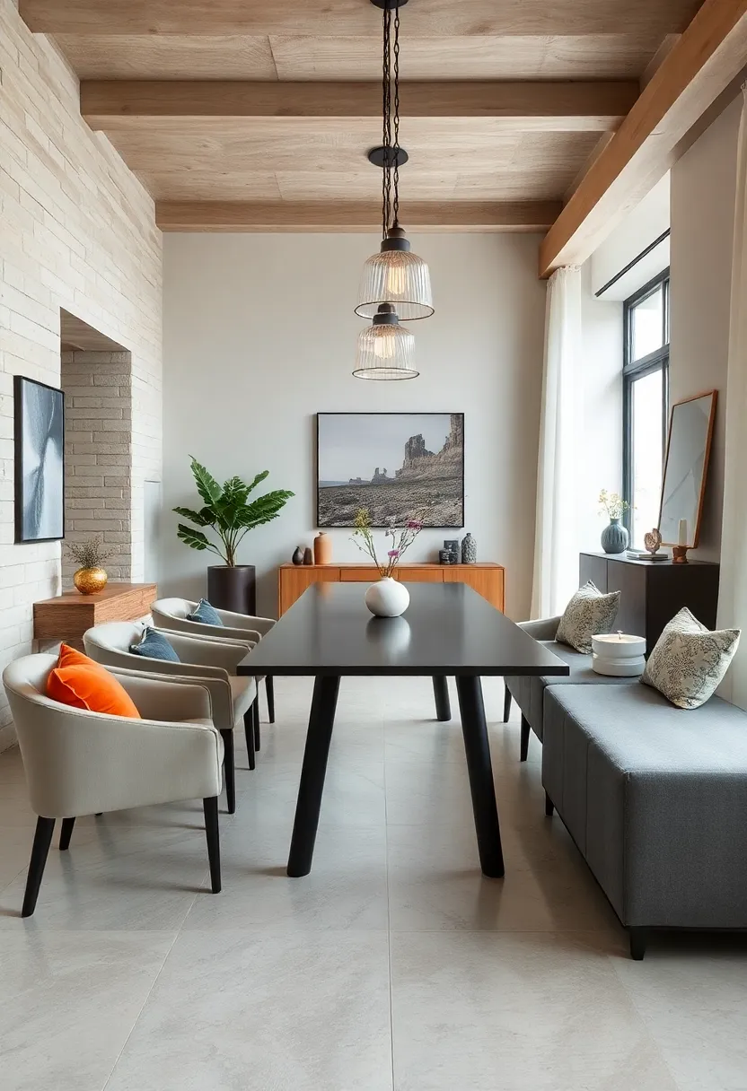
Incorporating matte black elements in a neutral dining space introduces a striking contrast that elevates understated elegance. Matte black table legs,for example,provide a sleek foundation that anchors light-hued wooden or marble tabletops,creating a harmonious blend of warmth and modernity. These accents add depth to the room without overpowering its calming palette, striking a balance between softness and edge that few other finishes can achieve.
Beyond furniture, lighting fixtures in matte black serve as sculptural statements that complement minimalist design while injecting personality.Think geometric pendant lights or understated sconces that punctuate the space with visual interest. Key benefits of matte black accents include:
- Timeless appeal that pairs seamlessly with any neutral tone
- Easy maintenance with smudge-resistant matte finishes
- Ability to unify mixed materials and textures
- Subtle yet bold additions that define modern elegance
Soft Contrast Layers: Mixing multiple shades of white and grey adds dimension and keeps the look dynamic yet restrained
Layering a palette of whites and greys creates a sophisticated visual texture that is anything but flat. By selecting varying shades—think soft dove greys paired with warm alabaster whites—the space gains subtle depth without overwhelming the senses. This approach allows shadows and light to play off each other, enhancing architectural details like wainscoting, crown molding, or exposed beams. The key is to keep contrast gentle yet intentional, maintaining a serene atmosphere that invites relaxation and focused conversation around the dining table.
Incorporate different materials and finishes within this tonal spectrum to further enliven the room. A matte plaster wall can beautifully complement a silk-grey velvet dining chair, while a glossy white ceramic vase adds a touch of crisp brightness.Mixing textures along with tones encourages the eye to travel around the room, creating a rhythmic harmony. Consider these elements to balance visual interest with restraint:
- Textured linens: Sheer curtains or woven table runners in off-white hues
- Natural fibers: rugs and baskets in muted greys or creamy whites
- Metallic accents: Brushed nickel or matte brass lighting fixtures that softly shimmer
- Art and decor: Monochrome prints or sculptural ceramics in layered neutrals
Natural Light Focus: Large windows with minimal window treatments amplify neutral tones and enhance spaciousness
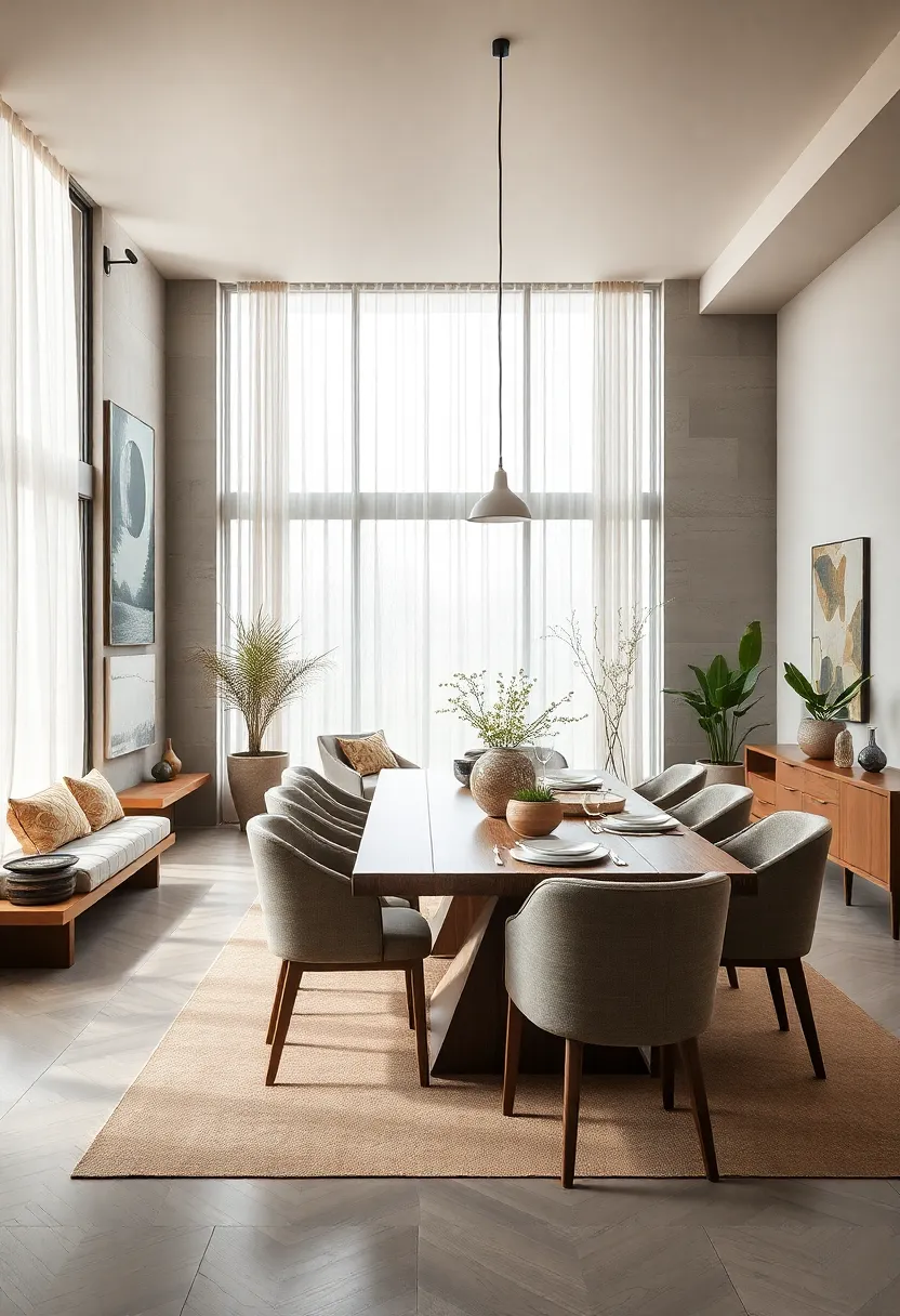
Flooding a dining area with abundant natural light transforms neutral palettes into a serene sanctuary. Expansive windows act as living frames, inviting the outside world in, while sheer or barely-there window treatments maintain an unobstructed flow of daylight. This bright openness not only magnifies soft beiges, warm taupes, and subtle grays but also creates an airy ambiance that fosters relaxed gatherings and timeless charm. The interplay between natural light and neutral hues ensures every meal feels more vibrant and every space feels more inviting.
- Maximize spaciousness: Minimal window coverings prevent any visual barriers, making rooms appear larger and more open.
- Highlight textures: Sunlight accentuates the gentle textures of linen curtains, woven baskets, and matte ceramics, enriching the minimalist design.
- Effortless elegance: Clean window lines paired with neutral walls evoke a sophisticated yet approachable dining environment.
Organic Shapes: Rounded furniture edges and curvy decor pieces soften the neutral scheme for inviting comfort
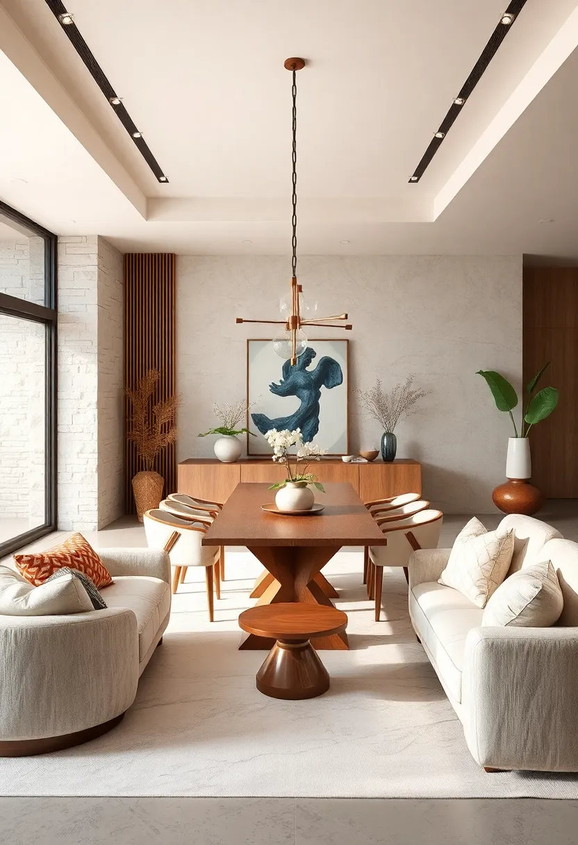
Soft, flowing forms bring a natural warmth to neutral dining rooms, creating an atmosphere that feels both serene and welcoming.Think gently rounded dining tables, chairs with subtly curved backs, and decor pieces that echo organic lines—these elements break up the starkness of minimalist color palettes without disrupting their understated charm. Incorporating items like pebble-shaped ceramics, wavy mirror frames, or sculptural vases can introduce tactile interest, making the space feel lived-in and inviting rather than cold or austere.
Integrating these graceful contours also enhances comfort on a practical level; rounded furniture eliminates harsh edges, encouraging relaxation and lingering conversations around the table. For a balanced look, pair these sinuous shapes with natural textures such as soft linens or woven rattan, which complement the neutral tones while reinforcing the soothing, nature-inspired vibe. The result is a dining space where elegance meets everyday ease, fostering moments that are as stylish as they are heartfelt.
Vintage Neutrals: Incorporating aged wood and antique finishes brings character while preserving a neutral base
Incorporating aged wood and antique finishes into your dining room introduces a rich tapestry of history and texture without overwhelming the space. Weathered wood panels, distressed dining tables, or vintage sideboards can serve as striking focal points, grounding the room in warmth and authenticity. These elements pair beautifully with soft neutral walls and minimalistic decor, creating a balanced interplay of rugged charm and refined simplicity. The subtle imperfections and natural patinas in aged wood invite the eye to linger, offering a sense of narrative that modern materials often lack.
To fully embrace this aesthetic, consider mixing textures and finishes that complement rather than compete. Matte ceramics, linen textiles, and muted metals help maintain a harmonious neutral palette while enhancing the tactile experience. here’s a quick guide to pairing vintage neutrals effectively:
| Material | Finish | Effect |
|---|---|---|
| Aged Oak | Distressed Matte | Warmth and rustic texture |
| Antique Brass | brushed | Subtle metallic accent |
| Washed Linen | Soft Matte | Light, breathable softness |
| Weathered Stone | chipped Natural | Organic and earthy base |
Minimalist Artistry: Simple line art in muted frames complements neutral walls without overpowering the space
The elegance of minimalist line art lies in its ability to convey form and emotion through simplicity. When paired with subtle, muted frames, these pieces gently enhance a neutral dining room without becoming the focal point. Their delicate lines and understated hues create a harmonious rhythm, echoing the calm and serenity that neutral walls naturally inspire. This approach allows furniture and natural textures to shine, while the artwork whispers its presence, adding depth without distraction.
Incorporate these ideas to maximize the effect:
- Choose frames in soft tones like dove grey, soft taupe, or matte black to complement the wall color and add subtle contrast.
- Opt for abstract or figurative line art with clean, flowing strokes to evoke movement and sophistication without visual noise.
- Group multiple small pieces for an editorial-look gallery arrangement, creating a curated feel while maintaining visual lightness.
- Balance negative space around artwork intentionally, giving the walls breathing room to elevate the room’s airy atmosphere.
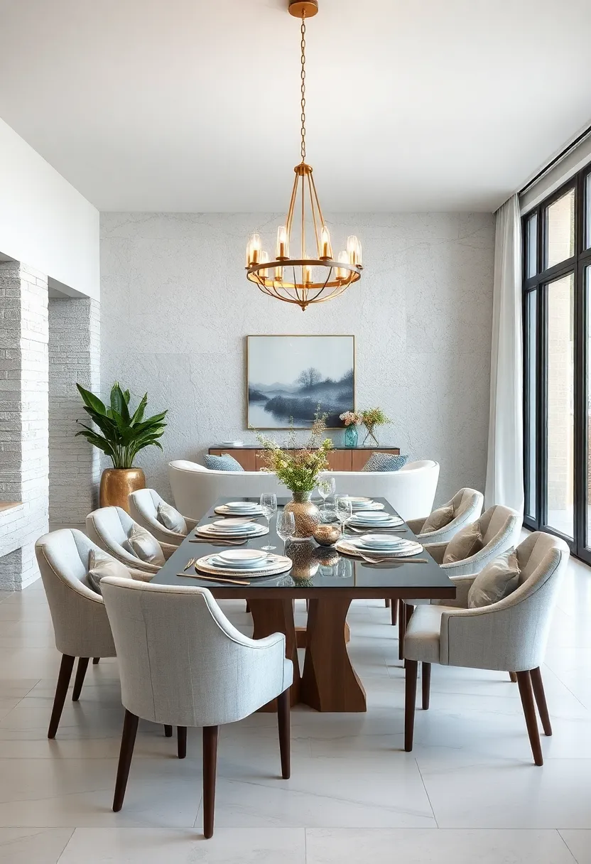
Metallic Neutrals: Soft gold and brushed nickel finishes introduce subtle shine while keeping the palette balanced
Incorporating soft gold and brushed nickel finishes adds a delicate shimmer that elevates a neutral dining space without overpowering its calm ambiance. These metallic tones work harmoniously with shades of beige, taupe, and gray by reflecting light subtly, which enhances the room’s depth and warmth. Whether it’s through elegant lighting fixtures, hardware accents, or decorative elements, these finishes provide just the right amount of sparkle to create a refined, timeless look.
To seamlessly blend these metallics into your design scheme, consider pairing them with:
- Natural textures like linen or woven rattan to maintain softness and intimacy
- Wooden furniture in muted tones that complement the shine
- Glass surfaces that amplify the glow of the metals
| Finish | Ideal Pairings | Effect in Room |
|---|---|---|
| Soft Gold | Warm woods, ivory textiles | Warm, elegant glow |
| Brushed Nickel | Gray hues, glass accents | Cool, sophisticated shimmer |
Linen Drapery elegance: Flowing linen curtains in neutral shades frame the room gracefully, adding softness
Soft, flowing linen curtains in muted tones effortlessly encapsulate the essence of understated luxury in any dining space. Their natural texture invites a tactile warmth that contrasts beautifully with sleek modern elements or traditional fixtures. These neutral shades—ranging from creamy ivories to gentle taupes—create an airy backdrop while diffusing sunlight to cast a soft, welcoming glow throughout the room. the gentle movement of the fabric subtly softens sharp lines, striking the perfect balance between refined elegance and cozy comfort.
Why choose linen draperies?
- Breathable fabric that allows light filtration without harsh glare
- Neutral palettes that complement a variety of color schemes
- Natural fibers that add environmental friendliness to your décor
- Enhance acoustic comfort by muffling sharp sounds at the dining table
- Timeless appeal that grows richer with age and wear
| fabric Type | Ideal neutral shades | Style Compatibility |
|---|---|---|
| Linen Blend | Soft Beige, Light Gray | Modern, Scandinavian |
| Pure Linen | Warm Ivory, Sand | Traditional, Coastal |
| Washed Linen | Muted Taupe, Stone | Rustic, Transitional |
Subdued Geometrics: Gentle geometric patterns in upholstery and decor introduce intrigue without breaking neutrality
Introducing subtle geometric patterns in your dining room’s upholstered chairs or decor pieces adds a layer of visual interest while maintaining a calm and neutral palette. think soft hexagons, pale chevrons, or muted diamond shapes woven into linen cushions or drapery fabric — these gentle motifs create depth without overwhelming the senses. This approach transforms minimalist spaces into thoughtful environments where design whispers sophistication instead of shouting for attention.
Consider pairing these understated patterns with solid-colored wood or metal furniture that carries clean lines, creating a harmonious balance between texture and form. Accessories such as rugs or table runners featuring faded geometric prints can enhance the entire setting.The key lies in choosing patterns that are slightly blurred or intentionally low-contrast, allowing them to blend seamlessly with creams, taupes, and soft grays, resulting in a dining room that feels both inviting and timeless.
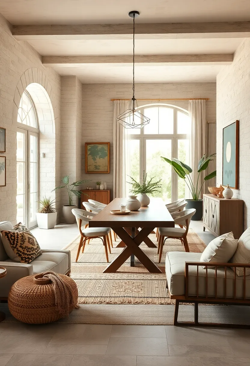
Natural Fiber accents: Rattan, wicker, and cane elements blend effortlessly with neutral tones to add texture and warmth
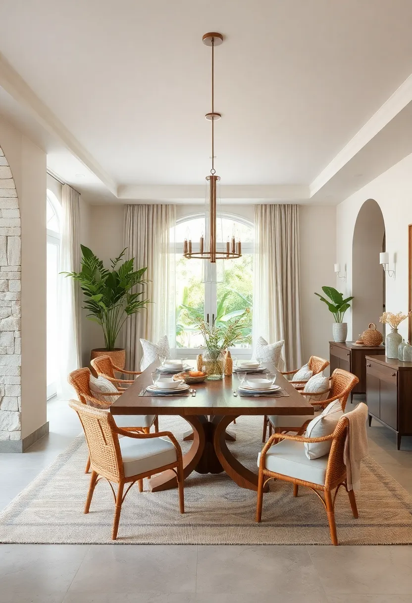
Incorporating rattan, wicker, and cane elements into a neutral dining room instantly introduces a subtle, organic charm. These natural fibers carry an earthy story that contrasts beautifully with smooth, muted palettes, adding layers of texture without overwhelming the space. Imagine a rattan-backed dining chair paired with sleek beige walls or a woven cane pendant light casting gentle shadows—these accents bring a tactile warmth that invites comfort and conversation around the table. Their lightweight and flexible nature also make them perfect for mixing and matching with different furniture styles, from minimalist to rustic.
These materials don’t just enhance aesthetics—they also contribute durability and timeless appeal. To help visualize their impact, here’s a simple guide showcasing how different natural fiber pieces elevate various neutral schemes:
| Fiber Element | Neutral Palette | Textural Effect | Best Use |
|---|---|---|---|
| Rattan | Soft taupe & cream | Cozy yet sophisticated | Chair backs, baskets |
| Wicker | warm beige & light gray | rustic & inviting | Sideboards, light fixtures |
| cane | Off-white & sand | Delicate & airy | Cabinet doors, chair seats |
- Layer textures: Blend these fibers with linen or cotton textiles to enhance softness.
- Neutral continuity: Keep the color palette consistent to maintain a calm environment.
- Natural finishes: Opt for matte or lightly polished surfaces to emphasize authenticity.
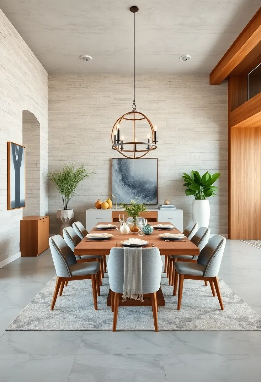
Tonal Wood Layers: Combining light, medium, and dark wood finishes creates a rich yet neutral dining atmosphere
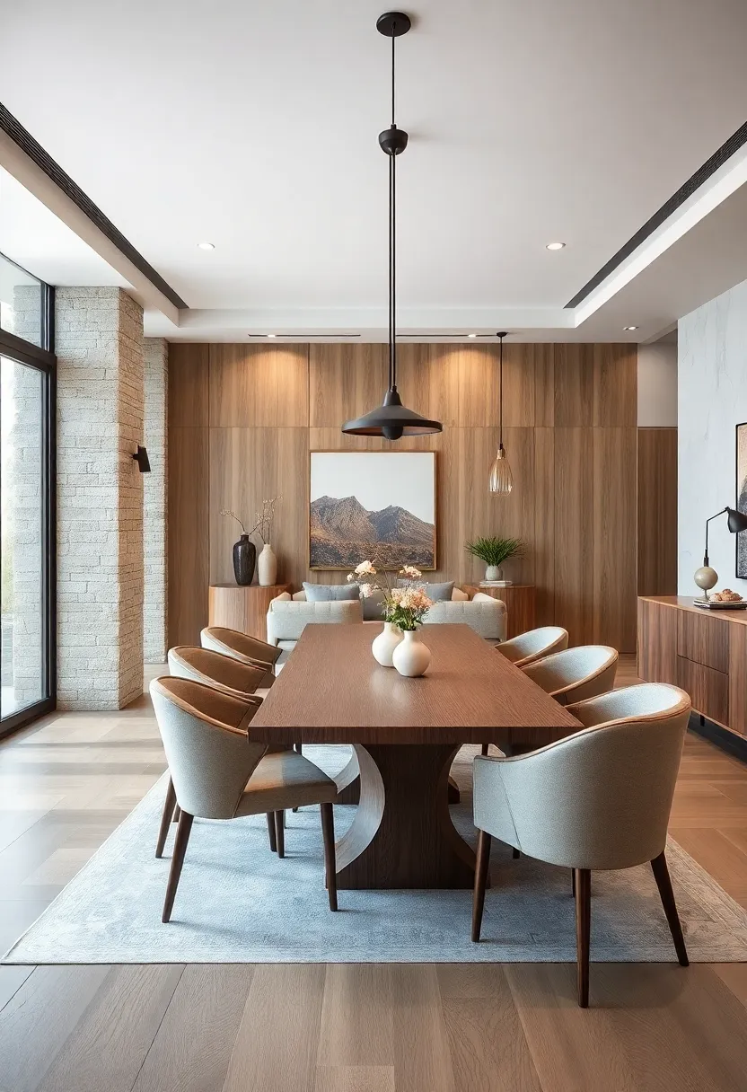
Layering various wood tones within your dining space is a masterstroke of design that brings warmth and texture without overwhelming the senses. Imagine a dining table crafted from smooth light oak paired with chairs showcasing a medium walnut finish, all set against a backdrop of deep, dark mahogany shelving. This tonal interplay creates a dynamic yet harmonious palette that feels both intentional and effortlessly balanced. When these finishes are thoughtfully combined, they evoke a sense of timelessness and invite guests to linger, turning everyday meals into cherished rituals.
To achieve this sophisticated melding of hues, consider the following elements:
- Contrast: Use darker wood accents to anchor the space while letting lighter tones breathe and open up the room.
- Texture: Mix smooth,polished surfaces with raw,matte wood grains to add tactile interest.
- Consistency: Stick to warm or cool undertones across all wood finishes for a cohesive look.
- Balance: Distribute wood finishes evenly to avoid overpowering one side of the room.
| Wood Finish | Visual Effect | Ideal Use |
|---|---|---|
| Light Maple | Brightens and expands space | Dining table tops or cabinetry |
| Medium Walnut | Adds warmth and richness | Chairs and sideboards |
| Dark Mahogany | Grounds and defines areas | Frames,shelving,or flooring |
Whisper White Walls: Pure white walls provide a fresh,clean backdrop that highlights furnishings and accents
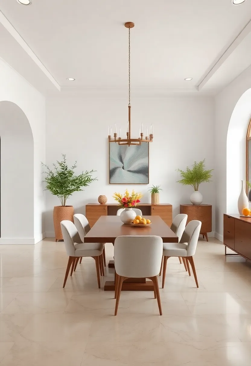
Embracing a palette of pure whites creates a serene canvas that effortlessly amplifies every element within the dining space.This gentle hue invites natural light to dance across the room, making it feel larger and more inviting. Whisper white walls act as a silent partner to your dining furnishings—whether it’s a rustic wooden table or sleek metallic chairs, each piece shines without competition. The simplicity of white allows you to experiment boldly with textures and materials, from linen drapes to plush velvet cushions, without worrying about color clashes.
- Versatility: Pairs beautifully with any accent color or wood tone.
- Timelessness: Creates a look that transcends seasonal trends.
- Focal Enhancement: Highlights statement art pieces or floral centerpieces.
Consider subtle variations in finishes to add depth: a matte paint finish offers an understated elegance, while a satin sheen subtly reflects light for added dimension. For those who enjoy injecting a bit of character, layering neutral textiles in creams, beiges, and soft greys complements white walls seamlessly. This strategy ensures the dining area remains calm and refined, perfect for both everyday meals and special gatherings.
Calm Coastal Neutrals: Soft sandy hues mixed with muted blues evoke serene coastal charm in a neutral dining space
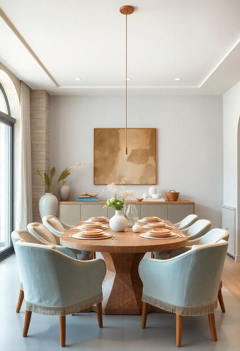
Imagine a dining room where the tranquility of the coast seamlessly blends with refined simplicity. This palette pairs soft sandy tones—think driftwood beige and sun-bleached taupe—with muted blues reminiscent of quiet ocean waves and overcast skies.The effect is an inviting space that inspires calm conversation and gentle ambiance without overpowering the senses. Natural textures like linen cushions, woven rugs, and weathered wood chairs complete the look, grounding the room in both warmth and subtle sophistication.
To elevate this calm coastal vibe, incorporate accents that reflect nature’s effortless grace: a centerpiece bowl of smooth sea glass, ceramic tableware in blue-gray hues, or a minimalist pendant light mimicking the shape of a shell.The key lies in balancing simplicity with warmth: neutral walls create an airy backdrop, while soft pops of coastal blue provide just enough contrast. For those seeking design guidance, the following table highlights key elements to consider when crafting a serene coastal-inspired dining space.
| Element | Description | Suggested Materials |
|---|---|---|
| Wall Color | Soft sand and beige tones | matte paint, textured plaster |
| Accent Hues | Muted ocean blues and grays | Ceramics, textiles, art prints |
| Furniture | Weathered wood with clean lines | Reclaimed timber, bamboo |
| Textures | Natural fibers and organic materials | Linen, jute rugs, woven baskets |
Insights and Conclusions
Whether you lean toward understated minimalism or subtle sophistication, these 25 timeless neutral dining room designs prove that elegance and simplicity can coexist beautifully. By blending soft hues, natural textures, and clean lines, each space invites you to savor not just the meal but the moment itself. Let these inspirations guide you in crafting a dining room that feels both effortlessly chic and warmly welcoming—a true reflection of timeless style.