
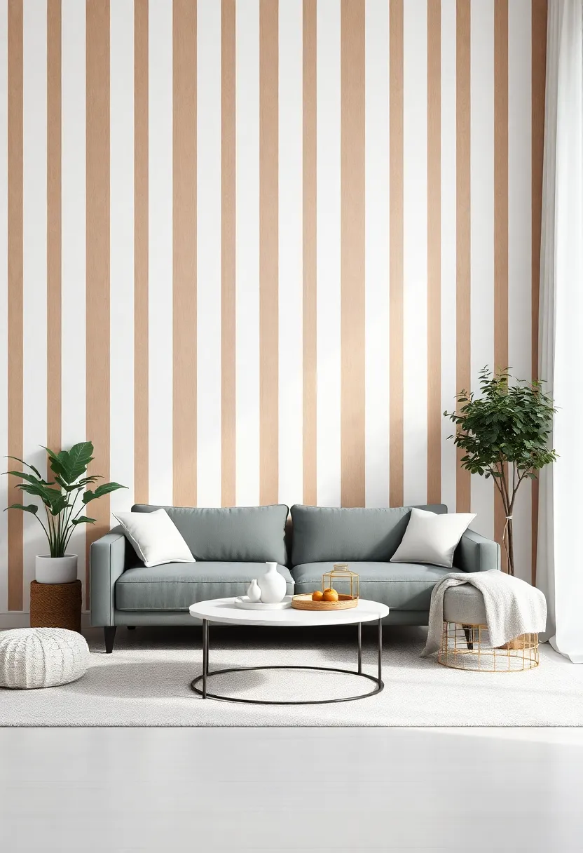
In the realm of interior design, the walls we choose to decorate are more than just a backdrop; they are the canvas upon which our lives unfold.Among the manny techniques available to transform an ordinary room into a stunning visual narrative, the understated elegance of vertical stripes stands out. This architectural art form not only draws the eye upward, creating an illusion of height and spaciousness, but also infuses character and dynamism into any space. Whether you’re looking to breathe new life into a cozy nook or make a grand statement in your living room, the strategic use of vertical stripes on accent walls can be the key to unlocking your home’s full potential. Join us as we explore the transformative power of this timeless trend, offering insights and inspiration to elevate your living space, one stripe at a time.
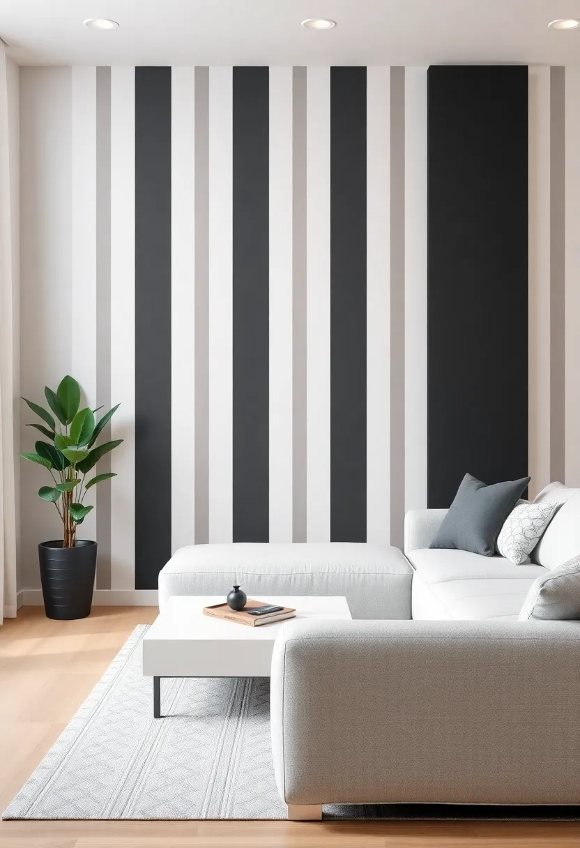
Elevating Aesthetic Appeal Through Vertical Stripes in Your Living Space
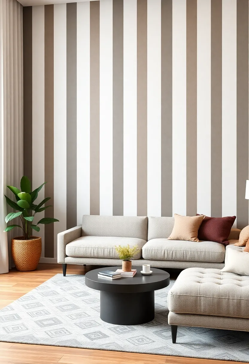
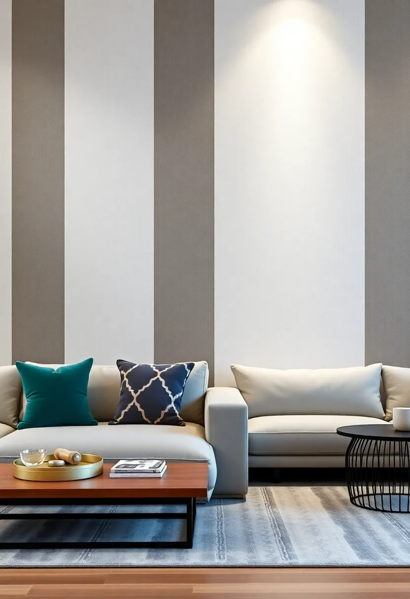
Incorporating vertical stripes into your living space can dramatically transform its aesthetic. These lines not only draw the eye upward but also create an illusion of height, making the room feel more expansive and airy.By selecting stripes in varying widths and colors, one can achieve a personalized look that resonates with the overall design theme. Consider combinations such as:
- Bold contrasts: Wide stripes in deep hues can create a striking focal point.
- Subtle shades: Thin stripes in muted tones evoke calm and sophistication.
- Texture play: Incorporate different materials, such as wallpaper or painted wood panels.
To achieve the best results, it’s essential to choose the right wall for your design adventure.An accent wall adorned with vertical stripes can set the stage for the entire room, guiding your furniture placement and decor choices. Here’s a quick overview of considerations for different spaces:
| Room Type | Ideal Stripe Style | Recommended Colors |
|---|---|---|
| Living Room | Wide Stripes | Deep Blue, Charcoal |
| Bedroom | Thin Stripes | Pale Gray, Soft Cream |
| Home Office | Textured Stripes | Forest Green, Light Beige |
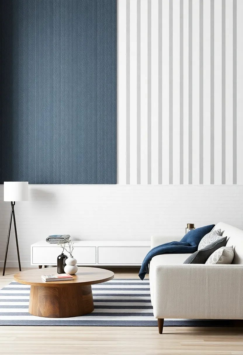
Creating an Enticing Focal Point with Striped Accent Walls
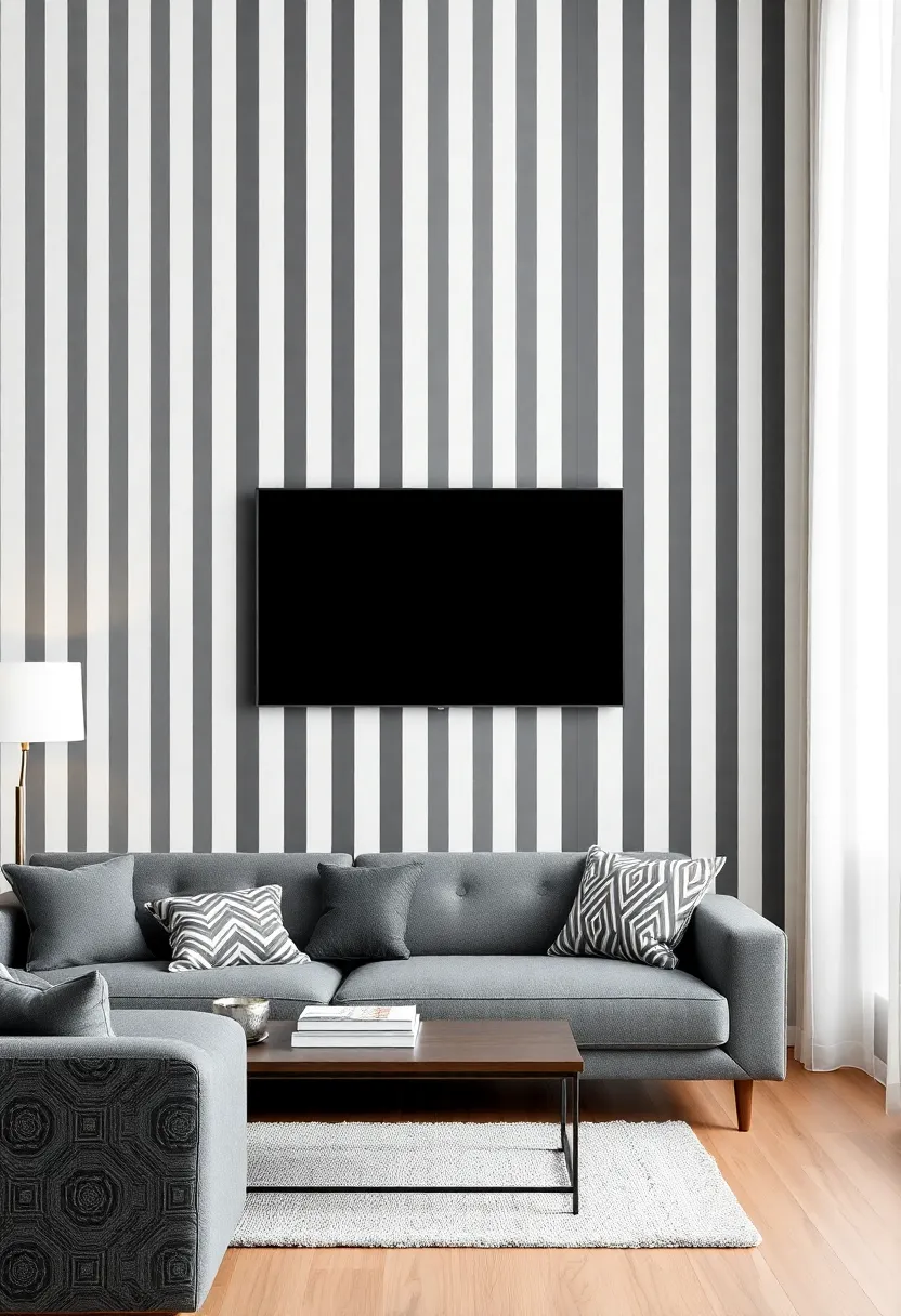
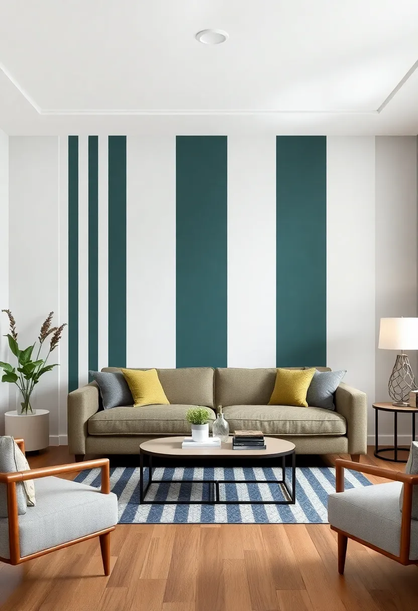
Vertical stripes can transform an ordinary wall into a stunning visual centerpiece, drawing the eye and sparking conversation. When considering a striped accent wall, think about the colour palette you want to enhance.Bold contrasts, like black and white or navy and gold, can create a dramatic effect, while soft pastels offer a more subtle, calming vibe. Here are some tips to keep in mind:
- Choose Your Width: The width of the stripes will dictate the overall feel of the space. Wider stripes can make a room feel more expansive, while thinner stripes add delicacy and texture.
- Incorporate Texture: Consider using different materials or finishes in your stripes for added interest, such as matte, gloss, or even textured wallpaper.
- Strategic Placement: Placing your accent wall at the right focal point—behind a sofa, above a fireplace, or in a hallway—can enhance its impact.
To further pique interest in your striped accent wall,consider accompanying colors and furnishings that harmonize with,or complement,your chosen hues. Using accessories like cushions, art pieces, or rugs in similar shades can tie the room together seamlessly. A well-designed accent wall can exhibit stunning synergy with:
| Color Palette | Complementary Accessories |
|---|---|
| Black and White | Gold decor, Marble accents |
| Navy and Coral | Light wood furniture, Textured fabrics |
| Pale Pink and Gray | Silver ornaments, Soft throws |
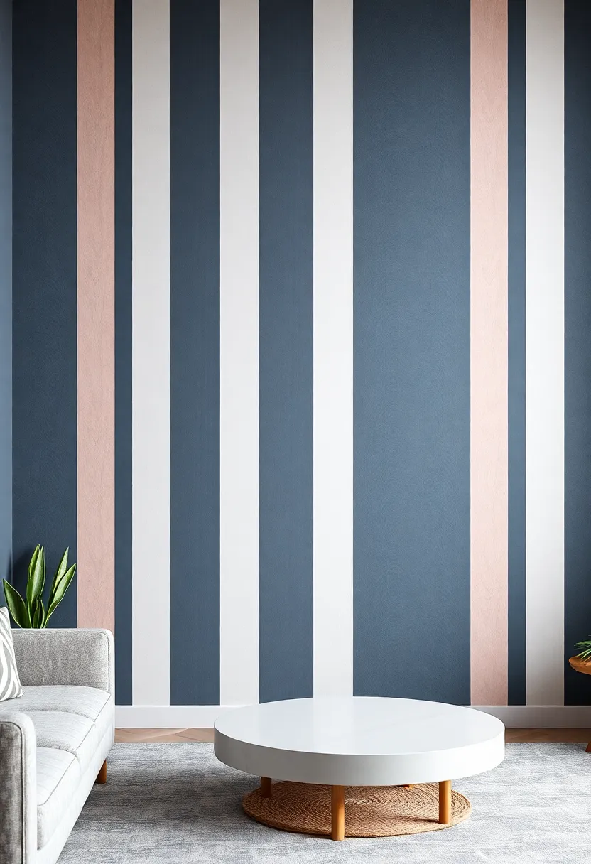
Choosing the Right Color Palette for Bold Vertical Stripes
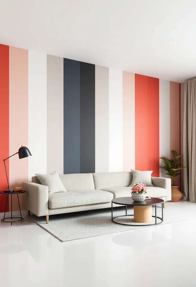
When selecting a color palette for bold vertical stripes, it’s essential to consider the atmosphere you wish to create within your space. A striking combination can act as a focal point, drawing the eye and enhancing the room’s overall aesthetic. To achieve this look, you might want to explore a few key suggestions:
- Monochromatic schemes: choose varying shades of a single color to create depth while maintaining cohesion.
- Contrasting Colors: Pair bold colors like navy blue with crisp white for a dynamic and modern feel.
- Soft Neutrals: If the room has a lot of natural light, opt for soft pastels or muted tones to maintain a serene environment.
The scale of your stripes can also dictate the emotional response elicited by your color choices. Wider stripes may evoke a more dramatic and contemporary vibe, while thinner stripes can create an elegant and sophisticated touch. Below is a table exemplifying effective stripe combinations:
| Stripe Width | Color Combination | Overall Mood |
|---|---|---|
| Wider | Dark Grey and Mustard Yellow | Trendy and Assertive |
| Medium | Teal and Coral | Vibrant and Energetic |
| Narrow | Pastel Blue and White | Calm and Airy |
Exploring Texture: The Role of Material in Striped Wall Design
When designing an accent wall with vertical stripes, the choice of material plays a pivotal role in achieving the desired aesthetic and functionality. Stripes can be crafted from a variety of materials, each contributing unique characteristics to the overall look and feel of your space. For example, incorporating textured wallpaper can add depth, while wood paneling provides warmth and a touch of rustic charm. The contrast in materials allows for creativity in layering,setting a tone that speaks to both modern and traditional sensibilities.
In addition to the visual impact, various materials influence the wall’s interaction with light and sound, enhancing the living experience. Consider the following materials for your striped wall design:
- Fabric – Softens sound and adds a cozy atmosphere.
- Paint – Versatile and easily customizable, allowing for bold color choices.
- Metallic finishes – Catch the light beautifully, creating a dynamic effect.
- Tiles - Offer a durable solution with textured patterns for an artistic flair.
This variety not only enhances the aesthetic appeal of your space but also reflects your personal style and enhances the overall ambiance.
Contrasting Patterns: How Vertical Stripes Enhance Room Depth
Vertical stripes have long been a staple in interior design, renowned for their ability to alter perceptions of space and ambiance. By guiding the eye upward, these stripes create an illusion of height, making rooms appear larger and more airy.This visual effect is especially useful in areas with low ceilings, where the lines draw attention upwards, effectively enhancing the spatial experience. When used on an accent wall, vertical stripes can serve as a stunning focal point, adding character and elegance while ingeniously manipulating light and shadow to further amplify the depth of the room.
To maximize the impact of vertical stripes in your living space, consider the following elements:
- Color Selection: Choose colors that contrast sharply for a bold statement or subtle shades for a more tranquil atmosphere.
- Width of stripes: Varying stripe widths can influence the perceived movement within the room—wider stripes for drama and narrower ones for a more streamlined look.
- Material and Texture: Incorporate different textures, such as a matte finish against a glossy one, to play with light and enhance visual interest.
The Psychological Impact of Stripes on Space Perception
Stripes have an undeniable ability to alter our perception of space, creating a visual experience that can transform any room. When applied vertically, stripes can enhance the feeling of height, making a space appear more expansive and open. This illusion occurs as the eye is naturally drawn upward along the lines, encouraging an upward gaze that fights against feelings of confinement. By painting an accent wall with bold vertical stripes, you can effectively push the boundaries of a room, contributing to a sense of elegance and sophistication. The psychological effects can be particularly beneficial in smaller spaces, where every inch counts.
Moreover, the colors used in striping patterns can evoke different emotional responses, further impacting the perception of space. As an example, light colors can enhance brightness and create an airy atmosphere, while darker hues add depth and intimacy. When considering a design,it’s valuable to think about how these colors can work together to complement the overall aesthetic of your home. Here are a few color combinations to consider for your vertical stripes:
| Color Pair | Effect |
| Soft Blue and White | Calming and Serene |
| Charcoal Gray and Light Pink | Modern and Chic |
| Olive Green and Cream | natural and Inviting |
In this way, the interplay between stripes and color not only creates a focal point in a room but also influences how we feel and perceive our living space. As you explore the art of using vertical stripes on accent walls, keep in mind the powerful psychological implications they carry and how they can be utilized to craft an environment that reflects your style and enhances your well-being.
Mixing and Matching Striped Accents with Existing Decor
integrating striped accents into your existing decor can breathe new life into your space. Begin by assessing the color palette of your current furnishings; selecting stripes that complement or contrast can create a dynamic appeal. Key considerations when choosing striped accents include:
- Color Harmony: Opt for stripes that echo the hues already present in your decor.
- Scale and size: Balance the width of the stripes with the size of your room; wider stripes can make a bold statement, while thinner stripes add subtle sophistication.
- Material Mix: Combine textures by pairing striped fabrics with different materials, such as wood or metal, for a layered look.
to enhance the visual appeal, consider using a table to balance the stripes with solid colors across your furniture and accessories.A well-thought-out arrangement allows striped accents to shine without overwhelming the eye.
| Accent Element | Recommended Striped Accent |
|---|---|
| Cushions | Bold vertical stripes in contrasting colors |
| Curtains | Soft pastel stripes that blend with walls |
| rug | Narrow stripes to elongate the space |
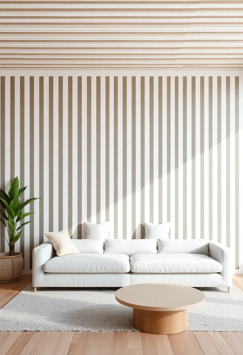
Incorporating Vertical Stripes in Various Interior Design Styles
Vertical stripes can seamlessly blend into various interior design styles, offering a unique twist that enhances the overall ambiance of a space.In modern minimalism, for instance, using soft, muted stripes in a monochromatic palette encourages a sense of height and sophistication while maintaining simplicity. you can opt for narrow stripes to create an illusion of elongated walls,making the space feel more open and airy. In contrast, in a bohemian setting, vibrant, bold stripes can infuse energy and character. Consider mixing different colored stripes in various widths to evoke a playful yet cohesive look that aligns with the eclectic nature of boho design.
The versatility of vertical stripes doesn’t stop there; they can also elevate traditional or rustic interiors. In traditional spaces, opt for rich, classic colors such as navy or burgundy to convey a sense of elegance and timelessness. These stripes can be paired with ornate furniture for a polished finish. Meanwhile, in rustic designs, using distressed paint or wallpaper with vertical stripes can add an unexpected element, harmonizing beautifully with natural wood and textiles. whether through wallpaper, paint, or fabric, incorporating vertical stripes allows for creativity and expression across all design styles.
Adaptable Designs: Stripes for Modern, Classic, and Eclectic Spaces
Stripes possess an innate versatility that makes them a perfect choice for accent walls across various design aesthetics. In modern interiors, sleek and bold vertical stripes can create a striking focal point, drawing the eye upwards and enhancing the sense of space. Whether using a monochromatic palette for a minimalist effect or incorporating vibrant hues for a pop of color,these patterns can transform contemporary living spaces into stylish retreats.Additionally, materials and finishes such as matte paint, high gloss, or even wallpaper can shift the feel of the stripes from casual to dramatic, catering to any modern homeowner’s preferences.
In contrast, classic spaces can benefit from softer, muted stripes that add an elegant touch without overwhelming the decor. think pastel tones or subtle color combinations that enhance traditional furnishings and architectural details, creating a harmonious blend of old and new. For eclectic interiors, mixing various stripe patterns, widths, and colors can result in playful and unique statement walls. A carefully curated selection of stripes can reflect personal style while maintaining an interior balance. Consider the following elements when incorporating stripes:
- Scale: Use larger stripes in spacious areas and smaller ones in cozier settings.
- Color Harmony: Ensure your stripe colors complement your existing palette.
- Texture Variation: Mix materials for added depth,such as painted and fabric textures.
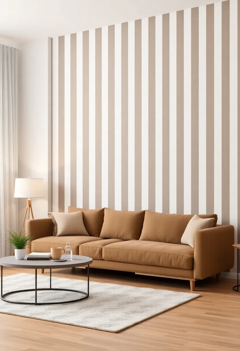
Mastering proportions: the Ideal Width for Vertical Stripes
When it comes to designing with vertical stripes,getting the proportions right can make all the difference in your accent wall’s impact.Width variations can evoke different feelings and perceptions, so consider the following suggestions:
- Narrow Stripes (1-2 inches): These create a delicate and sophisticated look, perfect for smaller spaces or to add a subtle touch of elegance.
- Medium Stripes (2-4 inches): Strikes a gorgeous balance, offering enough contrast without overwhelming the room. They can make walls appear taller and draw the eye upward.
- Wide Stripes (4-6 inches or more): bold and graphic, these can serve as a strong focal point, ideal for larger areas or to define a unique style.
It’s also crucial to consider the overall aesthetic of your space when selecting stripe widths. As an example, if your room features ornate furnishings or intricate details, narrower stripes can complement that elegance without competing for attention. Conversely, in a minimalist setting, wide stripes can function as a striking feature that enhances the contemporary vibe. A simple table of recommended widths paired with room styles can further clarify these choices:
| Stripe Width | Ideal Room Style |
|---|---|
| 1-2 inches | Classic, Elegant |
| 2-4 inches | Balanced, Versatile |
| 4-6 inches | Bold, Modern |
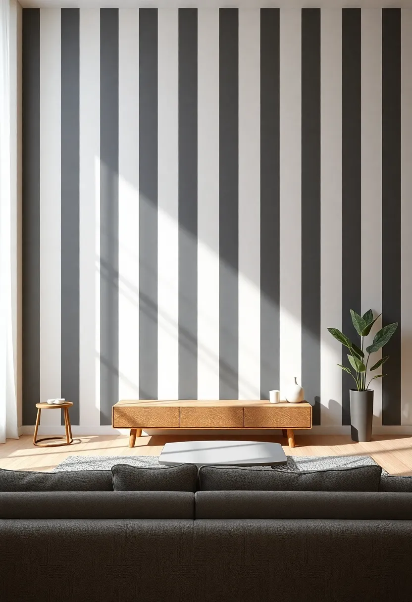
Lighting Considerations for Showcasing Vertical Stripe Walls
When showcasing vertical stripe walls, the right lighting can make all the difference in how these patterns are perceived. Natural light can enhance the physical dimensions of the stripes, allowing them to visually stretch and lift the space. To maximize the impact of daylight, consider these approaches:
- Utilize sheer window treatments: Allow soft daylight to filter through, creating an ethereal glow while keeping a level of privacy.
- Accentuate stripes with spotlights: Adjustable track lighting can be directed towards specific areas to highlight the texture and color variations in the stripes.
- Use ambient lighting: Incorporating lamps or wall sconces with warm-toned bulbs brings out the inviting nature of the stripes, creating a cozy atmosphere.
Along with natural and ambient lighting, it’s essential to consider color temperature and the texture of the wall itself. Here’s a quick overview of how different light sources affect vertical stripes:
| Light Source | Effect on Vertical Stripes |
|---|---|
| Cool White LED | Enhances clarity and makes colors appear more vibrant. |
| Warm Yellow Bulb | Adds a cozy warmth and softens sharp lines. |
| Natural Light | Brings out the true colors, providing a natural, fresh look. |
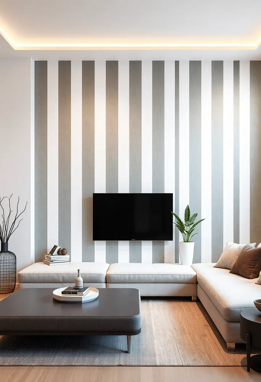
Using Vertical Stripes to Define Spaces in open Floor plans

In an open floor plan, the absence of physical barriers can create a fluid and spacious environment, but it can also lead to visual confusion. Utilizing vertical stripes on accent walls serves as an effective method to define specific areas without the need for additional walls.By drawing the eye upwards, these stripes not only elicit a sense of height but also segment the space according to its function. As an example, a dining area can feel distinct from a casual living space when separated by a bold, striped backdrop. This creates a natural flow while preserving the openness typical of modern designs.
When selecting vertical stripes, consider the color palette of the entire space. Stripes can range from subtle to striking, affecting the mood and perception of the room. Here are some tips to enhance your design:
- Choose complementary colors to harmonize with existing furnishings.
- Vary stripe widths to add visual interest and depth.
- Experiment with textures for a tactile effect that can soften or enhance the aesthetic.
Incorporating vertical stripes creates a defined area that invites different activities to coexist. Employing a striped design on a feature wall behind a sofa or dining table not only accentuates that area but also encourages unique character and functionality within the open space. Such strategic choices transform the ambiance while cleverly delineating zones for relaxation, dining, or social gatherings.
Vertical Stripes and Their Influence on Ceiling Height Illusions
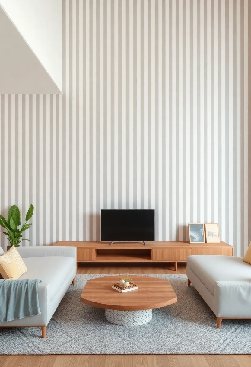
Vertical stripes have a remarkable ability to transform the perception of space, particularly when it comes to ceiling height. When applied to an accent wall, these elongated lines can create an optical illusion that draws the eye upward, making the room feel airier and more expansive.lighter colors work best in this scenario, as they reflect light and enhance the effect. To effectively utilize vertical stripes to elevate your space, consider the following elements:
- Color Choice: Pale hues or shining whites amplify the sense of height.
- Stripe Width: Narrow stripes can create a more subtle effect, while bold, wider stripes make a bolder statement.
- Material Finish: Glossy or satin finishes can help reflect light, further emphasizing the illusion of height.
Moreover,the submission of vertical stripes can harmonize well with other design elements,creating a cohesive aesthetic that enhances your overall decor. When considering patterns for your accent wall, it’s essential to remember that the scale of the stripes should be proportionate to the size of the room. Here’s a handy comparison of how different stripe patterns can influence visual height:
| Stripe Pattern | Visual Impact |
|---|---|
| Narrow Stripes | Enhanced height perception |
| Wide Stripes | Bold design statement |
| High Contrast Stripes | Dynamic visual interest |
| Monochromatic Stripes | Subtle sophistication |
Seasonal Decor: Harmonizing Striped walls with Time of Year
As the seasons change, so too can the ambiance of your living space. Striped walls offer a versatile backdrop that adapts beautifully to seasonal decor. By incorporating colors and accessories that reflect the time of year, you can maintain a cohesive look while infusing fresh energy into your home. As an example, in the spring, consider pairing soft pastel accents or floral prints that play off the coolness of your striped walls. In contrast, during the autumn, rich tones like burnt orange or deep burgundy can create a warming contrast, inviting the cozy feelings of the season.
To harmonize your striped walls with seasonal elements, think about incorporating a few of the following design ideas:
- Textiles: Change out throw pillows and blankets to correspond with seasonal hues.
- Artwork: Swap in seasonal artwork or prints that complement your wall colors.
- Greenery: Add seasonal plants or dried arrangements that accentuate the stripes.
- Lighting: Use lighting in warm or cool tones to enhance the mood of your striped backdrop.
To better visualize the seasonal changes, consider creating a quick reference table that outlines suggested color palettes for each season:
| Season | Suggested Colors | Decor Elements |
|---|---|---|
| Spring | soft Pastels, Light Greens | Floral Arrangements, Light Fabrics |
| Summer | Bright Southern Hues, Aqua Blues | Beach-Inspired Decor, Light Curtains |
| Autumn | Burnt Orange, Deep Burgundies | Cozy Throws, Pumpkins |
| Winter | Crisp whites, Icy Blues | Snowy Accents, warm Lighting |
By thoughtfully pairing your striped walls with seasonally inspired decor, you’ll create a dynamic living space that feels fresh and inviting throughout the year.
Creative Techniques for Painting Vertical Stripes Like a Pro
transforming your walls with vertical stripes can be a delightful endeavor when approached with creativity and finesse.To begin, consider using painters’ tape for crisp, clean lines. Start by measuring the width of your stripes—common options range from 6 to 12 inches. Once you’ve marked your desired width, secure the tape along the edges, ensuring each edge is smooth to prevent paint from seeping underneath. For added depth, experiment with a combination of matte and glossy finishes: the contrast can create an eye-catching effect that draws the eye upward, enhancing the perception of height in your space.
Moreover, color selection holds the key to elevating your design. Light and airy hues can make a room feel expansive, while bold and vibrant colors lend a dramatic flair. Create a harmonious palette by considering the following combinations:
| Base Color | Stripe Color |
|---|---|
| Soft Beige | Warm terracotta |
| Pale Blue | Crisp White |
| Charcoal Gray | Vibrant Yellow |
Combine this understanding of color and pattern with clever lighting to highlight the stripes. Focused lights,such as spotlights or wall-mounted fixtures,can create striking visual effects that complement your striped walls,ensuring your living space exudes both style and sophistication.
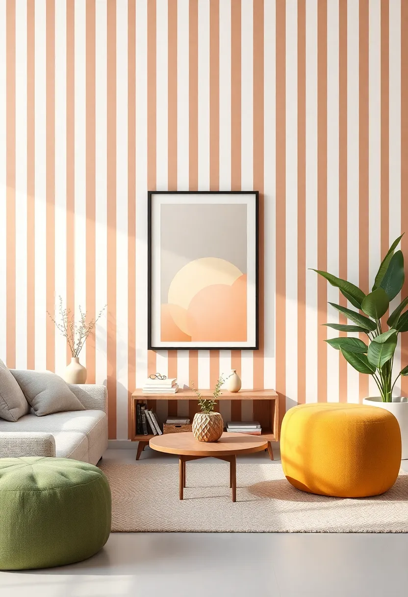
Elevating Mood with Invigorating Color Choices in Stripes
Transforming your living space can be as simple as introducing invigorating color choices through the use of stripes. Vertical stripes, in particular, can create an energizing atmosphere that uplifts your mood every time you step into the room. By opting for vibrant hues such as turquoise, sunny yellow, and fresh green, you can evoke feelings of joy and positivity.The beauty of stripes lies in their ability to draw the eye upward, creating a sense of height and openness while simultaneously reflecting your personal style.
When selecting your color palette, consider pairing bold shades with softer accents to maintain a balance that inspires rather than overwhelms. Mixing patterns can also amplify the effect, whether you choose different stripe widths or incorporate complementary geometric designs.To make your walls truly pop, employ a few strategies:
- Choose a focal point: Paint one wall in a striking color while leaving the others neutral.
- Experiment with proportion: Vary the width of the stripes for added interest.
- Incorporate textures: Use matte and glossy finishes to contrast and enhance the visual appeal.
Layering Patterns: Combining Stripes with Other Motifs
Layering patterns can create a dynamic and visually appealing environment in your living space,especially when it comes to pairing vertical stripes with other motifs. When considering combinations, geometric shapes and floral designs can complement stripes beautifully. For example:
- Stripes and geometric Shapes: Use stripes in a bold color as a backdrop for smaller geometric prints, such as chevrons or triangles, in accent cushions or artworks.
- Stripes and Florals: Combine wide vertical stripes on the wall with soft, delicate floral patterns in upholstery or drapery for a balanced yet striking look.
To maintain harmony, it’s essential to consider the color scheme and scale of each pattern.A practical approach is to use a color palette that ties the stripes to the secondary motifs. Take a look at this simple table to guide your choices:
| Pattern Type | Recommended Color Pairing |
|---|---|
| Stripes (Bold) | Pastels or Contrasting Dark Colors |
| Floral | Soft neutrals or Matching Stripes |
| Geometric | Same Color Family with Variation in Shade |
By experimenting with different textures, sizes, and arrangements, you can create a captivating layered look that enhances your accent wall and brings your space to life. Remember, the key is to balance visual weight and maintain an interplay of patterns that feels cohesive and inviting.
Showcasing Art and Decor Against Striped Backgrounds
When it comes to adding personality to your living space, using vertical stripes as a backdrop can be transformative. striped walls create a visually engaging environment that not only enhances the artwork but also complements other decor items. Consider the following elements when showcasing art against a striped background:
- Contrast: Choose art pieces that contrast with the stripe colors for maximum impact.
- Frame Selection: Opt for bold frames to define the artwork and ensure it stands out.
- Scale: Vary the sizes of the artwork; larger pieces can anchor the space while smaller ones can create an eclectic, layered look.
Additionally, the interaction between the stripes and the decor elements can foster a unique atmosphere. Textured fabrics and patterned accessories can play off the linear nature of the stripes, allowing for a seamless blend of dimension. Here’s a quick reference to consider when styling decor against striped walls:
| Decor Element | Recommended Style |
|---|---|
| Throws | Solid Colors |
| Cushions | Geometric Patterns |
| Wall Hangings | Framed Art |
| Plants | Textured Pots |
Cultural Influences: Global Inspirations for Vertical Stripe designs
The allure of vertical stripes goes beyond mere aesthetics; it draws upon cultural motifs that span the globe. From the bold colors of African textiles to the serene palettes of Scandinavian design, stripe patterns tell a story that resonates across different cultures. In various countries, stripes are not just decorative; they symbolize unity, strength, and a connection to heritage. Incorporating these elements into your accent wall can transpire a simple room into a canvas of rich cultural narratives. You might find inspiration in the following global influences:
- Japanese Ikat: Intricate patterns that invoke natural elements and simplicity.
- Indian Block Print: Vibrant colors and hand-crafted designs that honour tradition.
- French Stripes: Classic, nautical designs bringing a chic air to interiors.
As you consider these diverse inspirations, remember that the scale and orientation of stripes can dramatically alter the ambiance of space. Such as, wide stripes tend to create a bold statement, while thin stripes may lend a more delicate touch. Additionally, blending contrasting colors or soft tones can either energize a room or create a calming retreat. If you’re pondering which stripe design will suit your space, here’s a quick comparison to guide your decision:
| Stripe Style | Ideal Mood | Best Use |
|---|---|---|
| Wide Bold Stripes | Energetic | Living Rooms, Playrooms |
| Narrow Subtle Stripes | Calm | Bedrooms, Offices |
| Contrasting Colors | Dramatic | Dining rooms, Feature Walls |
| Soft Tones | Serene | Bathrooms, Cozy Corners |
Sustainable Choices: Eco-Friendly Paints for Striped Walls
When it comes to transforming your living space with bold vertical stripes, the choice of paint is a crucial factor not just for aesthetics but also for sustainability. Eco-friendly paints not only contribute to a healthier indoor atmosphere but also minimize environmental impact. These paints often consist of natural ingredients and are free from harmful chemicals like volatile organic compounds (VOCs), ensuring that your home remains safe for you and your loved ones. as you plan your striped wall adventure, consider options such as:
- Low-VOC Paints: Perfect for maintaining indoor air quality.
- Milk Paint: A biodegradable option derived from natural ingredients.
- Clay Paints: Made from earth minerals, these provide unique textures and colors.
When selecting your eco-friendly paint, it’s also essential to consider the colors and finishes that will work best for your striped design. The beauty of using sustainable paints lies in their versatility and range. Many brands offer finishes that enhance the richness of your stripes without compromising on ecological values. Here is a simple comparison of popular eco-friendly paint types:
| Paint Type | Key Features | Best Use |
|---|---|---|
| Low-VOC | Fast-drying, minimal odor | Indoor walls and ceilings |
| Milk Paint | Non-toxic, versatile | Wood, furniture, and walls |
| Clay Paint | Eco-friendly, natural texture | Living rooms and bedrooms |
Personalized Touch: Customizing Vertical Stripes to Your Taste
When it comes to accent walls, vertical stripes offer unparalleled versatility and style.To truly make them your own, consider factors like color, width, and spacing. Achieve a chic look by choosing softer hues for a calming effect,or go bold with vibrant colors that energize the space. Varying stripe widths can also dramatically alter the visual impact; wider stripes tend to create a more dramatic statement, while narrower stripes offer a sleek and subtle touch.
Incorporating textures into your stripes adds dimension and character. Such as, you might mix matte and glossy finishes to create a dynamic interplay of light. Alternatively, opting for a patterned stripe—such as a texturized paint technique or wallpaper—can infuse your walls with personality. To help you visualize your customization options, consider the following table that highlights popular combinations of colors and widths:
| Color Combination | Stripe Width | Effect |
|---|---|---|
| Soft Gray & White | Narrow | Elegant & Airy |
| Deep Blue & Gold | Wide | Luxurious & Dramatic |
| Pastel Pink & Green | Medium | playful & Cheerful |
In Conclusion
As we draw the curtains on our exploration of vibrant vertical stripes, it becomes clear that accent walls can be so much more than mere backdrops—they are the canvases of your personal expression. By embracing the art of vertical stripes, you have the opportunity to manipulate space, create movement, and infuse your surroundings with individuality.Whether you choose bold, contrasting colors or soft, subtle tones, the key lies in selecting a pattern that resonates with your style and complements the narrative of your home.
Now that you are equipped with insights on the psychology of stripes and practical application tips, let your imagination run wild. Transform that blank wall into a stunning focal point that breathes new life into your living space. Remember,each stroke and every stripe tells your unique story—so go ahead,elevate your environment and let your walls speak volumes about who you are.happy decorating!