When considering Mid-century modern design, the first feature that often comes to mind is its distinctive color palette. But what specifically defines the colors associated with this style?
A harmonious balance of earthy tones and vibrant accents characterizes Mid-century modern color schemes. These designs skillfully blend warm hues like mustard yellow, burnt orange, and deep browns with cooler shades such as blue-green, olive green, and cobalt blue. This combination fosters a sense of balance, merging grounded, natural elements with the bold and innovative spirit of the mid-20th century.
The essence of Mid-century modern colors lies in achieving equilibrium. The neutral tones serve as a soothing backdrop, while the lively accents inject energy into the space. This contrast reflects the era’s focus on functional design infused with a touch of artistic creativity.
When we think about it Mid-century modern When it comes to design, the first thing that comes to mind is the iconic use of color. But what exactly makes a color palette this style?
How can black be incorporated into a mid-century modern color scheme?
Black may not be the first color you associate with mid-century modern design, but it plays a surprisingly important role. Here’s how to use it effectively.
Black like a sophisticated anchor
While it is rarely the star of the show, black often serves as the star anchor in mid-century modern interiors. It grounds the palette and adds a sense of sophistication to the design. Black combines beautifully with bright colors and creates a contrast that highlights the surrounding elements.
Creative Ways to Incorporate Black
Black can often be seen in it Furniture frame, Furnitureor as accents in Lamp base, Picture frameor decorative items. For an extra touch of elegance combine black with Metallics like gold. This combination creates impressive visual depth and a timeless, chic look.
Are pastels suitable for mid-century modern interiors?
Bold colors often steal the spotlight in mid-century modern design, but pastel tones also have their place. So how can you incorporate these softer tones without losing the distinctive character of this style?
The charm of soft blue and pink tones
Especially pastel tones gentle bluesare a subtle but effective way to create a calming and subdued atmosphere. Similar, Pastel pink can serve as a neutral backdrop that complements iconic mid-century modern furniture.
Balance pastel colors with natural elements
To keep the look coherent, combine pastel tones with natural wood tones or stronger accents. For example, a pastel blue wall can provide a calm background, while a mustard yellow chair or walnut coffee table can provide warmth and contrast. This balance maintains the playful, functional aesthetic that defines the style.
1. Mustard yellow and teal
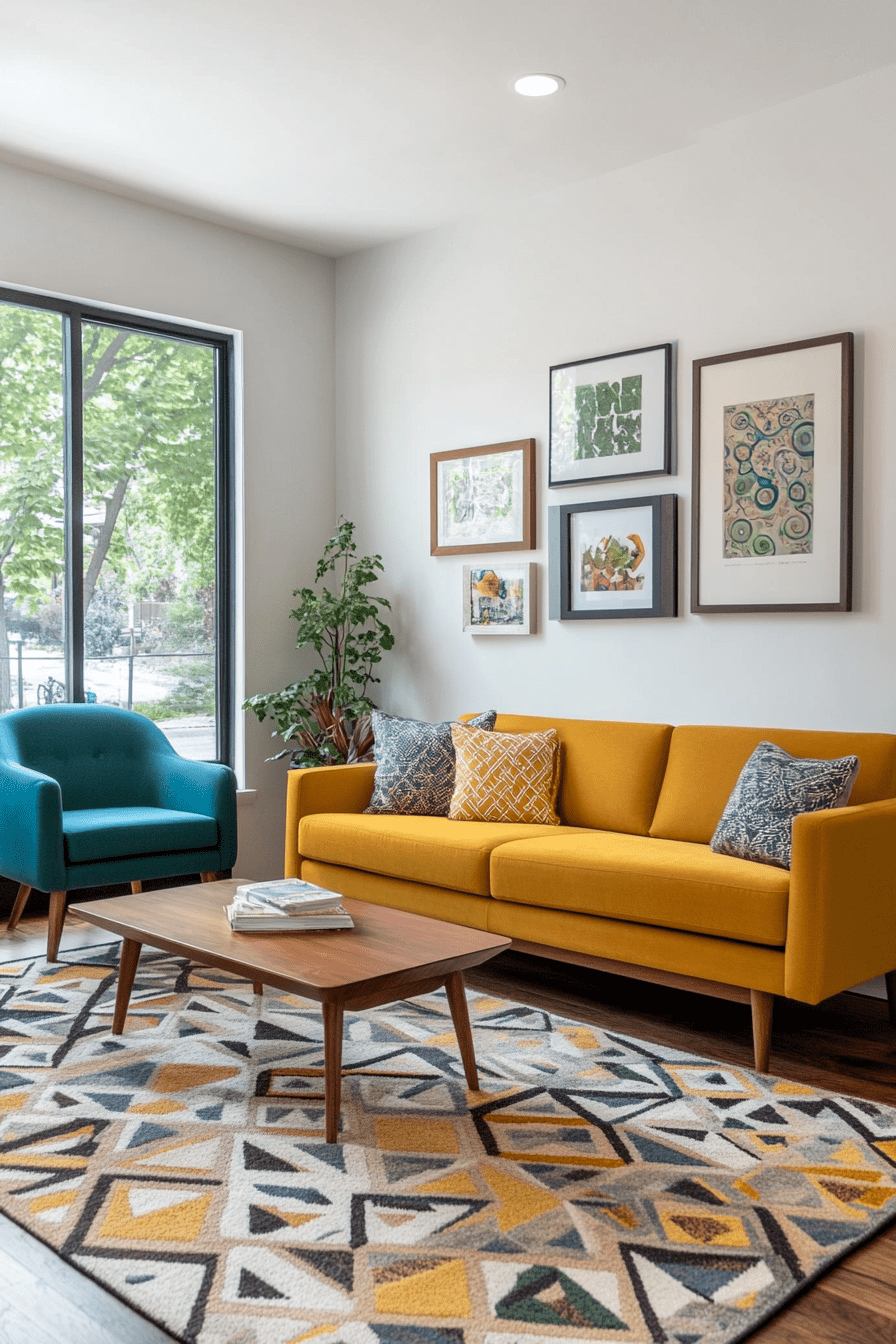
Why it works
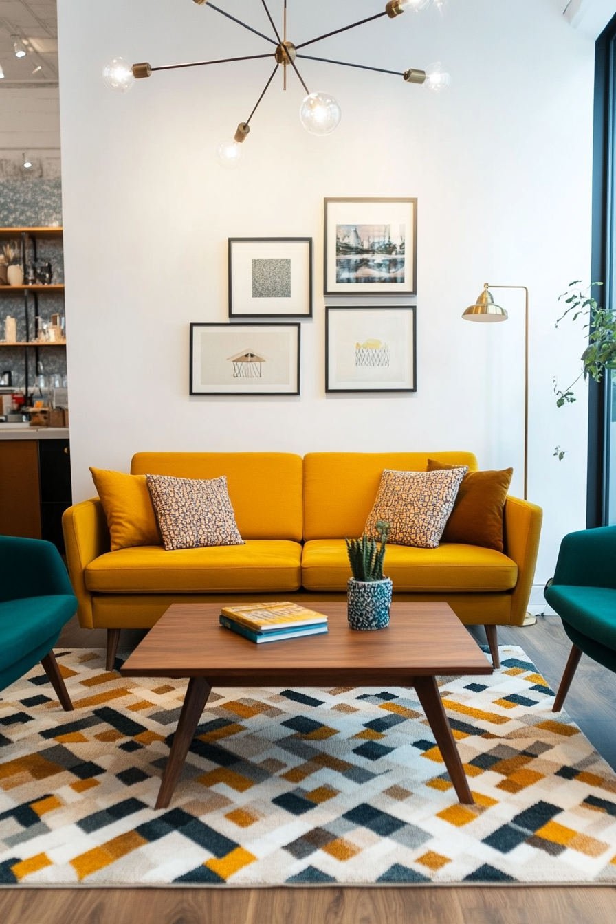
Mustard yellow and teal create a bold and vibrant contrast, perfectly embodying the retro-modern vibe of mid-century design. The warm tones of mustard yellow are balanced by the cool, rich depth of teal, resulting in a palette that feels nostalgic and fresh. This combination is ideal for statement furniture, accent walls or even playful decorative items.
Here’s how to implement it
A. Add color with furniture
- Mustard yellow sofa: Invest in a mustard yellow sofa to add retro flair to your living room.
- Teal armchairs: Pair with turquoise armchairs for complementary seating.
B. Use in home textiles
- Throw pillow: Pair mustard yellow and teal throw pillows on neutral furniture for a pop of color.
- Carpets: Look for rugs with geometric patterns in these hues to pull the room together.
C. Add small accents
- Wall art: Choose artwork with mustard yellow and teal accents to subtly introduce the color palette.
- Ceramic vases: Place teal and mustard yellow vases on side tables or shelves to create a unified look.
Styling tip
To keep the color palette cohesive, use warm woods like walnut for furniture and accents.
2. Orange, teak and cream
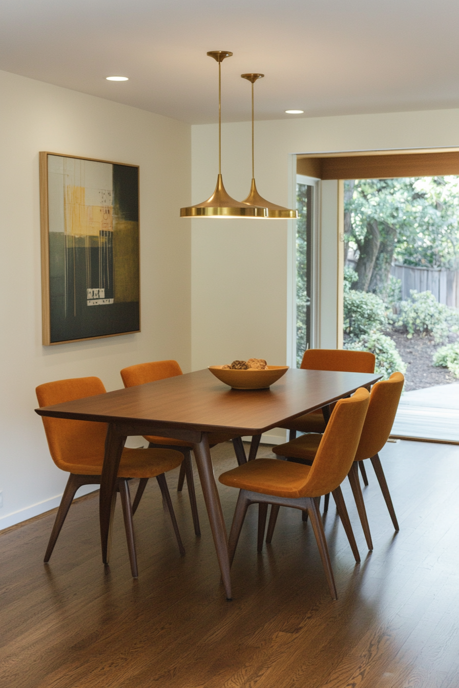
Why it works
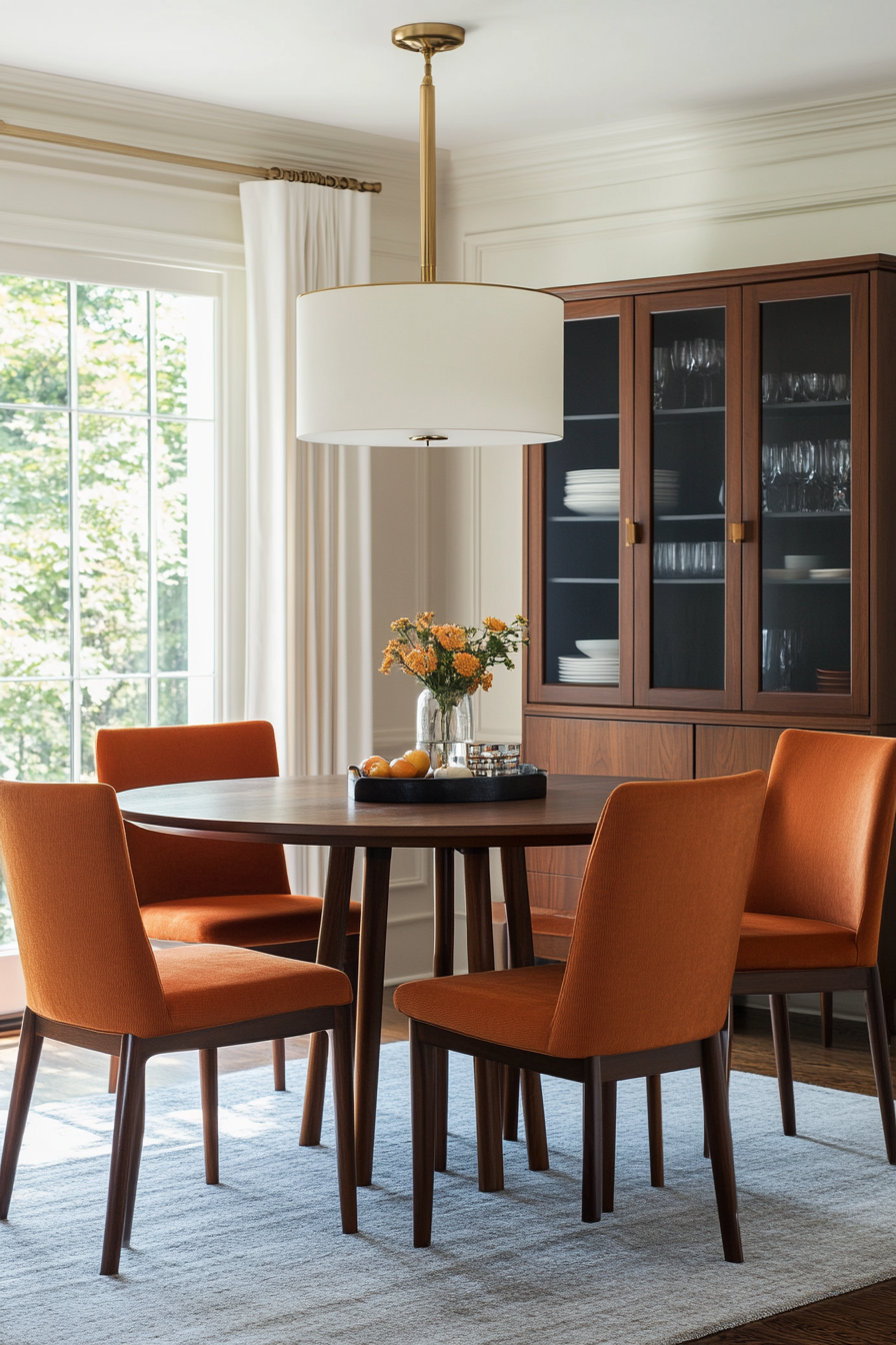
This warm trio combines the richness of orange, the natural beauty of teak and the softness of cream. It’s an inviting palette that adds warmth and elegance to any room. The balance of bold and neutral tones ensures the look is eye-catching but not overwhelming.
Here’s how to implement it
A. Highlight with color
- Orange Accent Walls: Use a muted orange for a bold yet sophisticated statement.
- Cream walls or trim: Keep walls or trim neutral in cream to balance out the boldness.
B. Focus on furniture
- Teak sideboards: Incorporate teak furniture such as sideboards or coffee tables.
- Orange upholstery: Choose chairs or sofas with orange fabric for a retro touch.
C. Use in accessories
- Textiles: Add cream and orange patterned curtains or pillows.
- Decorative items: Place mirrors with teak frames or orange ceramics for subtle details.
Styling tip
Combine this palette with brass or gold metallic colors to highlight the warm tones.
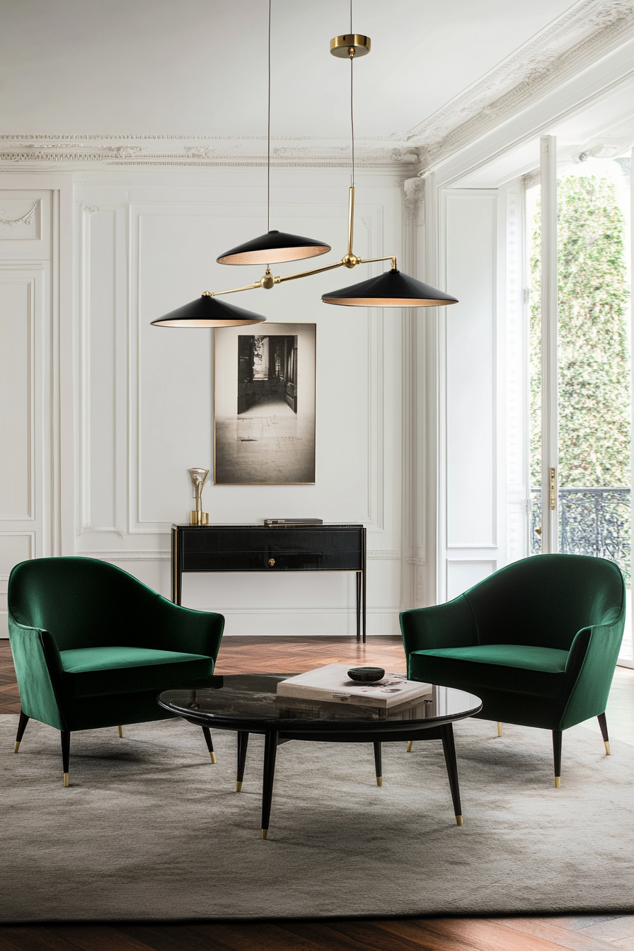
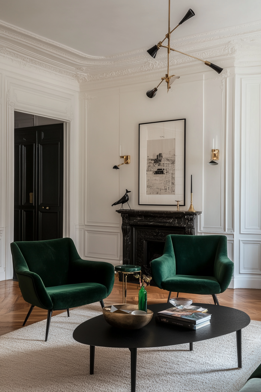
3. Emerald green with black accents
Why it works
Emerald green adds a lush, rich hue to your space that is perfectly complemented by the elegant elegance of black accents. This palette feels luxurious and grounded, offering a timeless appeal. It works particularly well in living or dining areas where drama and elegance are desired.
Here’s how to implement it
A. Special walls
- Emerald walls: Use emerald green for a bold, grounding wall design.
- Black trim: Incorporate black trim or moldings to elegantly frame the space.
B. Furniture selection
- Green velvet furniture: Opt for emerald green upholstered chairs or sofas.
- Black wooden tables: Add black lacquered wooden tables to create a strong, chic contrast.
C. Accessorize wisely
- Green and Black Artwork: Choose wall art that includes both colors to complete the look.
- Metallic accents: For a touch of warmth and elegance, add brass or gold lamps.
Styling tip
Combine the strong colors with white or cream-colored textiles such as carpets or curtains so that the room does not appear too dark.
4. Purple, tan and brass
Why it works
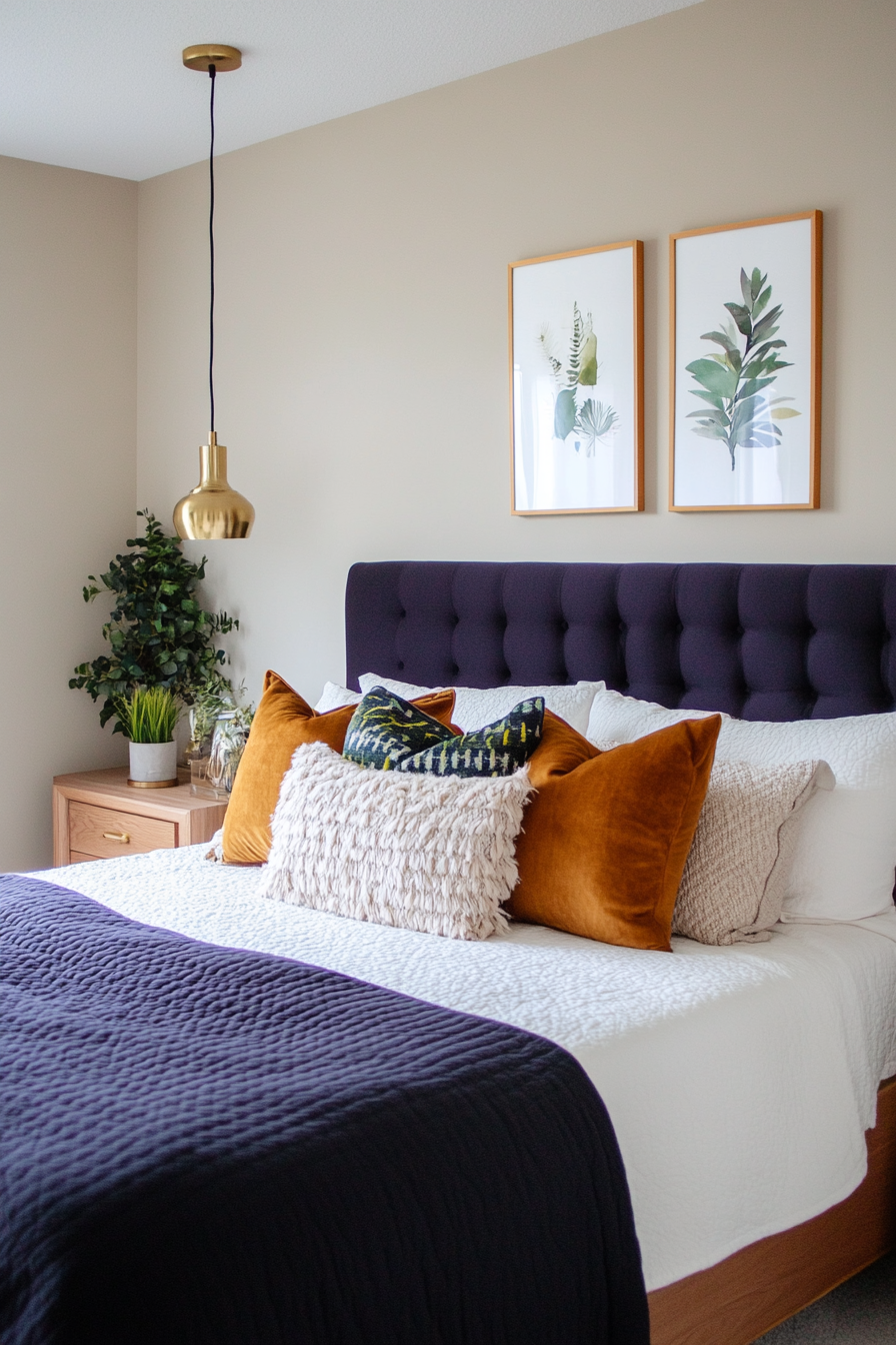
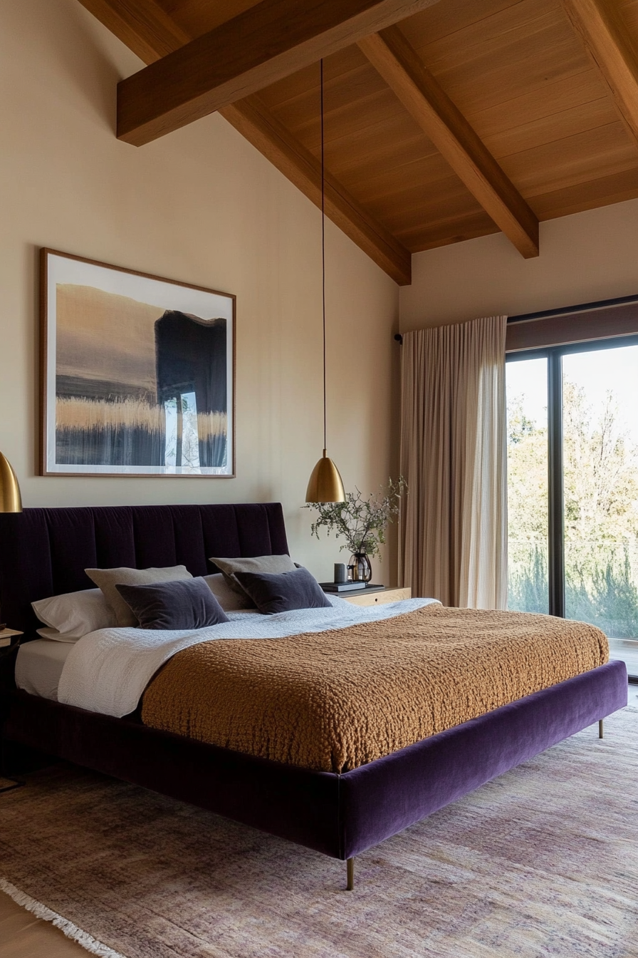
The royal purple tones harmonize wonderfully with the earthy neutrality of brown and the shiny elegance of brass. This palette feels sophisticated and warm, making it an excellent choice for bedrooms or cozy sitting areas. The brass elements add just the right touch of mid-century glamour.
Here’s how to implement it
A. Use in textiles
- Plush Purple Padding: Use deep purple for armchairs, pillows or headboards.
- Light brown carpets: Opt for soft, neutral rugs in tan to anchor the room.
B. Highlight with brass
- Lighting fixture: Incorporate brass pendant lights or lamps for a luxurious touch.
- Decor accents: Use brass vases, mirrors or picture frames to add sparkle.
C. Wall treatments
- Light brown walls: Keep the walls light and neutral with a shade of tan or beige.
- Purple accents: Add purple artwork or small decorative items to create a cohesive look.
Styling tip
Mix textures like velvet, leather and brass to add depth and variety to this luxurious palette.
5. Burnt orange and olive green
Why it works
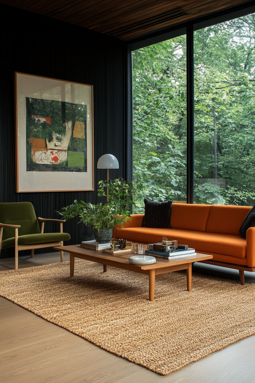
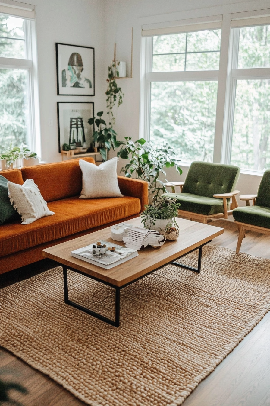
Burnt orange and olive green create a warm and earthy color palette that feels timeless and grounded. The burnt orange adds vibrancy while the olive green provides a calming, natural balance. Together they are ideal for creating inviting and comfortable spaces that draw the eye to nature.
Here’s how to implement it
A. Furniture
- Burnt Orange Sofa: Anchor the room with a sofa in this rich, warm hue.
- Olive green chairs: Add olive green chairs or a love seat to balance things out.
B. Wall colors
- Olive green walls: Use olive green as your primary wall color to create a calming effect.
- Burnt Orange Accents: Add burnt orange in smaller areas, such as: B. on decorative strips or door frames.
C. Decor details
- Patterned textiles: Choose throw pillows or curtains in both colors to ensure good cohesion.
- Natural wood furniture: Complement the palette with mid-toned wood for added warmth.
Styling tip
Bring in woven textures like rattan or jute for an extra layer of organic charm.
6. Cobalt blue and turquoise
Why it works
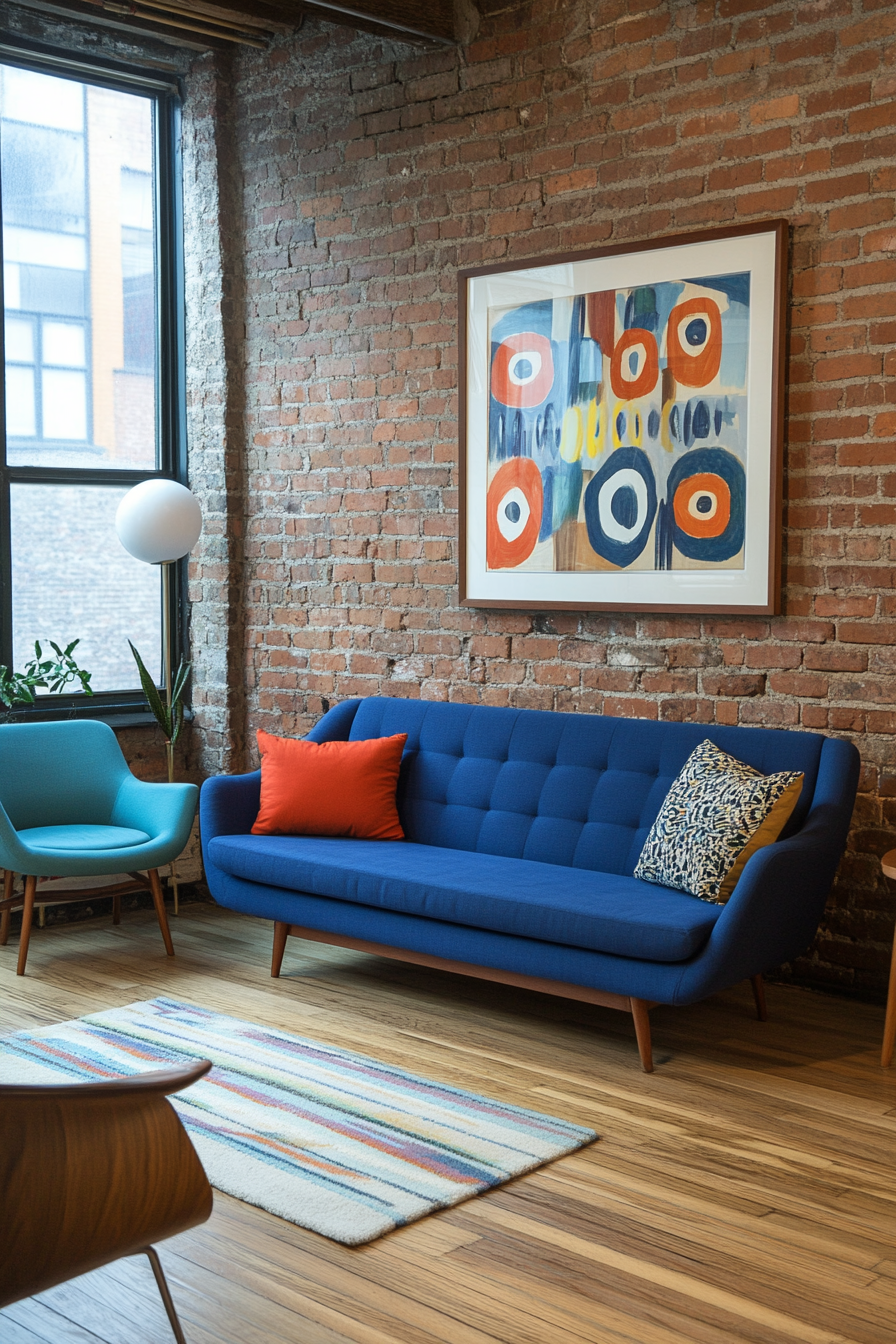
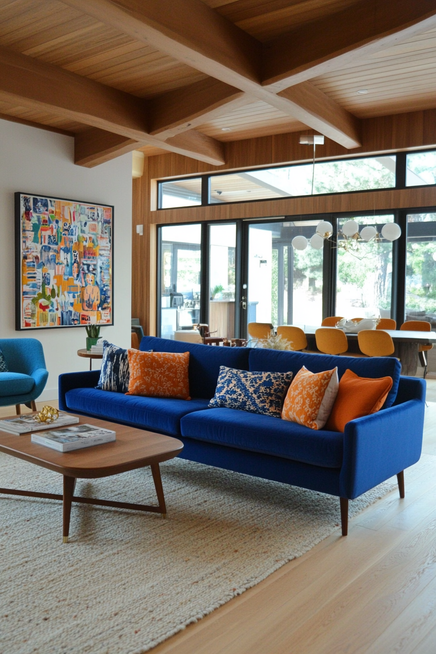
Cobalt blue and turquoise create a refreshing and dynamic color palette. The intensity of cobalt blue is tempered by the airy brightness of turquoise, making the combination energetic yet balanced. This combination works wonderfully in rooms where you want to evoke a playful retro vibe with a modern touch.
Here’s how to implement it
A. Walls and floor coverings
- Turquoise walls: Paint walls turquoise to create a light and airy atmosphere.
- Neutral flooring: Pair with neutral or light wood floors to highlight the colors.
B. Furniture focus
- Cobalt blue chairs: Add bold cobalt blue armchairs or dining chairs.
- Turquoise upholstery: Use turquoise on sofas or ottomans to create a cohesive flow.
C. Decorative accents
- Artwork: Choose abstract art with tones of cobalt blue and turquoise.
- Throw blankets: Use textured throws in these hues for added comfort and style.
Styling tip
Balance the boldness with white or gray accents like curtains or vases for a crisp and clean finish.
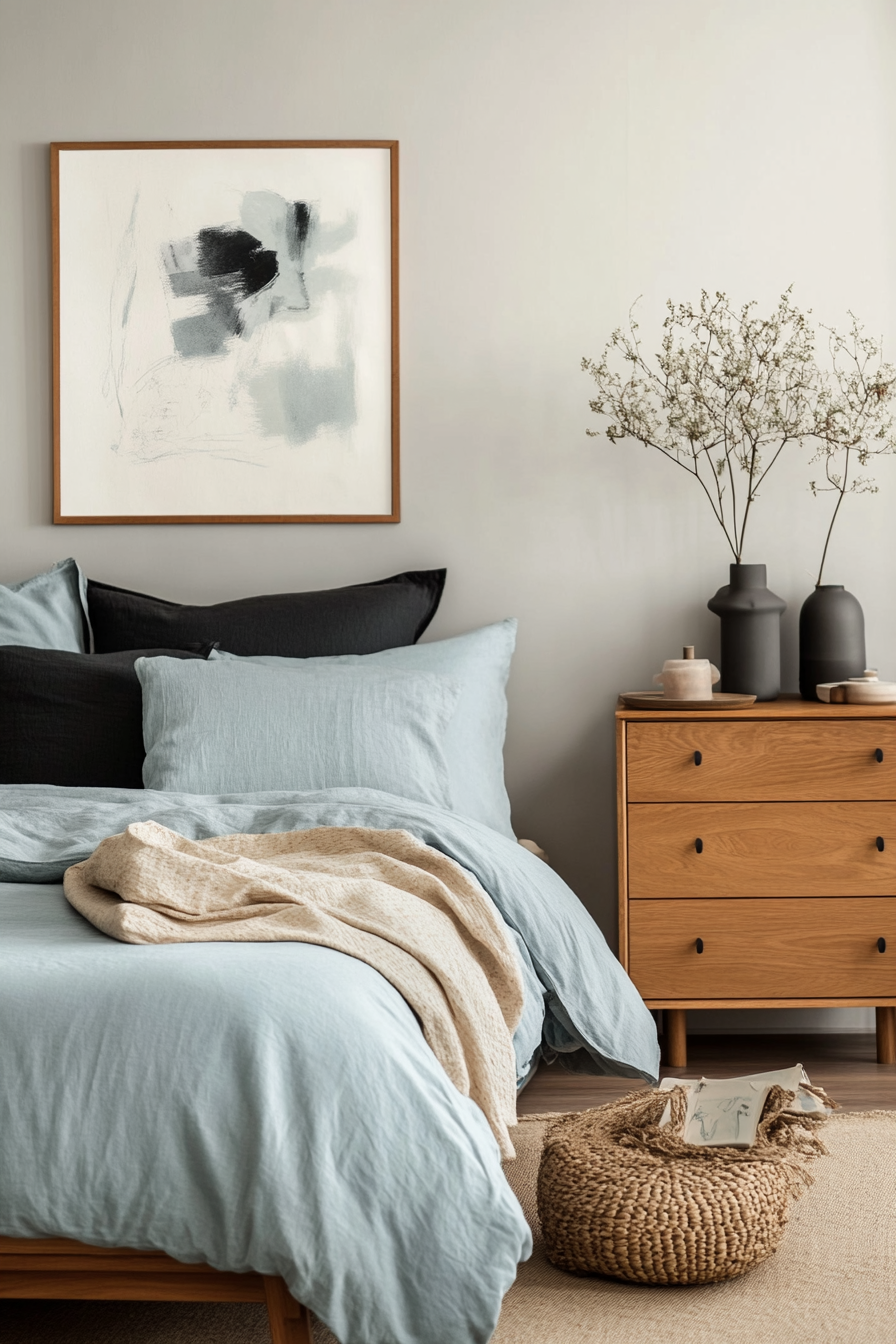
7. Warm gray and light blue
Why it works
Warm gray and light blue create a subtle and calming color palette that is perfect for relaxing spaces such as bedrooms or reading nooks. Warm gray provides a neutral base, while light blue adds a touch of softness and calm. Together they are understated yet elegant, embodying the simplicity of mid-century design.
Here’s how to implement it
A. Use on walls
- Warm gray walls: Opt for warm gray as a neutral backdrop in any room.
- Light blue accents: Highlight trim, ceilings, or small walls with light blue to create a refreshing contrast.
B. Furniture and textiles
- Gray furniture: Choose gray sofas or beds with clean mid-century lines.
- Blue accessories: Incorporate light blue pillows, rugs or curtains to enhance the look.
C. Decorate with soft accents
- Blue artwork: Choose minimalist artwork with shades of blue.
- Ceramic: Place warm gray and light blue ceramics for subtle decor embellishments.
Styling tip
Mix natural wood elements to add warmth and texture to this calm palette.
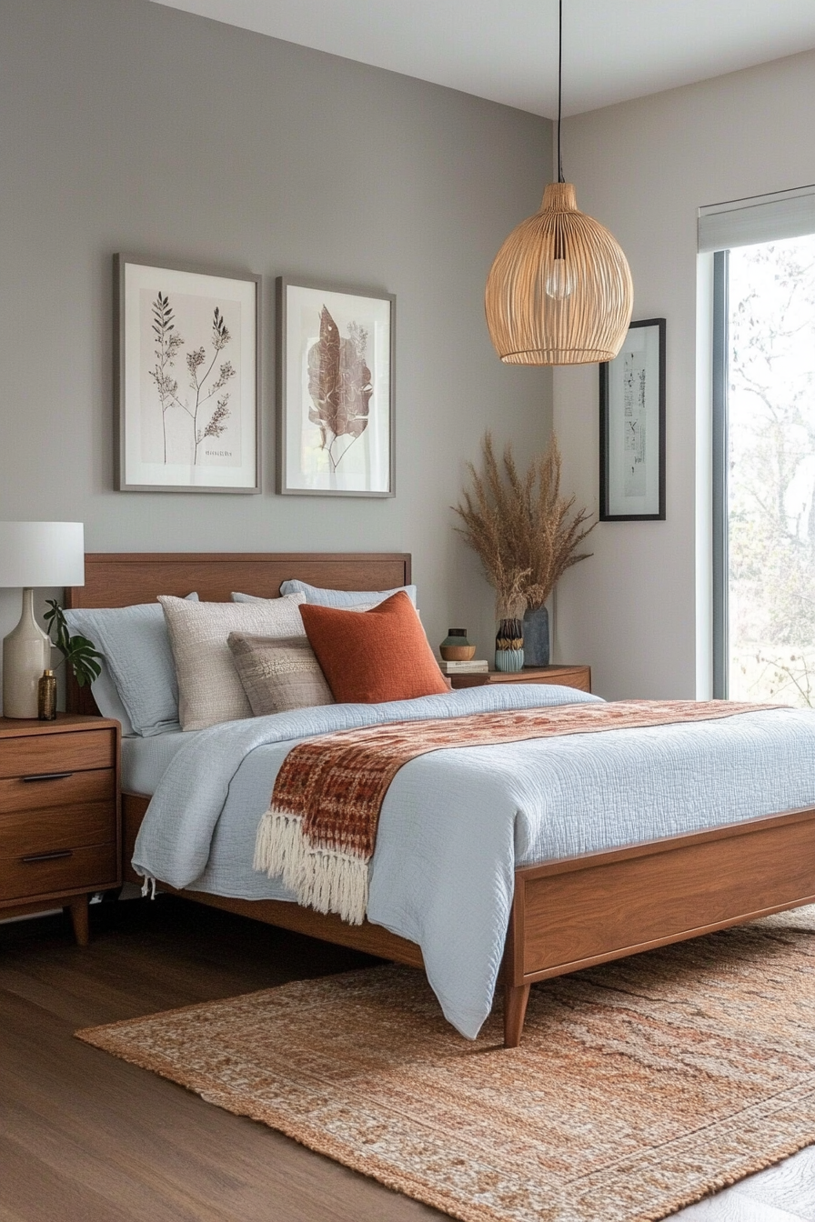
8. Rich gold and earthy taupe
Why it works
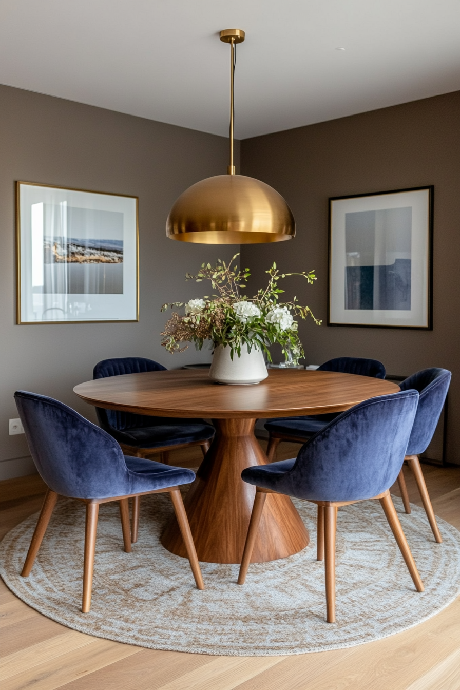
Rich gold and earthy taupe add warmth and elegance to your space. The luxurious shine of gold accents complements the grounding neutrality of taupe, making this combination a timeless choice. This palette works particularly well in formal spaces such as dining rooms or offices.
Here’s how to implement it
A. Walls and floor coverings
- Taupe walls: Use earthy taupe as your primary wall color for a cozy base.
- Gold highlights: Incorporate gold into trim or metallic wallpaper accents.
B. Furniture and decoration
- Taupe upholstery: Choose taupe for sofas, chairs or bedding for a versatile look.
- Gold games: Add gold hardware or light fixtures for a touch of luxury.
C. Decorative elements
- Metallic accents: Strategically place gold vases, frames or mirrors to catch the light.
- Structured fabrics: Use velvet or silk in taupe and gold for added depth.
Styling tip
Apply textures like wool or leather to make the palette feel warm and approachable.
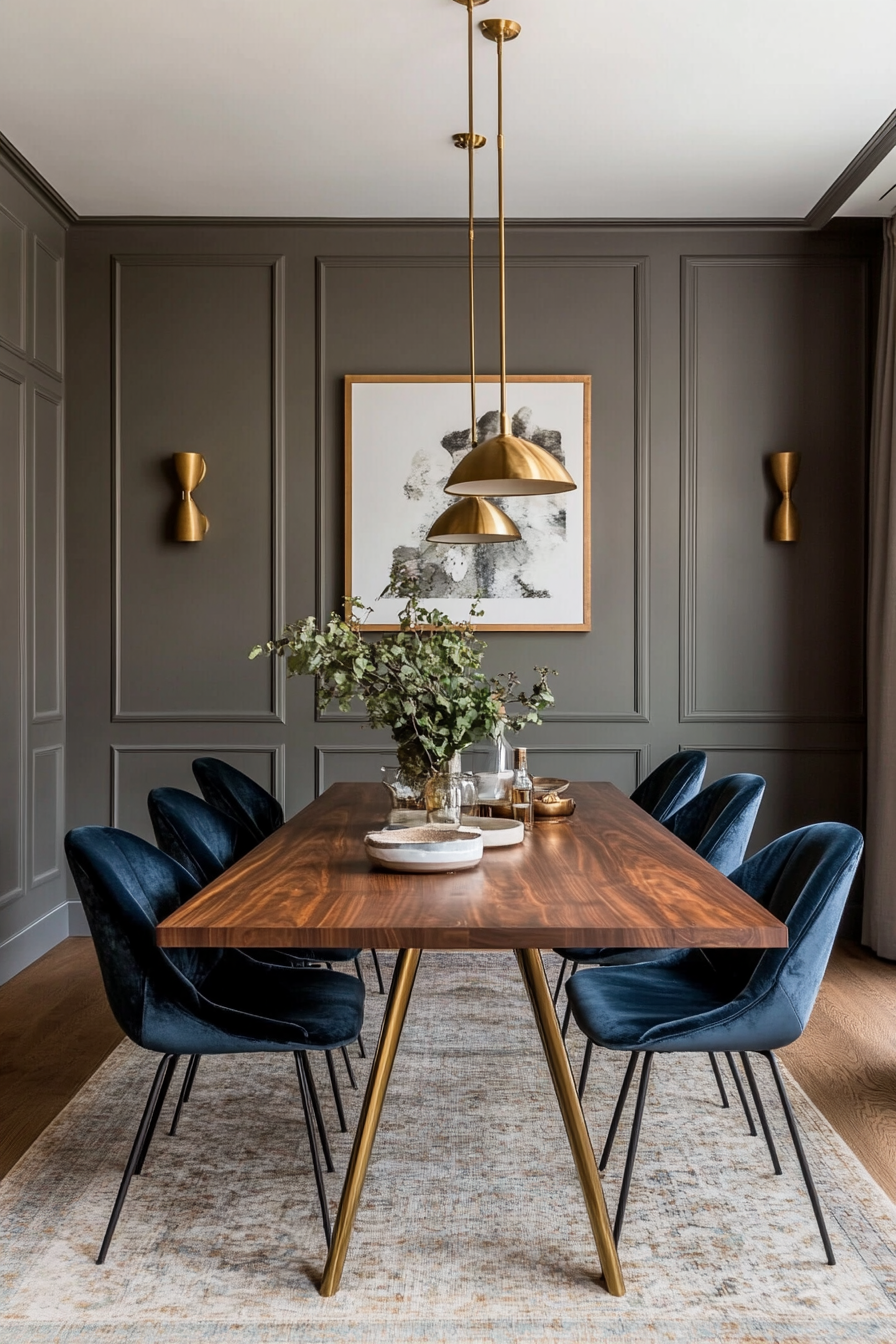
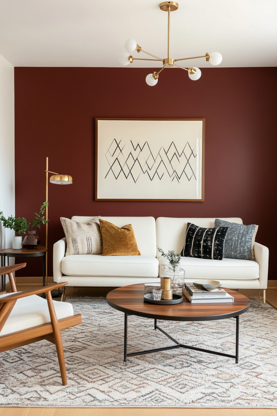
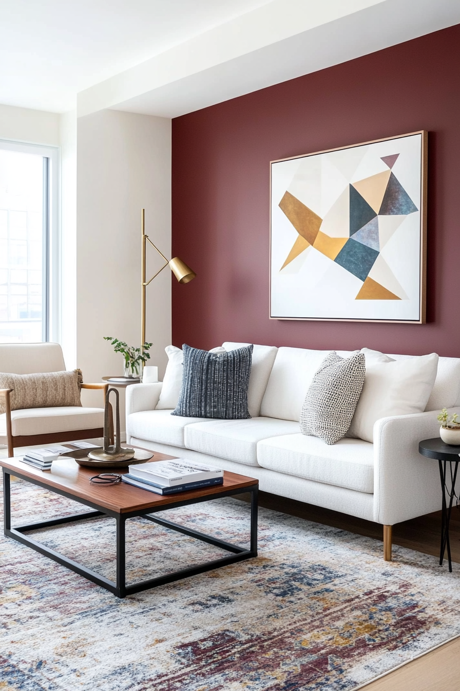
9. Vibrant maroon and creamy white
Why it works
The rich, dramatic tones of maroon are beautifully balanced by the softness of off-white, creating a bold yet approachable aesthetic. This combination works well for accent walls, furniture and decorations, making it versatile for living and dining areas. The neutral white allows the maroon to shine without overwhelming the room.
Here’s how to implement it
A. Accent walls
- Maroon Accent Wall: Paint a wall maroon to create an eye-catching focal point.
- Creamy white base: Use cream white on the other walls to keep the room open and bright.
B. Furniture selection
- Maroon sofa: Anchor the room with a maroon sofa or armchair.
- Cream colored upholstery: Use off-white for chairs, stools or dining room benches to create contrast.
C. Decorative elements
- Artwork: Choose abstract or geometric art in shades of maroon and white.
- Ceramic: Incorporate maroon and white vases, bowls or planters for a cohesive decoration.
Styling tip
Expand the palette with warm metallic tones like gold or brass for an added touch of mid-century charm.
10. Smoke gray and pastel blue
Why it works
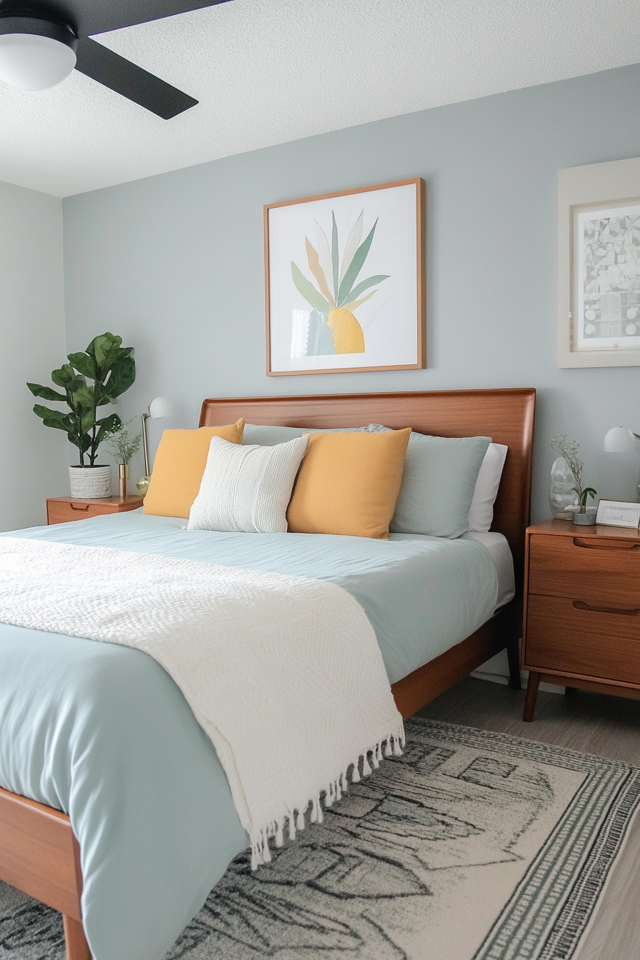
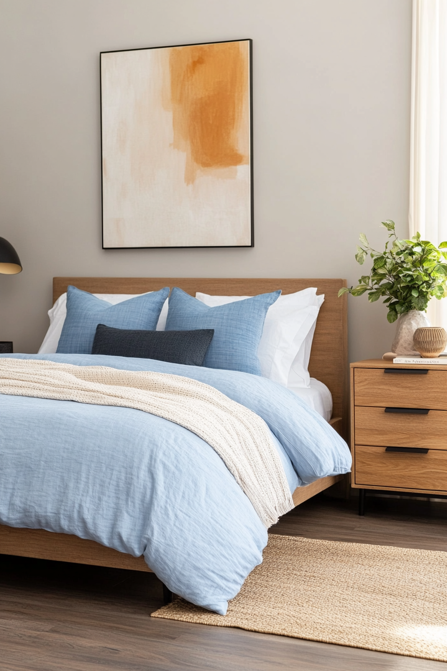
Smoke gray and pastel blue create a calm, minimalist atmosphere, ideal for rooms where relaxation is the priority. Smoke gray provides a sophisticated base, while pastel blue adds a soft pop of color without overwhelming the design. This combination is perfect for bedrooms, offices or modern living rooms.
Here’s how to implement it
A. Use on walls
- Smoky gray walls: Choose smoke gray as your primary wall color for a moody yet sophisticated look.
- Pastel blue accents: Use pastel blue for a single wall or decorative panel.
B. Furniture and textiles
- Gray sofa: Choose a smoky gray sofa as a timeless centerpiece.
- Blue pillows: Add pastel blue pillows or blankets for soft details.
C. Decor selection
- Blue artwork: Showcase abstract art with pastel blue accents.
- Gray ceramic: Use gray-toned ceramics to enhance the minimalist look.
Styling tip
Add natural textures like linen or jute to soften the overall aesthetic and add warmth.
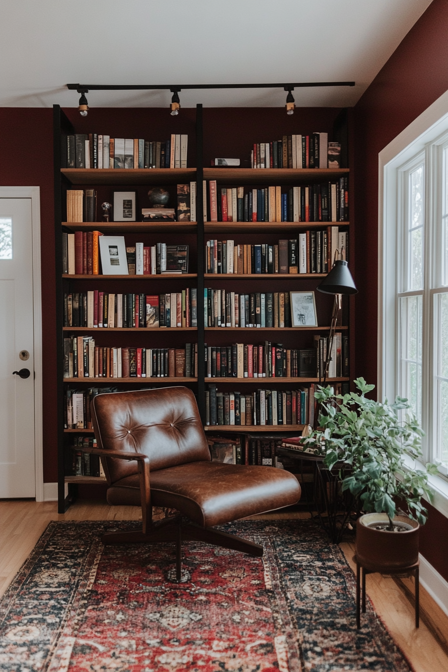
11. Deep red and natural wood tones
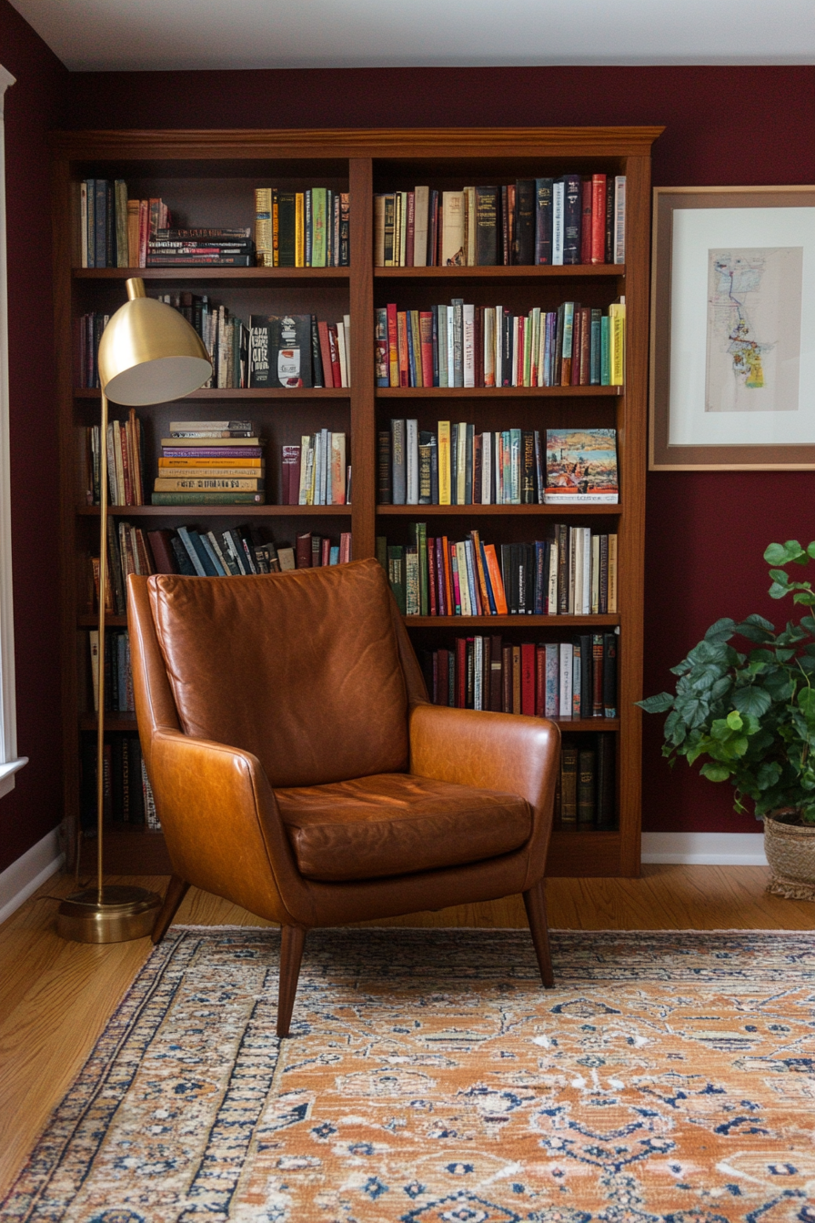
Why it works
The warmth of deep red is enhanced by the organic charm of natural wood tones, making this palette perfect for cozy, grounded interiors. The deep red provides fullness and depth, while the wood tones provide a tactile, timeless quality. This combination is ideal for living rooms, studies or libraries.
Here’s how to implement it
A. Highlight furniture
- Wooden tables: Opt for mid-century wooden furniture such as coffee tables or walnut sideboards.
- Deep red upholstery: Use deep red fabric for chairs or ottomans to add a dramatic accent.
B. Walls and floor coverings
- Red accents: Add rich red to accent walls or paneling to add a bold touch.
- Wooden floors: Allow the natural wood grain of your floors to shine with minimal treatment.
C. Small accessories
- Throw blankets: Choose dark red throws or pillows for subtle warmth.
- Wood decor: Add wooden sculptures, trays or picture frames for more uniformity.
Styling tip
Combine it with warm lighting to highlight the richness of deep red and natural wood tones.
12. Peach, gold and white
Why it works
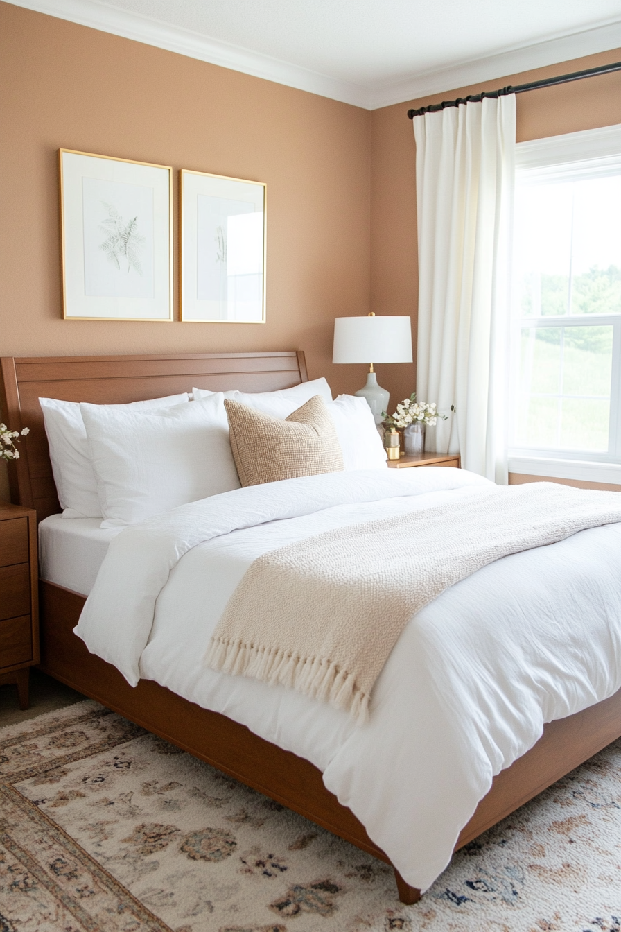
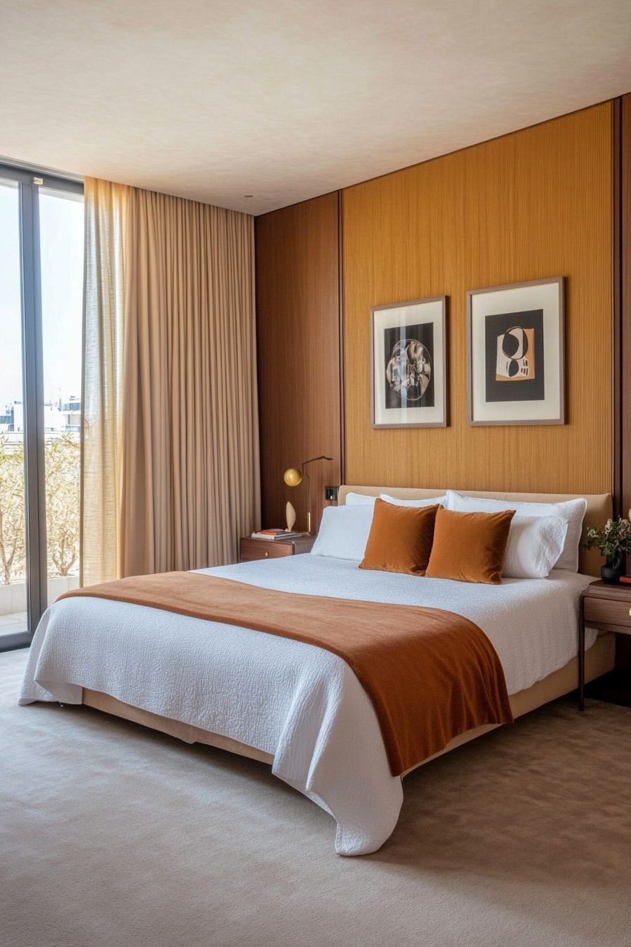
The warmth of peach blends beautifully with the luxurious shine of gold and the crisp neutrality of white, creating a soft and inviting color palette. This combination is wonderful for bedrooms, bathrooms and any room that exudes a calming and romantic touch.
Here’s how to implement it
A. Walls and accents
- Peach Accent Wall: Use a soft peach tone on one wall to create a focal point.
- White walls: Keep other walls white for a crisp, clean look.
B. Furniture and textiles
- Peach colored upholstery: Add subtle peach tones to armchairs, ottomans or bedding.
- Gold accents: Incorporate gold into light fixtures or hardware for a touch of glamour.
C. Decorative elements
- Peach and Gold Accessories: Choose vases, frames or candles in these shades.
- White textiles: Use white curtains or rugs to ground the room and keep it airy.
Styling tip
Combine it with soft lighting, e.g. B. LEDs in warm tones to enhance the delicate warmth of this palette.
13. Primary colors with wood accents
Why it works
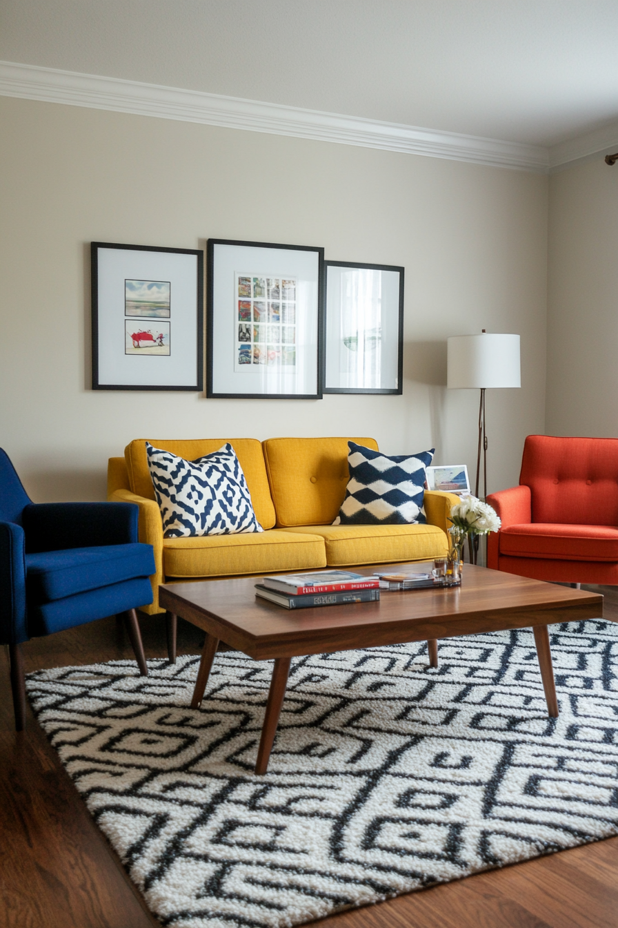
Primary colors – red, blue and yellow – give mid-century design an energetic and playful atmosphere. Combining these bold colors with natural wood tones helps ground the space and prevent it from feeling too overpowering. This palette is perfect for family rooms or creative workspaces.
Here’s how to implement it
A. Use in furniture
- Colorful chairs: Incorporate red, blue, or yellow chairs for vibrant seating.
- Wooden tables: Pair it with a classic mid-century walnut coffee or dining table.
B. Decorative accents
- Throw pillow: Combine cushions in primary colors.
- Art prints: Choose geometric or abstract art with reds, blues, and yellows.
C. Highlight with neutrals
- Neutral walls: Keep the walls neutral to allow the primary colors to shine.
- Wooden floors: Emphasize natural wood floors for warmth and texture.
Styling tip
Add plants to balance the bold colors with fresh, organic elements.
14. Burgundy red and ocher yellow
Why it works
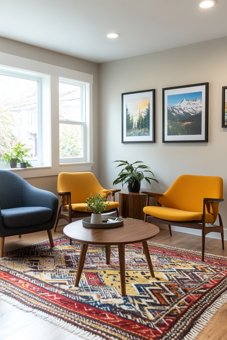
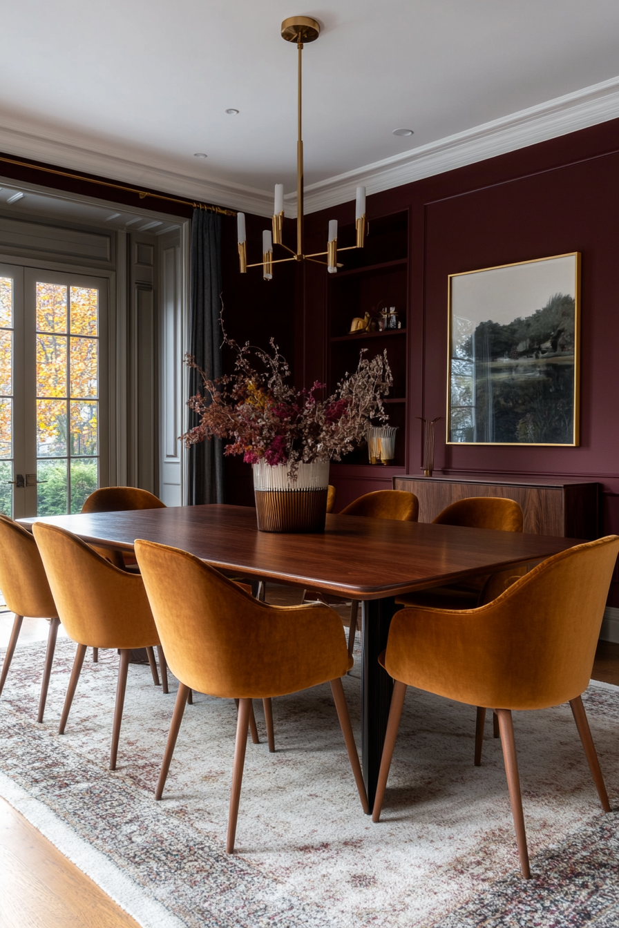
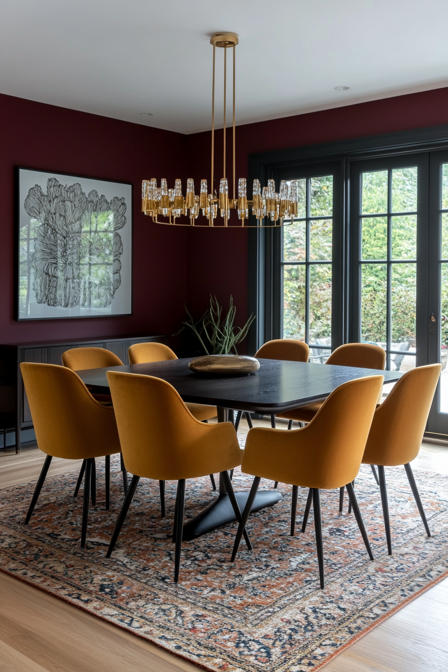
The richness of burgundy red and the earthiness of ocher yellow create a warm and inviting color palette. This combination feels sophisticated and timeless and is perfect for dining rooms, entryways or cozy living spaces. It’s a bold combination that still feels approachable due to its natural undertones.
Here’s how to implement it
A. Walls and cladding
- Burgundy walls: Paint walls a deep burgundy red for a dramatic effect.
- Ocher trim: Add ocher trim or trim for a contrasting pop of color.
B. Padding
- Ocher sofa: Use an ocher yellow sofa as a statement piece.
- Burgundy cushions: Accent the sofa with burgundy throw pillows to create more cohesion.
C. Decorative elements
- Metallic accents: Add brass or gold decor to highlight the warm tones.
- Wooden furniture: Use dark-stained wood to make the color palette even richer.
Styling tip
Pair with textured fabrics like velvet or wool to enhance the luxurious feel of this palette.
If you’re a fan of interior design, you’ve probably heard of the term “Mid Century Modern” before. This style, which originated in the mid-20th century, has seen a resurgence in popularity in recent years. One of the key elements that define Mid Century Modern design is its color palette. In this article, we will explore what makes up a Mid Century Modern color palette and how you can incorporate it into your own home.
Understanding Mid Century Modern Color Palette
The Mid Century Modern color palette is characterized by a mix of bold and muted hues, along with natural materials and textures. This style is known for its clean lines, geometric shapes, and minimalistic approach to design. When it comes to color, Mid Century Modern interiors often feature a combination of the following hues:
- Earthy Tones: Think olive green, mustard yellow, and burnt orange. These warm, earthy tones add a sense of coziness and nostalgia to a space.
- Primary Colors: Bold hues such as red, blue, and yellow are commonly used in Mid Century Modern design. These colors add a pop of brightness and playfulness to a room.
- Neutrals: Mid Century Modern interiors often incorporate neutral colors like white, gray, and beige as a backdrop to the bolder hues. This helps to balance out the overall color scheme and prevent it from becoming overwhelming.
- Wood Finishes: In addition to paint colors, wood finishes play a crucial role in defining the Mid Century Modern color palette. Teak, walnut, and oak are commonly used in furniture and decor pieces, adding warmth and depth to the space.
Benefits and Practical Tips for Using a Mid Century Modern Color Palette
There are several benefits to using a Mid Century Modern color palette in your home:
- Creates a cohesive and harmonious look: The carefully curated color scheme of Mid Century Modern design helps tie the room together and create a cohesive look.
- Timeless appeal: The classic colors and timeless design elements of Mid Century Modern interiors ensure that your space will never go out of style.
- Adds character and personality: The bold colors and unique combinations of a Mid Century Modern color palette can add personality and character to your home.
Here are some practical tips for incorporating a Mid Century Modern color palette into your space:
- Start with a neutral base: Begin with a neutral backdrop of white, gray, or beige walls and furniture. This will provide a clean canvas for adding pops of color.
- Introduce bold accents: Add in bold accent colors like mustard yellow throw pillows, a teal accent chair, or a red area rug to inject some personality into the space.
- Mix and match textures: Incorporate a variety of textures such as wood, metal, glass, and fabric to add depth and visual interest to the room.
- Pay attention to lighting: Lighting can play a crucial role in highlighting the colors in a room. Consider installing statement lighting fixtures or using natural light to enhance the color palette.
Case Studies and First Hand Experiences
To truly understand the impact of a Mid Century Modern color palette, let’s take a look at some case studies and first-hand experiences from homeowners who have embraced this style:
- Sarah, a young professional living in a studio apartment, decided to revamp her space using a Mid Century Modern color palette. By incorporating a mix of teal, mustard yellow, and wood finishes, she was able to create a cozy and inviting atmosphere that reflected her personal style.
- John and Emily, a couple in their 30s, renovated their suburban home with a Mid Century Modern color palette. They opted for a neutral base of white walls and wooden floors, accented with pops of blue and orange. The result was a modern and stylish space that felt both welcoming and timeless.
a Mid Century Modern color palette is a great way to add warmth, character, and style to your home. By incorporating a mix of earthy tones, primary colors, and natural materials, you can create a space that is both visually appealing and timeless. So go ahead, unlock the charm of Mid Century Modern design and transform your home into a stylish haven!
