
As we step into 2025, the world of interior design is ready to embrace a fresh palette of possibilities, inviting us to reimagine the heart of our homes: the living room. No longer just a place for relaxation or entertainment,this significant space now serves as a canvas for personal expression and innovation. color trends are not merely fleeting whims, but rather reflections of our evolving lifestyles and aspirations. In this article, we will explore the top living room color trends set to make waves in 2025, from soothing earth tones to vibrant pops of color, helping you envision a rejuvenated environment that mirrors your individuality and enhances your daily living. whether you’re embarking on a complete renovation or a simple refresh, let these trends guide you in transforming your space into a sanctuary of style and comfort.
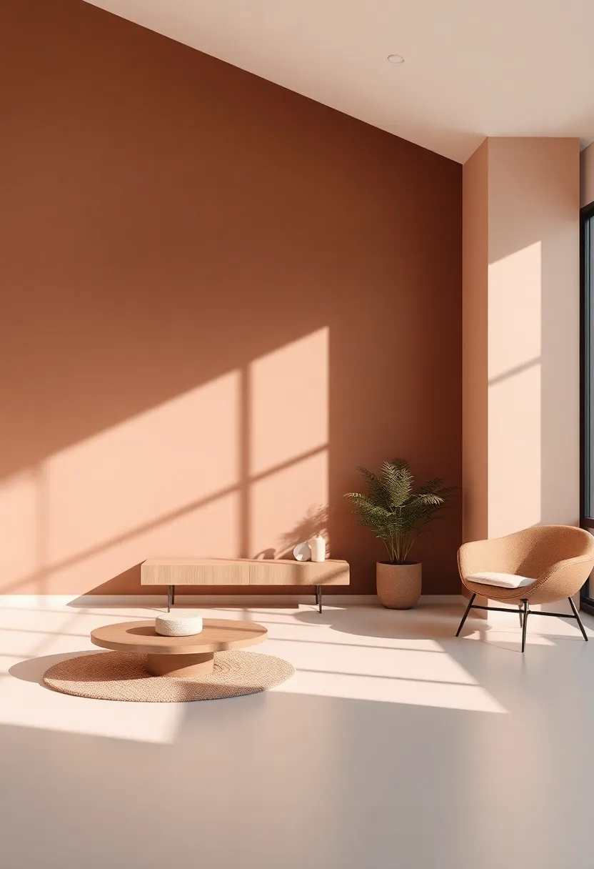
Transforming Walls With Earthy Tones That Bring Nature Indoors
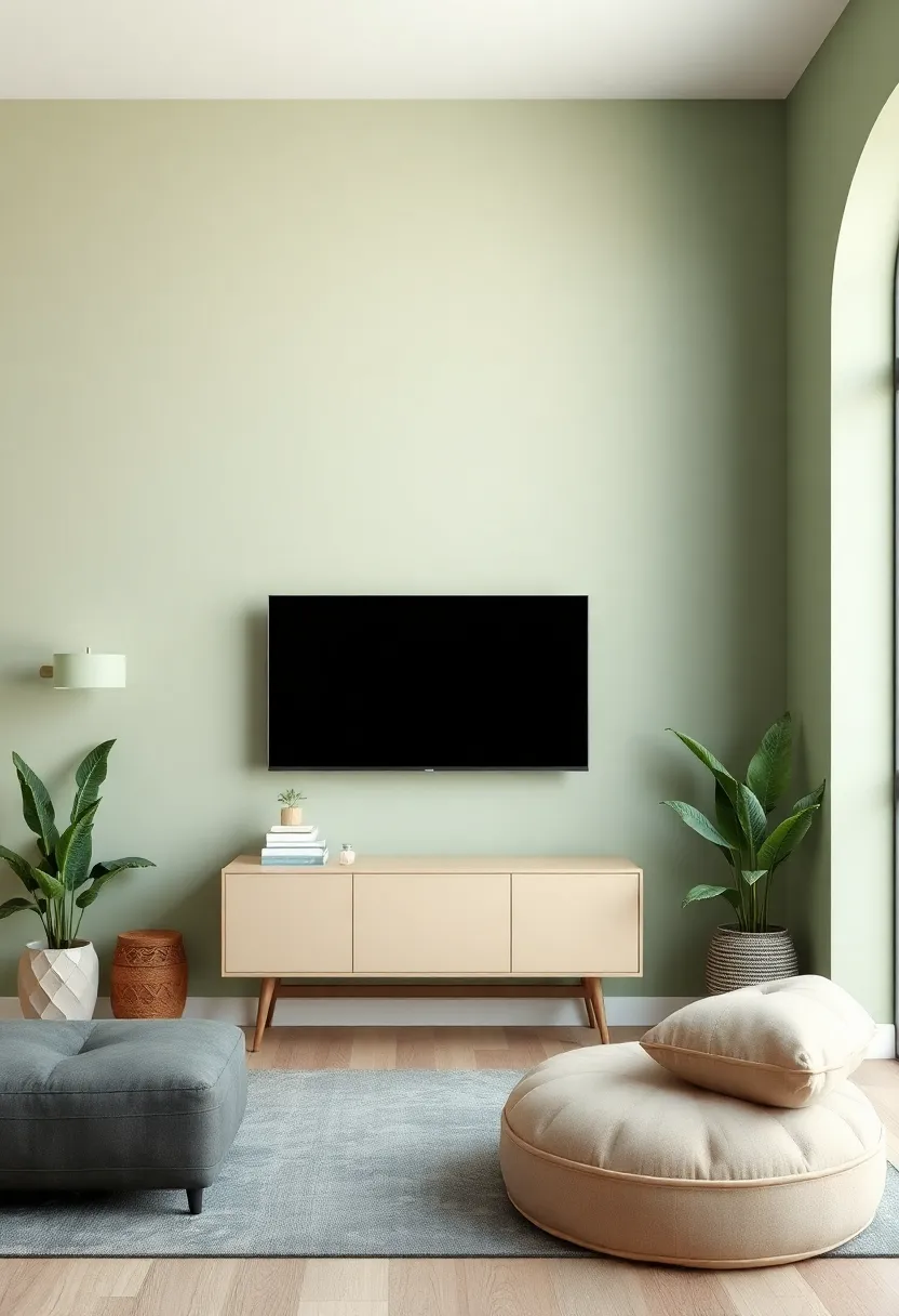
In 2025,embracing a palette that echoes the serene hues of the earth can truly enhance your living space. Colors such as warm terracotta, soft olive green, and muted sandy beige are set to make significant waves in interior design, creating an inviting atmosphere that blurs the line between indoors and outdoors. These earthy tones not only evoke a sense of calmness but also foster a feeling of connection to nature, allowing individuals to feel grounded within their homes. When applied to walls, these colors can transform stark spaces into tranquil retreats, encouraging relaxation and mindfulness.
To further amplify these natural vibes, consider incorporating various textures and materials that complement your earthy color scheme. Here are some key elements to consider:
- Natural Wood Accents: pair earthy walls with furniture or decor made from reclaimed wood.
- Textured Fabrics: Integrate cushions or throw blankets in organic cotton or linen for added warmth.
- Plant Life: Incorporate indoor plants to enhance the organic feel and improve air quality.
Here’s a simple comparison table showcasing popular earthy tones and their ideal pairings:
| Color | Ideal Pairings |
|---|---|
| Terracotta | Creams, Deep Greens |
| Soft Olive | Muted golds, Warm Whites |
| Sandy Beige | Cool Blues, Dark Chocolates |
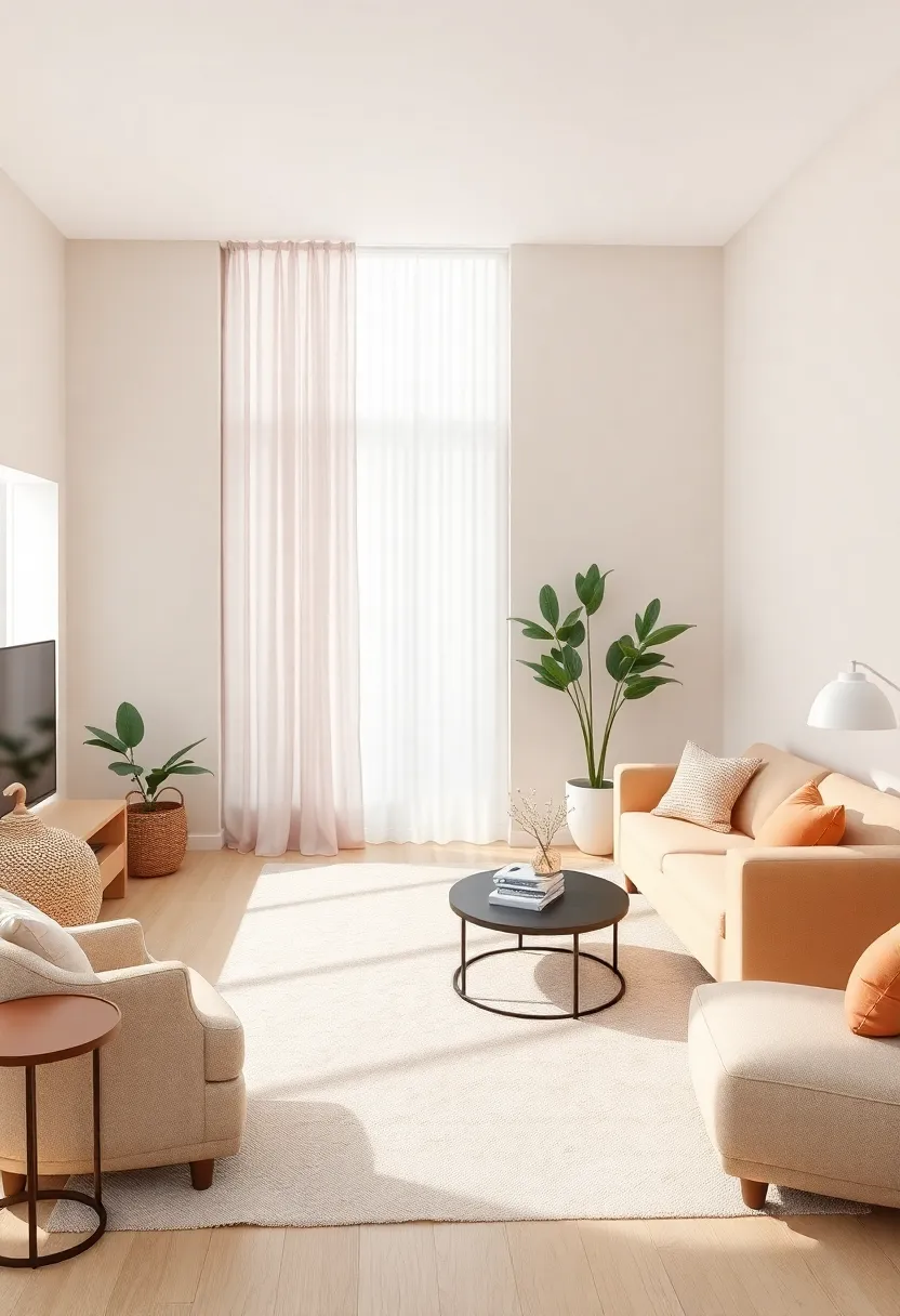
The Allure of Soft Pastels for a Calming Living Room Atmosphere
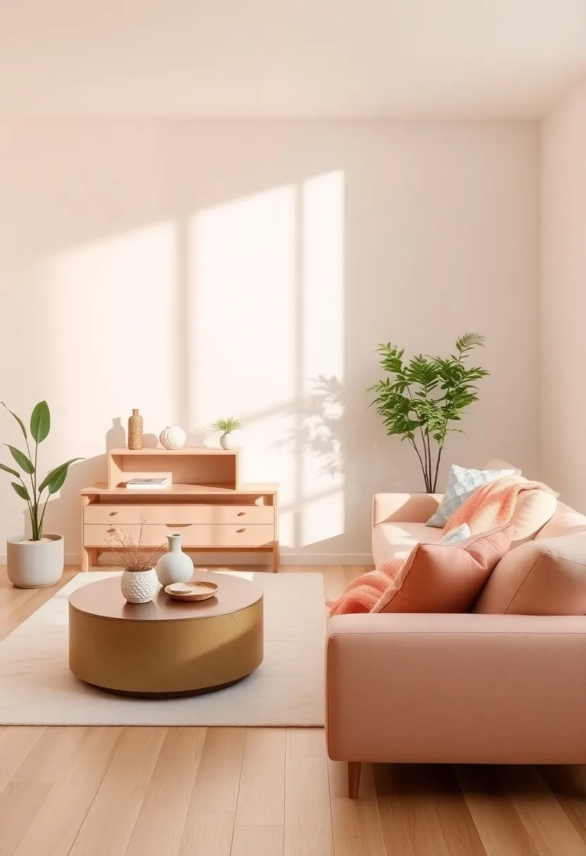
The gentle embrace of soft pastels can transform any living room into a sanctuary of tranquility. Shades such as blush pink, powder blue, and mint green evoke a sense of calm, making them perfect for creating an inviting environment. Integrating these colors into your decor can enhance the overall mood of the space. Consider pairing soft pastel walls with white furniture or natural wood accents to achieve a harmonious balance. accents, such as cushions, throw blankets, and artwork, can further enrich the palette without overwhelming the senses.
To ensure soft pastels have the desired effect in your living room, it’s essential to think about the light and elements around you. These shades naturally reflect light, making a room feel more airy and spacious. Utilize a combination of textures and patterns to keep the look fresh and dynamic. Here’s a simplified table to illustrate some effective pairings:
| Pastel Color | Ideal Pairing | Suggested Accent Material |
|---|---|---|
| Blush Pink | Warm Whites | Linen |
| Powder Blue | Greys | Wool |
| Mint Green | Earthy Neutrals | Canvas |
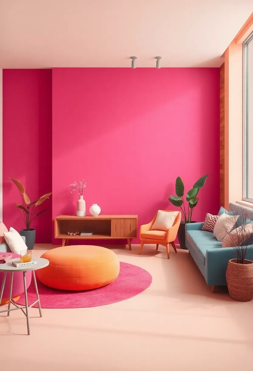
Bold Jewel Tones Infusing Elegance and Luxury into your Space
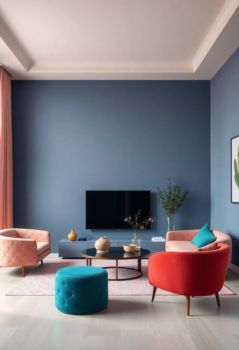
Bold jewel tones are making a striking resurgence in interior design,breathing new life into living spaces with their rich,saturated hues. Imagine a room adorned with deep emerald greens, regal sapphire blues, and luxurious amethyst purples, each color evoking a sense of opulence and sophistication. These vibrant shades can be artfully combined or used as accent pieces to create a dynamic and inviting atmosphere. whether incorporated through statement furniture, bold wall colors, or plush textiles, the impact of jewel tones is undeniable. They invite warmth and an air of luxury, making even the simplest spaces feel refined and abundant.
To harmonize the beauty of jewel tones within your living room, consider these elements:
- Accent Walls: A feature wall in a deep sapphire or rich burgundy can serve as a stunning focal point.
- Textiles: Use plush velvet cushions, lacquered throw blankets, or intricate area rugs in jewel tones to add texture and depth.
- Art Prints: Choose artwork that complements the color scheme, incorporating similar shades for a cohesive look.
| Jewel Tone | Emotion | Best Complementary Color |
|---|---|---|
| Emerald Green | Renewal | Soft Beige |
| Sapphire Blue | Calm | Warm Gray |
| Amethyst Purple | Creativity | Muted Yellow |
The Timeless Appeal of monochromatic Schemes for Modern Living
Monochromatic schemes have a unique ability to elevate modern living spaces,providing a serene and cohesive aesthetic that resonates with today’s style sensibilities. By relying on a single hue, you can explore a wide range of shades and tints, creating depth and interest without overwhelming the senses. Think of varying textures, from soft fabrics to sleek surfaces, all in a unified color palette. This approach allows you to play with light and shadow, making each element feel intentional and curated.
To successfully implement a monochromatic design, consider incorporating different materials and accents to enhance the visual experience. Here are key elements to bear in mind:
- Layered Textures: Combine smooth leather, plush textiles, and matte finishes for a rich and inviting space.
- Accent Pieces: Introduce contrasting elements within the same color family, such as darker furniture or brighter artwork, to create focal points.
- lighting Variations: Use light strategically to enhance the mood; warm lighting can soften the overall look while cooler tones can add elegance.
Below is a quick reference table featuring popular monochromatic color schemes for living rooms that will be trending in 2025:
| Color | Vibes |
|---|---|
| soft Beige | Warmth & Comfort |
| Deep Navy | Tradition & Elegance |
| Rich Forest Green | Calm & Nature-Inspired |
| Dusty Rose | Romantic & Inviting |
Creating Depth and Dimension With Two-Toned Color Combinations
One of the most stunning ways to enhance your living room is by playing with two-toned color combinations. By pairing contrasting hues, you can create visual interest and a sense of depth that transforms a flat space into a dynamic environment. For example, combining a deep navy blue with a soft, sandy beige not only provides balance but also helps to delineate areas within the room. This technique is perfect for accent walls, furniture pieces, or decorative elements such as cushions and throws. Consider these popular combinations to elevate your space:
- Charcoal Gray and Crisp White – A modern classic that exudes sophistication.
- burnt Orange and Teal - Bold and invigorating, perfect for a lively atmosphere.
- Forest Green and Pale Yellow – A refreshing earthy palette that brings the outside in.
- Cream and Dusty Rose - Soft and inviting,ideal for a cozy,romantic feel.
To effectively implement these color schemes, focus on the balance and ratio of each color in your decor elements. As a notable example, if you choose a darker color for the walls, lighter shades in furniture and accessories can create a beautiful contrast while still allowing the room to feel open and airy. Additionally, consider how natural and artificial lighting interacts with your color choices throughout the day. Here’s a simple guideline for determining the right balance:
| Color Application | Suggested Ratio |
|---|---|
| Walls | 60% |
| Furniture | 30% |
| Accessories | 10% |
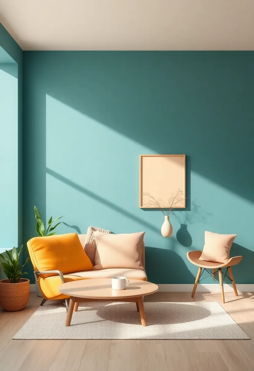
Bright and Cheerful Hues to Energize Your Living Room Vibe
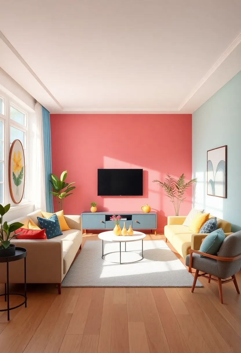
Bright and cheerful colors have a magical ability to transform your living room into a vibrant oasis.In 2025, expect to see a surge of uplifting shades that breathe liveliness into every corner. Consider incorporating sunny yellows, energizing corals, and lively turquoises that not only enhance the aesthetic appeal but also evoke a sense of joy and positivity. These hues can be introduced through accent walls, decorative cushions, or striking artwork that complements your existing decor.
When selecting shades, think about how they make you feel and the atmosphere you want to create. Here’s a handy list of colors to consider for your next living room refresh:
- Sunny Yellow: Perfect for adding brightness and optimism.
- Coral: A warm shade that fosters creativity and warmth.
- Turquoise: Invokes a refreshing beach vibe, encouraging relaxation.
- Mint Green: Elevates tranquility while bringing a touch of nature indoors.
| Color | Emotion Evoked | Best Used In |
|---|---|---|
| sunny Yellow | Happiness | Accent walls |
| Coral | Warmth | Accessories |
| Turquoise | Calmness | Furniture |
| Mint Green | Fresher vibes | Textiles |
Bringing the Outside In With Organic Greens and natural Shades
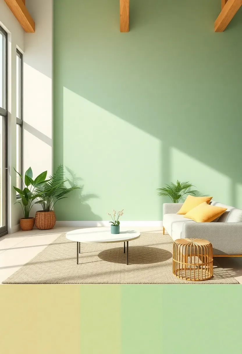
In 2025, embracing nature within your living space will be more than just a design trend; it’s a lifestyle choice that uplifts the spirit and harmonizes with the environment. Organic greens like sage and fern are making waves,inviting tranquility and rejuvenation into your home. These shades evoke feelings of calm and connection, reminding us of lush leaves and expansive fields. By integrating plants and natural textures, you can create a serene oasis that feels refreshing. Pair these greens with earthy tones, such as warm beiges and soft browns, to achieve a balanced, inviting atmosphere in your living room.
To further enhance this natural ambiance, consider incorporating natural materials and patterns. Textiles in cotton and linen, along with hand-crafted decor pieces, can accentuate the organic theme while keeping the space cohesive. The blend of different shades of green allows for versatility in design,making it easy to create focal points or subtle accents. Here’s a quick table to highlight the ideal color combinations that work beautifully with organic greens:
| Primary Green | Complementary Colors | Textures |
|---|---|---|
| Sage Green | Warm Beige, Cream | Cotton, Natural Linen |
| Fern Green | Muted Terracotta, Soft White | Jute, Wool |
| Olive Green | Slate Gray, Deep Brown | Leather, Untreated Wood |
Embracing Vintage Charm Through Retro Color palettes
In the quest to transform living spaces, retro color palettes offer a nostalgic charm that resonates with both modern and traditional aesthetics.Embracing shades like muted mustard yellows,dusty rose pinks,and soft mint greens can instantly create a warm and inviting atmosphere.These vintage-inspired hues have a way of enveloping the room, reminiscent of cozy afternoons spent in the company of cherished memories.consider pairing these colors with distressed wood accents or mid-century furniture pieces to accentuate their retro appeal.
Incorporating these shades can also encourage creativity and individual expression.Some of the most effective combinations include:
- Dusty Rose with Olive Green for a refreshing yet grounding feel.
- Muted Mustard with Teal for a vibrant, eye-catching contrast.
- Soft Mint with Warm Beige to evoke a sense of calm and balance.
utilizing these palettes can transform your living area into a sanctuary that celebrates the past while providing a fresh look. Below is a simple table highlighting the key aspects of each color combo:
| Color Combination | Effect |
|---|---|
| Dusty Rose + Olive Green | Refreshing & Grounding |
| Muted Mustard + Teal | Vibrant & Eye-catching |
| soft Mint + Warm Beige | Calm & Balanced |
The Power of Statement Ceilings in Colorful Living Room Designs
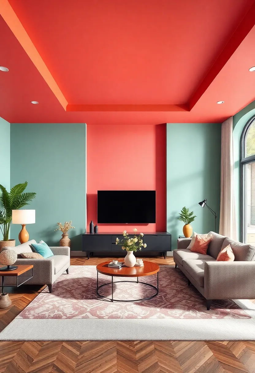
In a world where minimalism has dominated for years, the resurgence of colorful living rooms is a refreshing shift towards self-expression and vibrancy. Statement ceilings are the ultimate game-changer in this trend, offering an unexpected twist that draws the eye upward and transforms the entire ambiance of the room. These ceilings can become a bold canvas, showcasing unique patterns, textures, and hues that beckon admiration and create conversation. From rich jewel tones like emerald green to playful pastels, the choices are endless, allowing homeowners to reflect their personality and taste stylishly.
To make the most of this design element, consider a few key styles to elevate your living space:
- Bold Color Applications: Embrace striking colors like deep navy or fiery red to create a stunning contrast with your walls.
- Patterned Finishes: Opt for intricate wallpaper, geometric designs, or artistic murals that add depth and intrigue.
- Textured Treatments: Incorporate wooden beams or stucco finishes for a rustic feel,ensuring your ceiling is as inviting as your floor.
To illustrate how different colors and styles can impact your living room, here’s a simple comparison of popular ceiling treatments:
| ceiling Style | Color Scheme | Vibe |
|---|---|---|
| Solid Color | Bright Yellow | Cheerful and Lively |
| Patterned Wallpaper | Floral Pastels | Soft and Inviting |
| Wood Beams | Natural Wood Tones | Warm and Cozy |
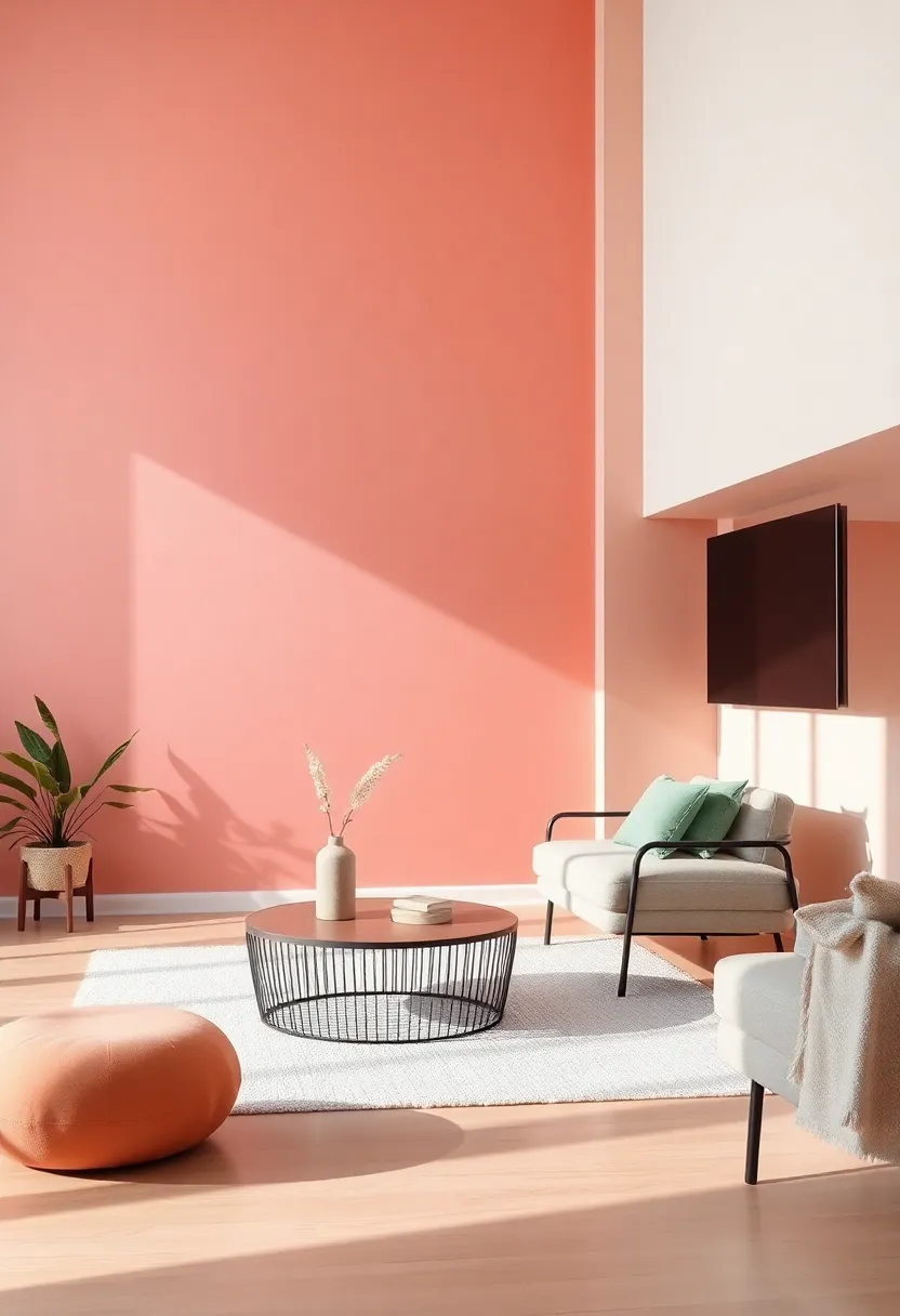
Rustic Warmth Through Rich Browns and Terracotta Accents
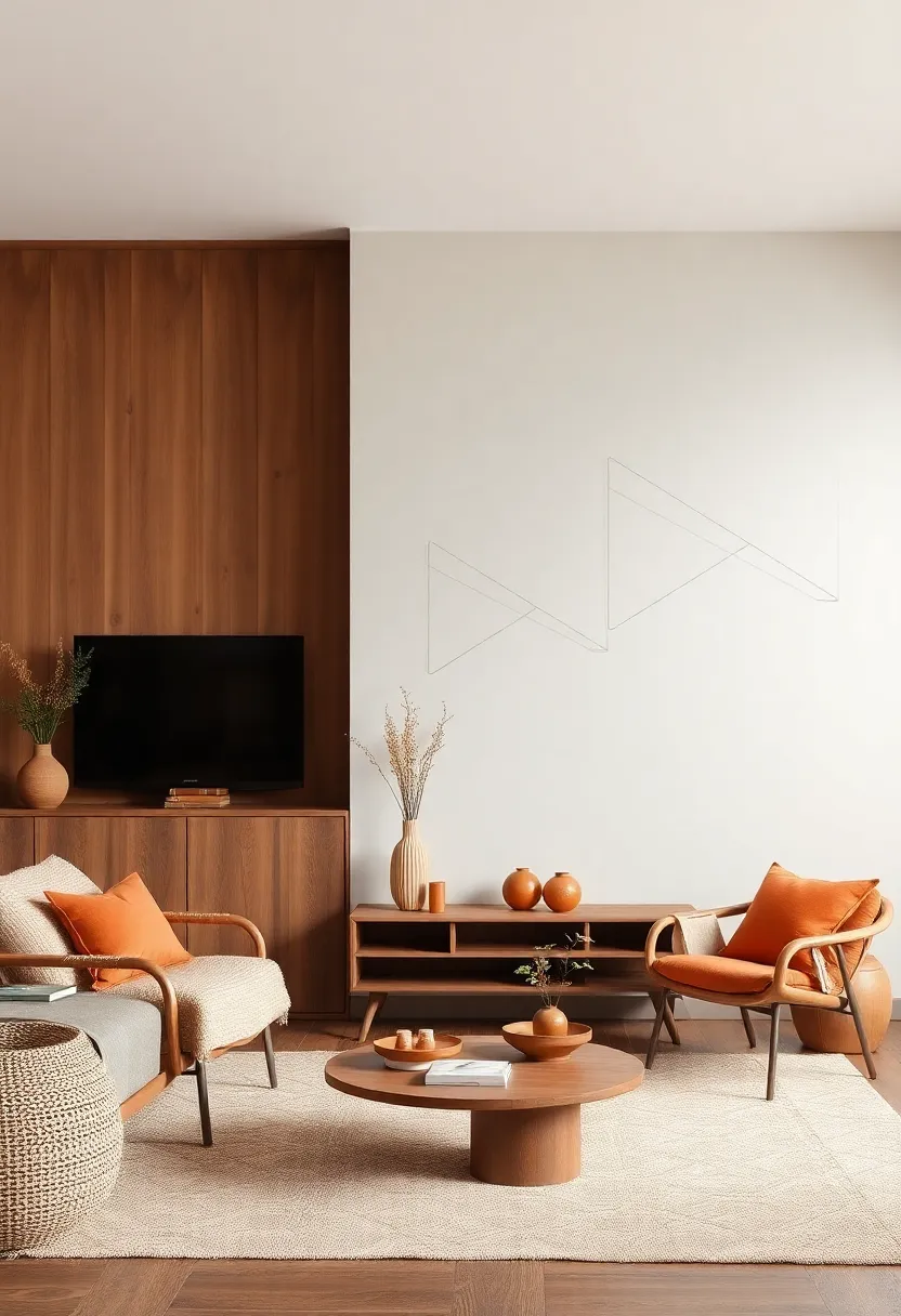
Embracing the allure of natural hues, living rooms adorned with rich browns and terracotta accents evoke a sense of rustic warmth that is both cozy and inviting. These earthy tones create an atmosphere reminiscent of sun-drenched landscapes and timeless traditions.Imagine a space where deep chocolate browns mingle with burnished terracotta, crafting a backdrop that invites relaxation and conversation. Accessories like throw pillows, pottery, and artwork featuring these colors can seamlessly tie the room together, offering a refined yet comfortable aesthetic.
To enhance the visual warmth and depth, consider incorporating various textures and layers.Utilizing elements such as woven textiles, textured woods, and natural stone can further enrich the ambiance. Below is a table showcasing complementary accents that harmonize beautifully with the dominant browns and terracotta shades:
| Accent Piece | Color Pairing |
|---|---|
| Soft Beige Throw | Enhances warmth |
| Olive Green Plant | Adds freshness |
| Gold Accents | Introduce elegance |
| Textured Rugs | Create depth |
Through careful selection of textures and complementary elements,a living room can embody a rustic charm that feels both modern and timeless. Let the warm embrace of these rich tones create a sanctuary that offers comfort and style, ensuring your space remains a delightful retreat for years to come.
Sustainable Style: Eco-Friendly Paints in Trendy Shades
As we embrace a more conscious lifestyle, sustainable design choices have become paramount in our interiors, especially when it comes to paint. Eco-friendly paints, made from natural materials and free from harmful chemicals, not only contribute to a healthier home environment but also offer a plethora of stunning colors to elevate your living space. In 2025, look out for shades like soft sage, muted terracotta, and deep navy, which not only enhance the aesthetics but also reflect a commitment to sustainability. These nature-inspired colors bring a sense of calm and warmth to your living room, creating a soothing sanctuary for relaxation and social gatherings.
When choosing your eco-friendly paint, consider options that are low-VOC or zero-VOC, ensuring that your living space remains fresh and breathable.Not only do these paints come in trendy hues, but they also boast durability and longevity, reducing the need for frequent repainting. Here’s a quick comparison of some popular eco-friendly paint brands to consider:
| Brand | Key Features | Popular Colors |
|---|---|---|
| Behr Premium | Low-VOC, durable finish | Soft Sage, Dusty Rose |
| Benjamin Moore Natura | Zero-VOC, antimicrobial | Deep Navy, Cloud Cover |
| Farrow & Ball | Natural pigments, eco-friendly | Setting Plaster, Green blue |
Layering Textures and Colors for a Cozy and inviting Setting
Creating a warm and inviting living space hinges on the artful combination of textures and colors. Here are some key elements to consider when layering these components:
- Fabrics: Incorporate soft fabrics like velvet or chunky knits through cushions and throws to enhance coziness.
- Materials: use a mix of natural materials—such as wood, rattan, and stone—to add depth while maintaining a soothing feel.
- Color Palette: opt for warm, earthy tones layered with pops of rich jewel hues to create visual interest without overwhelming the senses.
Balancing colors and textures requires a thoughtful approach to achieve harmony. Consider these strategies to maximize your living room’s inviting atmosphere:
| Texture | Color combination | Effect |
|---|---|---|
| smooth leather sofa | Deep forest green and warm beige | Create a grounding effect |
| Knitted throw blanket | Soft terracotta and creamy white | Add warmth and comfort |
| Woven rattan accents | Muted blush and olive | Bring a natural element indoors |
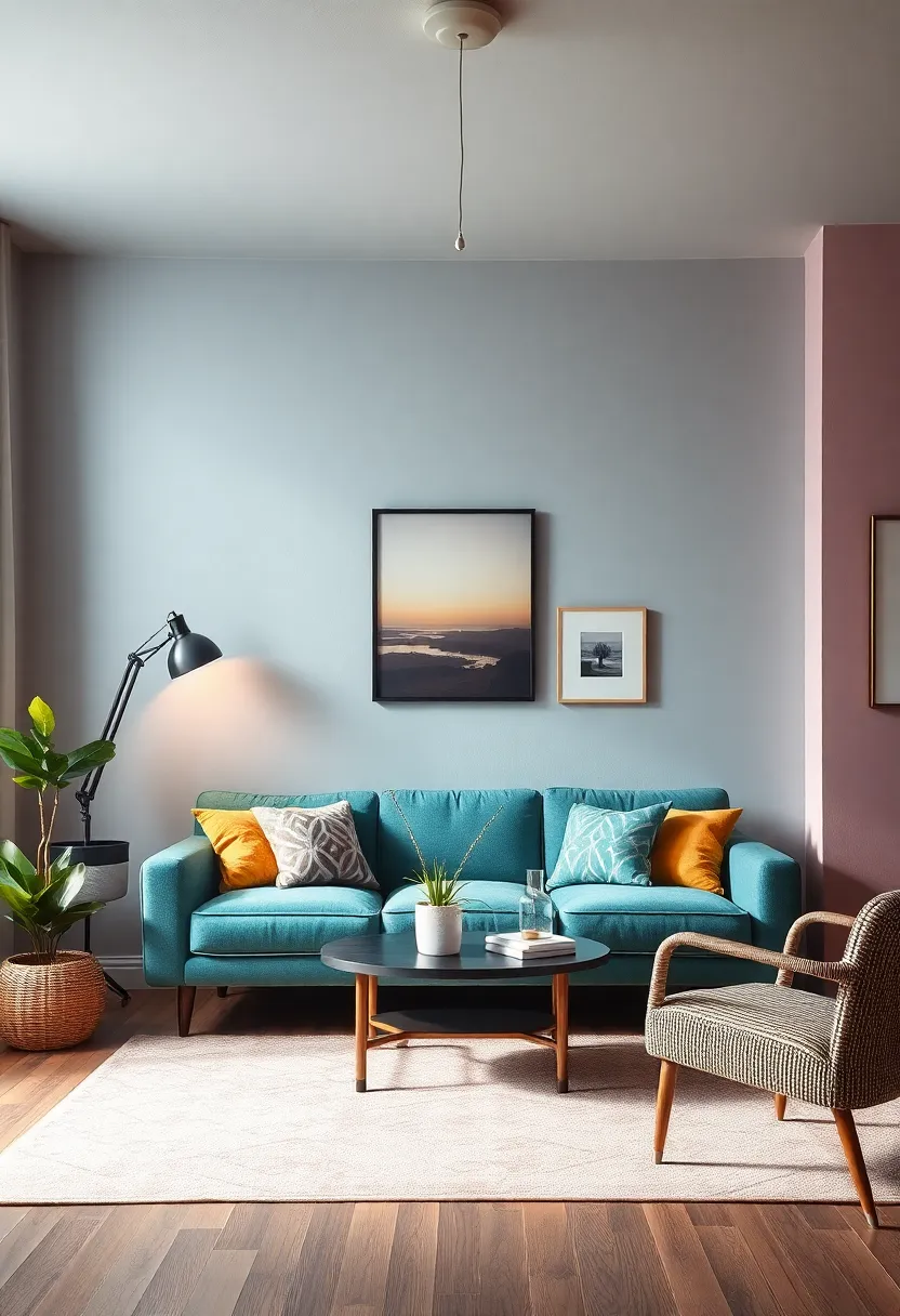
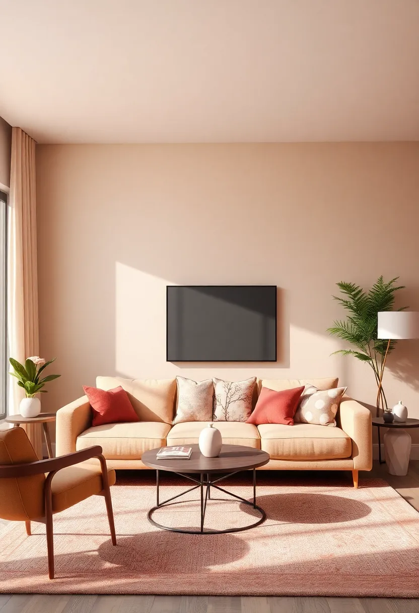
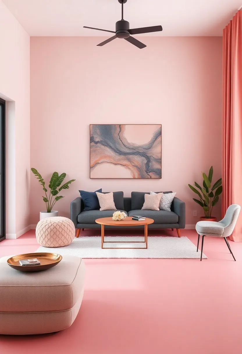
Inviting Serenity With Soft Neutrals and Accent Pops
Embracing a palette filled with soft neutrals can usher in an atmosphere of tranquility, making your living room a sanctuary of relaxation and peace. Shades like gentle beige,whispering gray,and creamy ivory create a harmonious backdrop that calms the senses. These hues not only expand your space visually but also allow for versatility in layering textures and patterns. To elevate this serene foundation,consider incorporating accent pops through decorative elements like cushions,rugs,or artwork. Think of soothing pastels alongside vibrant jewel tones that might include:
- Dusty blue for a hint of coolness
- Soft blush to add warmth and softness
- Emerald green for an energizing touch
- Coral accents to create a lively focal point
This thoughtful blend of neutrals and striking accents not only refreshes your space but also crafts a layered approach that invites comfort and style. An effective way to implement this concept is by utilizing a combination of materials and finishes that complement the neutral tones, creating visual interest. As an example, pairing a plush, neutral sofa with colored striped cushions or vibrant wall art can achieve a sophisticated look while maintaining balance. here’s a quick overview of material options to consider:
| Material | Ideal Color Pairing |
|---|---|
| Wood | White or light gray |
| Metal | Soft pastels |
| Fabric | Bold jewel tones |
| Glass | Neutral whites or beiges |
Finding Harmony With Color Trends Inspired by Nature’s Palette
In 2025, living rooms will embrace the organic hues that nature provides, creating serene environments that promote relaxation and rejuvenation. Imagine rich, earthy tones paired with soft pastels—think sage greens complementing dusty pinks and warm terracotta. This blend not only mirrors the colors found in vibrant landscapes but also invokes a sense of calm.The key is to create a layered look,interspersing bold splashes of color through accessories while maintaining a grounded base with neutrals.
To balance these natural tones effectively, consider incorporating a few timeless textures and materials. As a notable example, pairing textured linen cushions in deeper greens with a lightweight cotton throw in a gentle blush can seamlessly tie the color scheme together. Enhance this palette by implementing elements like:
- Natural wood accents – Think oak side tables or bamboo shelves.
- Soft metallics – Use brass or copper lamps to add a touch of elegance.
- Lush greenery – Introduce indoor plants for vibrant pops of life.
With this approach, you can curate a living space that is both on-trend and profoundly comforting, allowing the beauty of nature to flow into your everyday life.
Minimalistic Styles Enhanced by Subtle Color Variations
As we move into 2025,the allure of minimalistic design continues to captivate homeowners seeking simplicity and elegance. This trend emphasizes clean lines and uncluttered spaces, but with an exciting twist – the introduction of subtle color variations. Using soft, muted tones can enhance a minimalist aesthetic, adding depth without overwhelming the senses. Imagine a living room draped in delicate shades of greys, taupes, or off-whites, where even the smallest splash of color, like a pastel cushion or a peach-toned throw, can create a harmonious balance and infuse warmth into the space.
Incorporating accents in gentle hues allows for personal expression while retaining a serene environment. Consider the following elements when designing your minimalist space:
- Accent furniture: Choose pieces in soft pastels or earth tones to complement neutral bases.
- wall Colors: Opt for light, airy palettes with slight variations in undertones to provide depth.
- Textiles: Incorporate subtle patterns or textures in fabrics that feature muted colors.
Below is a simple guide showcasing some popular color pairings that embrace this concept:
| Main Color | Accent Color |
|---|---|
| Soft Cream | Pale Sage Green |
| Light Gray | Dusty Rose |
| Warm Beige | Muted Coral |
| Cool Blue | Faint Lavender |
Playful Patterns and Bright Colors for a Fun-Filled Living Room
Embracing playful patterns and vibrant hues can invigorate your living space, making it a joyful haven for family and friends. Incorporating patterns such as geometric shapes, floral designs, or abstract art can create a dynamic atmosphere that sparks conversation and creativity. Pair these patterns with bright colors like turquoise, sunny yellow, or coral to enhance the cheerful vibe of your room. Consider the following elements to elevate your living room’s playful essence:
- accent Pillows: Choose playful prints that complement your color scheme.
- Throw Rugs: opt for bold patterns that draw the eye and add comfort.
- Wall Art: Mix and match frames with colorful artwork to create an energetic gallery wall.
A carefully curated selection of furniture pieces can seamlessly incorporate fun and flair into your living room design. Look for items like a vibrant sofa in a solid color that contrasts with patterned armchairs. Layering textures using plush fabrics or incorporating retro elements can also soften the overall playfulness without overshadowing it. to help you visualize the best combinations, consider this table of popular pairing options:
| Color | Pattern |
|---|---|
| Mint Green | Botanical Prints |
| Sunny Yellow | Striped Fabrics |
| Coral | Polka Dots |
Creating Focus Areas With Contrasting Color Blocks in Design
Using contrasting color blocks in your living room can be a game-changer for creating dynamic focus areas. By strategically placing bold hues against softer tones, you can draw attention to specific elements such as artwork, furniture, or architectural features. Consider utilizing colors like emerald green paired with soft beige or deep navy with crisp white to achieve a striking visual effect. This technique not only adds depth to your space but also encourages creativity, allowing for a playful exploration of color that reflects your personal style.
To implement this design approach effectively, think about the spatial distribution of colors:
- Accent Wall: Paint one wall a bold color while keeping the others neutral.
- Furniture Accents: Choose cushions or throws in contrasting colors to add layers.
- art Displays: Frame artwork in vibrant colors to enhance the aesthetic.
Utilizing a well-considered palette will not only enhance the beauty of your living room but also promote mood and functionality throughout the space. Below is a simple table showcasing some trendy color combinations for 2025:
| Color Pairing | Focus Area |
|---|---|
| Coral & Charcoal | Cushions & Decor |
| Mustard & Teal | Accent Wall |
| Blush pink & Olive Green | Furniture & Rugs |
Exploring Global Influence Through Eclectic color Combinations
As we look ahead to 2025, the intersection of culture and design reveals a stunning array of color combinations that reflect our diverse world. Drawing inspiration from global aesthetics, decorators are starting to gravitate towards rich jewel tones complemented by unexpected color pairings. Think of deep emerald greens with bright coral accents or royal blues intermingled with soft earthy browns,which echo nature’s own palette. These eclectic mixes not only invigorate living spaces but also serve as a conversation starter, allowing individuals to express their unique personalities while celebrating different cultures.
Furthermore, the trending color combinations transcend borders, inviting an exploration of local artisan crafts reflected in home decor. By integrating elements such as handwoven textiles with vibrant hues, homeowners are creating intimate settings that blend warmth with energy. A few promising pairings to consider include:
- Zesty tangerine with calming slate Gray
- Dusty Rose paired with Olive Green
- Techno Blue combined with Golden mustard
These combinations not only captivate the eye but also resonate on a deeper level, as they are often derived from traditional palettes that have stood the test of time across various cultures. Embracing such colors can effectively transform ordinary living rooms into enriched spaces filled with history and artistry, where each glance tells a story.
Cohesive Color Storytelling That Connects spaces Within Your Home
In the quest to create a harmonious living environment, a cohesive color palette plays a fundamental role in linking various spaces throughout your home. By carefully selecting a range of shades that complement one another, homeowners can evoke feelings of calm, warmth, and sophistication. Consider the following color techniques for your 2025 transformations: monochromatic schemes, which use varying tones of a single hue; analogous blends, involving neighboring colors on the color wheel; and contrasting accents, where a bold hue can highlight subtle undertones in the furniture or decor.
To effectively implement these trends, pay attention to how colors flow from one area to another. For instance, a living room adorned with rich, earthy greens can seamlessly transition to a serene bedroom with soft sage and white accents. Consider creating a color connection table to visualize your home’s palette:
| Room | Main Color | Accent colors |
|---|---|---|
| Living Room | Olive Green | Soft Beige, Terracotta |
| Dining Area | Warm Taupe | Rust Orange, Cream |
| Bedroom | light Sage | soft White, dusty Rose |
By leveraging these connections, homeowners can craft environments that not only reflect personal style but also flow effortlessly from one room to the next, creating a unified aesthetic throughout the home.
Insights and Conclusions
As we gaze into the vibrant palette of 2025, it’s clear that our living rooms will become even more than simple gathering spaces—they will evolve into reflections of our identities, aspirations, and tastes. From soothing earth tones to invigorating splashes of color,the trends we’ve explored promise to infuse your space with warmth,elegance,and energy. Whether you choose to embrace bold statements or subtle sophistication, the key is to find a balance that resonates with your personal style. So, as you embark on your decorating journey, let these color trends inspire you to transform your living room into a sanctuary that truly feels like home.With creativity and intention, your space can be not only a feast for the eyes but also a haven of comfort and joy. Here’s to a year of vibrant transformations!