
Selecting the ideal trim color can instantly elevate your interior, turning ordinary rooms into stunning showcases.
Sherwin Williams presents an extensive palette of hues designed to set the tone, craft enduring styles, and leave a memorable impression.
Whether refreshing an existing space or designing anew, these 31 carefully curated shades will inspire you to create sharper, more inviting rooms. Prepare to discover colors that not only harmonize with your walls but also enhance your home’s overall aesthetic.
From gentle whites to striking contrasts, there’s a perfect trim shade for every design preference. Embark on this vibrant exploration and uncover the trim color that truly resonates with your style!
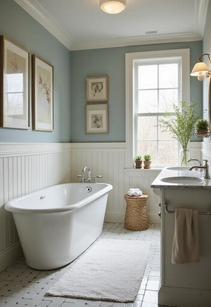
Classic Bright Whites for Timeless Elegance
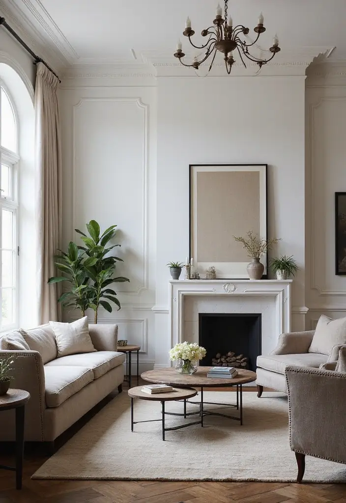
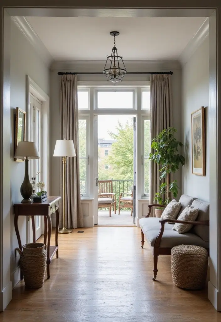
1. Pure White (SW 7005)
Pure White remains a quintessential choice for those seeking a fresh, luminous finish. Its crispness offers a striking contrast against darker walls while lending subtle sophistication to lighter tones. This adaptable trim color complements both classic and contemporary interiors seamlessly.
Design Tips:
- Pair with rich navy walls to create a bold, elegant statement.
- Utilize in sunlit rooms to amplify brightness and openness.
Ideal for kitchens, hallways, and living areas, Pure White fosters a clean, welcoming ambiance.
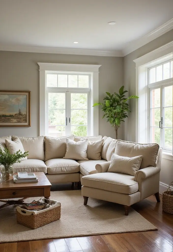
2. Alabaster (SW 7008)
Alabaster offers a warmer, softer alternative to stark whites, infusing spaces with a cozy, inviting aura. This shade pairs beautifully with muted pastels and natural wood finishes, enhancing a lived-in, comforting atmosphere.
Best Uses:
- Perfect for bedrooms and bathrooms to promote relaxation.
- Combines well with earthy tones for a grounded, serene environment.
Alabaster is a superb choice for creating tranquil retreats within your home.
3. Extra White (SW 7006)
For a sleek, modern aesthetic, Extra White delivers a pure, bright finish that visually expands spaces. It accentuates surrounding colors, making your decor elements stand out vividly.
Styling Suggestions:
- Use alongside bold, dark walls for dramatic contrast.
- Ideal for minimalist or contemporary interiors emphasizing simplicity.
Extra White shines in entryways and dining rooms where first impressions matter.
Soft Grays and Warm Neutrals to Soften Your Space
4. Snowbound (SW 7004)
Snowbound features delicate gray undertones that create a light, airy feel with a hint of warmth. It pairs effortlessly with soft grays and pastel walls, fostering a peaceful, inviting atmosphere.
Where to Use:
- Children’s rooms for a calm yet playful environment.
- Combine with textured fabrics to add depth and coziness.
Snowbound enhances the brightness and serenity of any room.
5. Eider White (SW 7014)
Blending subtle warmth with gray undertones, Eider White offers a refined alternative to traditional whites. It enriches rooms with a welcoming yet sophisticated vibe, bridging modern and classic styles.
Design Recommendations:
- Perfect for living and dining rooms seeking warmth and elegance.
- Pair with dark wood or metal accents for a chic, balanced look.
Eider White (SW 7014) envelops your space in warmth, effortlessly blending contemporary and traditional elements for inviting sophistication.
6. Dover White (SW 6385)
Dover White is a creamy off-white that exudes comfort and depth, ideal for both modern and traditional interiors. It complements natural materials like stone and wood, enhancing their organic appeal.
Best Applications:
- Use with warm grays for a sophisticated, layered palette.
- Great for highlighting wainscoting or molding with classic charm.
Dover White creates a soothing, homey atmosphere that invites relaxation.
Elegant Grays for Modern Living
7. Repose Gray (SW 7015)
Repose Gray offers a balanced blend of warm and cool undertones, making it a versatile trim color that complements a wide range of wall shades, from crisp whites to deep jewel tones.
Usage Ideas:
- Ideal for hallways and open spaces where natural light enhances its depth.
- Pair with bold artwork or statement decor for striking contrast.
This shade adds a touch of sophistication without sacrificing warmth.
8. Gray Owl (SW 7073)
Gray Owl strikes a harmonious balance between light gray and beige, offering understated elegance that suits both traditional and contemporary interiors.
Styling Suggestions:
- Complement with light oak or white furnishings for a fresh, airy feel.
- Use in monochromatic schemes for a sleek, cohesive look.
Gray Owl effortlessly refreshes and brightens your living spaces.
9. Mindful Gray (SW 7016)
Mindful Gray’s muted warmth brings a grounding, cozy effect to interiors, pairing beautifully with natural materials and earthy wall colors.
Best For:
- Spaces with ample natural light to highlight its inviting undertones.
- Living and dining rooms aiming for a relaxed, nurturing vibe.
This hue helps create a comforting sanctuary within your home.
10. Gauntlet Gray (SW 7019)
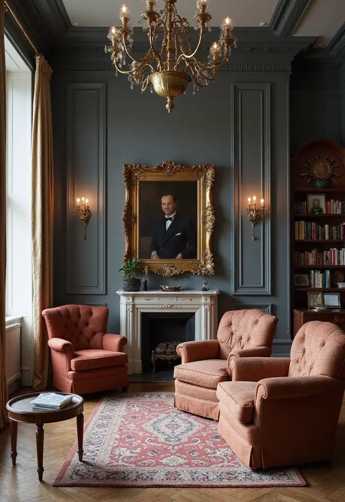
For a bold, dramatic statement, Gauntlet Gray offers a deep, rich tone that adds depth and sophistication, especially when contrasted with lighter walls.
Design Tips:
- Highlight moldings or doors to create eye-catching focal points.
- Perfect for media rooms, offices, or libraries seeking a mature ambiance.
Gauntlet Gray elevates your decor with a touch of refined drama.
Rich Earthy Tones for Cozy Spaces
11. Urbane Bronze (SW 7048)
Urbane Bronze is a deep, warm shade that brings a sophisticated, natural feel indoors. It pairs wonderfully with wood elements and earth tones, perfect for creating intimate, inviting rooms.
Usage Suggestions:
- Combine with soft whites or neutrals for balanced contrast.
- Use on cabinetry or accent walls to unify your design.
Urbane Bronze envelops your space in warmth, harmonizing beautifully with natural textures to create a cozy, stylish retreat.
12. Tricorn Black (SW 6258)
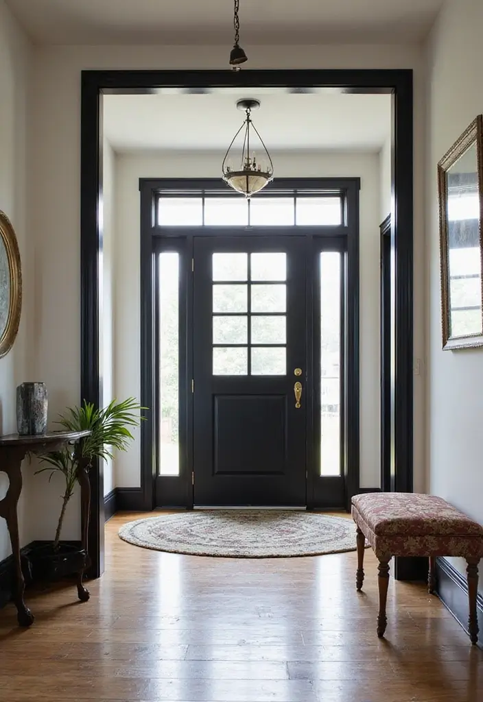
Tricorn Black is a bold, deep black that adds a contemporary edge and striking contrast to lighter walls. It’s perfect for trim, moldings, and cabinetry, delivering a sleek, modern finish.
Styling Ideas:
- Apply on doors and window frames for dramatic impact.
- Pair with metallic accents to introduce a touch of glamour.
Tricorn Black brings a sophisticated personality to your interiors.
Serene Blues and Greens for Relaxing Rooms
13. Naval (SW 6244)
Naval is a deep, calming blue that evokes tranquility and depth. It pairs beautifully with warm woods and crisp whites, making it ideal for bathrooms, studies, or any space designed for peaceful retreat.
Design Tips:
- Use on trim to create a nautical-inspired, sophisticated look.
- Combine with gold hardware for a luxurious touch.
Naval transforms your home into a serene sanctuary.
14. Sea Salt (SW 6204)
Sea Salt offers a fresh, coastal-inspired greenish-blue that brings nature’s calm indoors. It’s perfect for bathrooms, kitchens, or sunrooms, pairing well with whites, creams, and natural textures like wood and stone.
Usage Suggestions:
- Coordinate with ocean-themed decor for a cohesive vibe.
- Works beautifully with soft pastels for a tranquil palette.
Sea Salt invites a soothing, refreshing atmosphere into your home.
29. Rainwashed (SW 6211)
Rainwashed is a gentle blue-green shade that embodies tranquility, ideal for bedrooms and bathrooms. It pairs well with whites and soft grays, creating a fresh, airy feel.
Design Ideas:
- Combine with light woods and soft fabrics for a cozy, inviting space.
- Highlight architectural details like moldings to add subtle interest.
Rainwashed fosters a peaceful, rejuvenating environment.
Vibrant Accents to Energize Your Home
22. Meadowlark (SW 6697)
Meadowlark is a vibrant yellow that injects energy and joy into any room. It’s perfect for lively kitchens, playrooms, or family areas, pairing well with whites, grays, and natural wood tones.
Usage Tips:
- Use as an accent trim color against neutral walls for a cheerful pop.
- Complement with colorful decor to amplify its brightness.
Meadowlark transforms your space into a joyful, uplifting haven.
24. Coral Reef (SW 6606)
Coral Reef is a lively, cheerful coral shade that energizes children’s rooms, play areas, or creative spaces. It contrasts beautifully with light grays and whites, adding a playful yet modern touch.
Design Suggestions:
- Highlight window and door trims for a fun accent.
- Pair with vibrant decor to create a joyful atmosphere.
Coral Reef brings personality and vitality to your interiors.
Conclusion
Choosing the right trim color can profoundly impact your home’s ambiance, reflecting your personal style while enhancing architectural details.
Sherwin Williams’ diverse collection of timeless trim hues-from crisp whites to bold shades-offers options for every design vision.
Incorporate these versatile colors to refresh your decor and create spaces that feel both polished and inviting.
Frequently Asked Questions
Which Sherwin Williams trim colors are best for a timeless look?
For enduring elegance, consider Pure White (SW 7005) for a classic bright finish, Alabaster (SW 7008) for warmth and softness, and Extra White (SW 7006) for a crisp, modern edge. These shades set a refined tone that complements various styles.
How can I select the perfect trim color for my room?
Consider your wall colors and the mood you want to create. Bright trims like Extra White work well with dark walls for contrast, while softer tones like Dover White add warmth to lighter walls. Testing samples in your space under different lighting conditions is essential before finalizing your choice.
Can bold trim colors affect how spacious a room feels?
Yes, bold trim colors can influence spatial perception. Deep hues like Gauntlet Gray create intimacy and drama, making large rooms feel cozier. Conversely, light colors such as Snowbound can open up smaller spaces, making them appear larger and airier. Choose based on your room’s function and desired atmosphere.
What are some tips for pairing trim and wall colors?
Decide between contrast and harmony. For striking looks, pair dark trims like Tricorn Black with light walls. For subtle elegance, opt for monochromatic schemes using shades like Agreeable Gray. Always test combinations in your home’s lighting to ensure they complement each other beautifully.
Which trim colors are trending in modern home design?
Current favorites include Urbane Bronze for a sophisticated, earthy touch and Naval for a deep, calming blue. These hues add depth and elegance to contemporary spaces and pair well with lighter walls to maintain balance and warmth.