
Creating a home that feels both inviting and harmonious doesn’t mean you have to sacrifice personality or style. In fact,blending eclectic elements with serene neutral color palettes can result in a space that is uniquely yours—balanced,calm,and full of subtle intrigue. To help you master this artful combination,we’ve put together 23 inspiring ideas that will guide you through crafting an eclectic home infused with soft,calming tones. From clever layering techniques to unexpected accents,this listicle offers practical tips and creative insights that will empower you to design a space where tranquility and individuality coexist beautifully. Whether you’re starting fresh or looking to refresh your current décor, these ideas promise to unlock new possibilities for your home’s aesthetic journey.
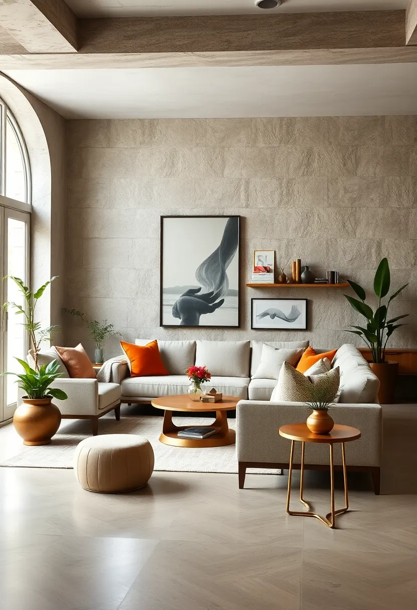
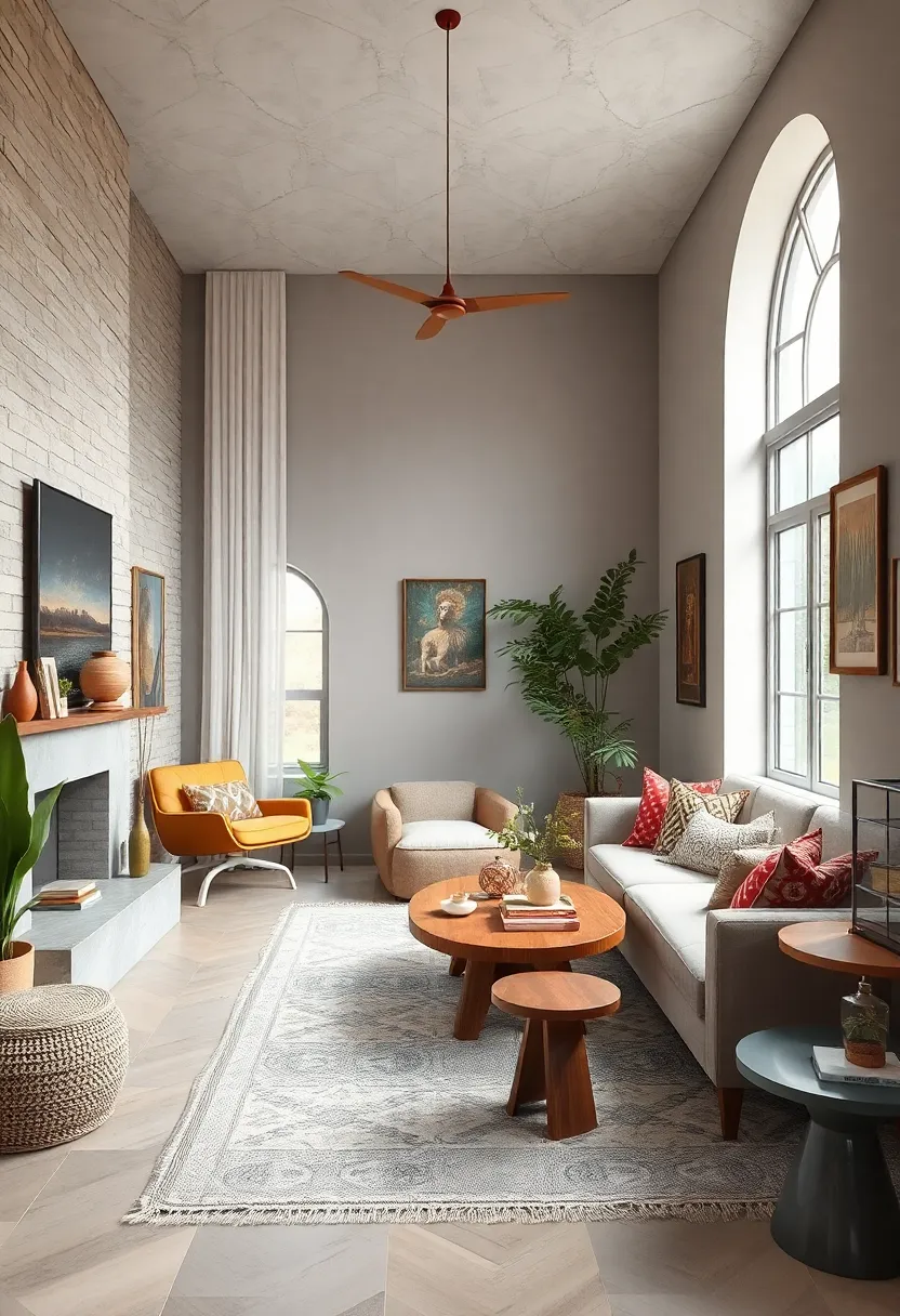
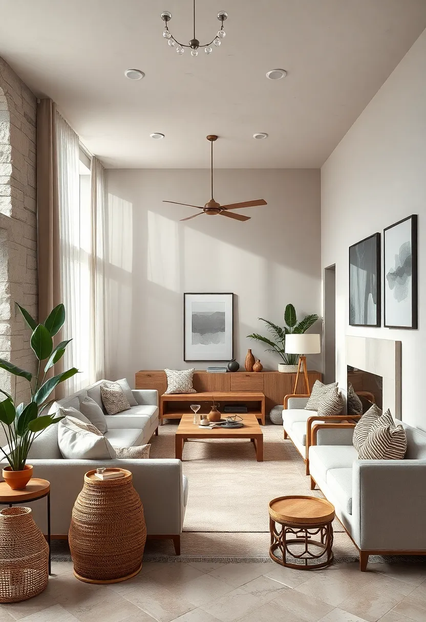
Embrace layered textures to add depth and warmth to your neutral space
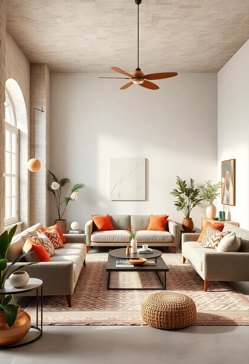
Layering different textures is a subtle yet powerful way to transform a neutral room from flat to fabulously inviting. Think beyond just smooth walls and sofas—instead, weave in tactile elements such as a plush wool rug, a nubby linen throw, or woven baskets that bring in an artisanal touch. The interplay of materials like suede,rattan,and soft cotton adds dimension,inviting your eye and fingers to explore each surface.These tactile contrasts create a visual rhythm that brings a comforting warmth, all while keeping your calming neutral palette intact.
Consider incorporating a mix of finishes to enhance both depth and coziness. Such as, pair a matte ceramic vase with a glossy glass lamp, or juxtapose rough-hewn wood furniture against silky curtains. Creating this balance can be simplified by using a texture matrix like the one below, helping you experiment with combinations that complement one another seamlessly:
| Soft | Rough | Smooth |
|---|---|---|
| Cashmere Throw | Woven Jute Rug | polished Marble Table |
| Velvet Pillows | Distressed Wood Shelves | Glass Decor Pieces |
| Silk Curtains | burlap Baskets | Metallic Light fixtures |
By thoughtfully combining textures that contrast yet harmonize, your neutral sanctuary will exude a tactile richness, inviting guests to linger in layers of cozy serenity.
Mix vintage and modern pieces for an eclectic but cohesive look
Blending vintage and modern elements can create a dynamic and inviting space that feels thoughtfully curated rather then overly styled. Start by choosing a few prominent vintage pieces — perhaps a weathered leather armchair or a mid-century wooden sideboard — and balance them with sleek, modern furnishings that echo the neutral palette.This interplay allows the character of aged craftsmanship to shine, while the simplicity of contemporary shapes prevents the room from feeling dated. Layers of texture, such as a soft linen throw on a vintage chair or a glass vase atop a minimalist coffee table, further bridge the gap between eras and add depth to your design.
To keep this mix cohesive, lean into a consistent color strategy.Neutrals like warm beiges, muted greys, and soft whites act as a unifying backdrop, letting your eclectic collection feel harmonious instead of chaotic. Consider these guiding points:
- Color echoes: Repeat subtle hues from vintage textiles or artwork in modern accents like cushions or rugs.
- Material harmony: Match natural materials—wood, linen, and stone—to create rhythm across pieces from different periods.
- Purposeful contrast: Mix ornate vintage details with streamlined modern silhouettes to highlight each object’s uniqueness.
| Vintage Piece | Modern Complement | Neutral Tie-In |
|---|---|---|
| Antique brass lamp | Concrete side table | Soft gray walls |
| Patterned wool rug | simple linen sofa | Warm beige cushions |
| Carved wooden mirror | Minimalist ceramic vases | Off-white curtains |
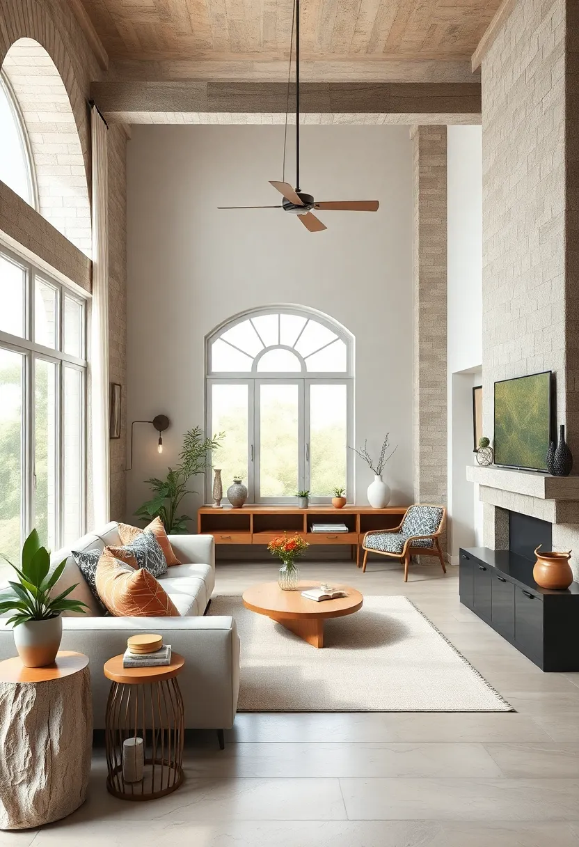
Incorporate natural materials like wood, rattan, and stone to ground your palette
Textures rooted in nature have a quiet power to anchor a room’s color story, turning abstract palettes into tactile, inviting spaces. Integrating wood with its warm grains and rich hues adds depth and timeless elegance, while the woven intricacies of rattan bring breezy, casual sophistication. When paired with the subtle solidity of stone, such as slate countertops or marble accents, these materials form a sensory experience that feels both organic and curated.
Consider mixing unfinished wooden beams or driftwood shelves with cozy rattan chairs and smooth stone planters to maintain serenity without sacrificing personality. The contrast between these natural elements also creates visual balance and harmony,elevating the neutral tones from simple backdrops to layered,soulful settings. Here’s a fast guide to marry these materials seamlessly:
| Material | Ideal Use | Effect on Space |
|---|---|---|
| Wood | Flooring, furniture, exposed beams | Warmth, grounding, texture |
| Rattan | Accent chairs, baskets, light fixtures | Airiness, casual elegance, pattern |
| Stone | Countertops, fireplace surrounds, décor | Cool solidity, natural sophistication |
- balance tonal contrasts: Combine light woods with darker stones to create subtle drama.
- Layer textures: Offset smooth marble with rough rattan weaves for visual intrigue.
- stay consistent: Tie materials together with neutral textiles to maintain calm ambiance.
Use soft beige and warm taupe as your base colors for a calming foundation
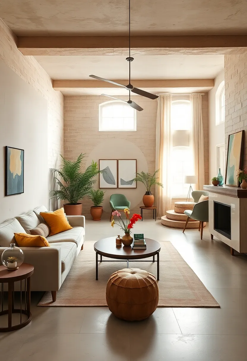
Crafting a serene sanctuary begins with selecting the perfect foundation colors. Soft beige and warm taupe offer a versatile duo that creates a tranquil backdrop without overpowering your eclectic decor. These hues bring a subtle warmth and depth to your space, allowing vibrant accents and unique textures to shine effortlessly. Their natural tones invoke a sense of calm and balance, making every room feel inviting and grounded.
To maximize their soothing effect, pair these base colors with tactile elements like woven rugs, linen cushions, and reclaimed wood furniture. The beauty of soft beige and warm taupe lies in their flexibility — whether your style leans toward vintage charm or modern minimalism, they complement a variety of eclectic pieces with understated elegance.
| Color | Hex Code | Mood | Best Paired With |
|---|---|---|---|
| Soft Beige | #F5F0E6 | Calming, Neutral | Earthy greens, burnt orange |
| Warm Taupe | #8B7D7B | Cozy, Grounding | Deep blues, rosy pinks |
Add subtle metallic accents in brushed gold or matte brass for understated elegance
Incorporating brushed gold or matte brass details can quietly elevate the neutral tones of your interior, adding a touch of warmth and luxury without overwhelming the space.Think beyond obvious fixtures—subtle metallics appear most charming when used sparingly, such as on the sleek arms of a side chair, drawer pulls, or minimalist picture frames. These elements catch the light just enough to create a cozy shimmer, enriching the room’s texture while maintaining a calm, collected vibe.
To balance function and finesse, consider a curated collection of accents that unite practical use with artistic flair:
- matte brass candle holders set against oatmeal-toned linens
- Brushed gold sconces framing abstract neutral art pieces
- Decorative trays or bowls with soft metallic finishes as catchalls on coffee tables
- Subtle brass-inlay coasters paired with stone or wood surfaces
| Item | Material | Recommended Placement |
|---|---|---|
| Wall Hooks | Matte Brass | Entryway or bathroom |
| Light Switch Plates | Brushed Gold | Living room or bedroom |
| Planter Stands | Matte Brass | Windowsill or corner nook |
| Furniture Legs | Brushed Gold | Neutral sofas or ottomans |
Play with patterns through rugs, cushions, or throws to introduce visual interest
Infuse your space with a captivating layer of texture and intrigue by mixing and matching patterns on rugs, cushions, or throws. These elements serve as subtle yet effective canvases for introducing geometric shapes, floral motifs, or abstract designs without overwhelming a serene neutral palette. Imagine a soft linen throw draped over a beige sofa, decorated with cushions in varying prints—from muted stripes to delicate botanicals—each contributing a unique rhythm that enlivens the room’s calm atmosphere. By choosing patterns with tones that harmonize rather than clash, you create a balanced, visually engaging habitat that feels both inviting and sophisticated.
To help orchestrate your pattern play, consider the following palette-guide table. It pairs popular neutral base colors with complementary pattern styles, ensuring cohesion while encouraging experimentation:
| Neutral Base | Recommended Pattern Styles | Texture Suggestions |
|---|---|---|
| Soft Taupe | Subtle Chevron, Delicate Paisley | Wool Rugs, Velvet Cushions |
| Warm Beige | Organic Botanical, Faded Ikat | Knitted Throws, Linen Pillows |
| Creamy White | Minimalist Stripes, Abstract Dots | Cotton Throws, Faux Fur Cushions |
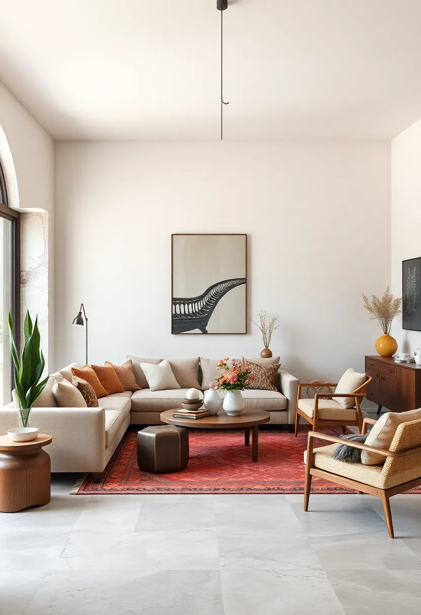
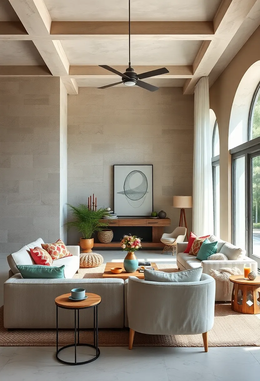
Choose furniture with clean lines and organic shapes for an inviting atmosphere
Opting for furniture that features clean lines paired with organic shapes creates a calming visual flow essential to an eclectic yet serene space. Such designs omit unnecessary ornamentation, emphasizing subtle curves and smooth edges that soothe the eye and invite relaxation. Think softly rounded armrests, tapered legs, or gently arched backs that complement neutral palettes without overwhelming them. This balance maintains an open, airy feel, making rooms appear spacious while ensuring each piece contributes warmth and approachability.
Incorporate this style by mixing materials like natural wood, rattan, or stone-inspired finishes with soft textiles to enhance the tactile experience.The beauty lies in simplicity, where minimalism meets nature-inspired forms to effortlessly create a harmonious vibe. Below is a quick guide to pairing furniture elements that embody this aesthetic:
| Furniture type | Organic Shape Example | Ideal Material | Texture Highlight |
|---|---|---|---|
| Sofa | Curved backrest | Light oak frame | Linen upholstery |
| Accent Chair | Rounded arms | Woven rattan | Soft cotton cushion |
| Coffee Table | Oval top | Natural stone | Matte finish |
- Choose shapes that mimic nature: circles, ovals, and gentle arcs soften structural lines.
- Mix simplicity with tactile warmth: balance sleek silhouettes with plush or textured fabrics.
- Keep colors neutral: whites, beiges, and soft greys enhance the inviting, serene mood.
Integrate handcrafted ceramics and artisanal decor to infuse personality
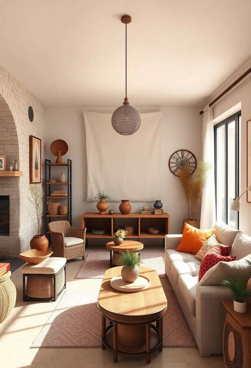
Bring warmth and character to your serene, neutral spaces by weaving in handcrafted ceramics and artisanal decor. These unique pieces, with their subtle imperfections and organic textures, create a tactile contrast that breathes life into minimalist backdrops. Imagine a collection of matte-glazed vases, soft-hued pottery bowls, or delicate hand-painted plates nestled atop open shelving or serving as striking centerpieces on natural wood surfaces. Their story-rich presence invites curiosity, sparking conversations while grounding the room in authenticity.
To curate a cohesive yet eclectic vibe, try mixing a variety of handmade objects with soft textiles and muted tones. Combine pottery with woven baskets, hand-forged metal accents, or vintage glassware for that effortless blend of old-world charm and modern simplicity. Here’s a quick guide to pairing popular artisanal materials with neutral palettes:
| Material | Neutral Color Match | Styling Tip |
|---|---|---|
| Matte Ceramic | Warm Beige, Soft Taupe | Cluster multiple sizes for dynamic display |
| Handwoven Textiles | Off-white, Mushroom Gray | Drape over armchairs or layer on rugs |
| antique brass | Cream, Pale Gold | Use small accents like candlesticks or trays |
Layer sheer curtains to soften natural light and enhance tranquility
Sheer curtains offer a delicate filter for sunlight,transforming harsh daylight into a gentle,ambient glow that wraps your space in calmness. By layering multiple panels, you not only control brightness but also introduce subtle depth and texture, adding a sophisticated softness to neutral-toned rooms.This technique creates an airy atmosphere where light dances freely, enhancing the overall feeling of serenity without overpowering your eclectic décor.
To maximize this effect, consider combining sheer fabrics in varying opacities or light neutral shades such as ivory, oatmeal, or soft taupe. This layering trick balances privacy with openness, making your windows a focal point wrapped in tranquil elegance. Below is a simple guide to choosing materials and layering for a visually soothing experience:
| Layer Type | Material | Effect on Light |
|---|---|---|
| Base Layer | Light Linen | Soft, diffuse glow |
| Middle Layer | Voile | Adds gentle texture and depth |
| Top Layer | Organza or Chiffon | Creates shimmer and ethereal softness |
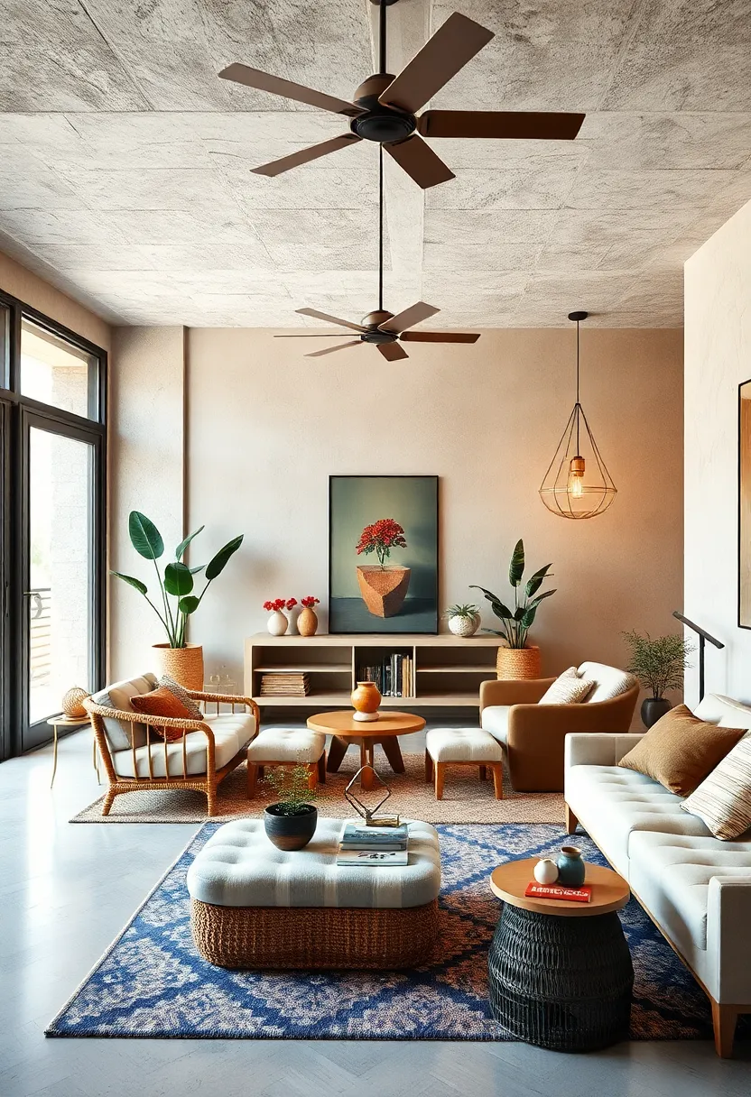
use greenery strategically to bring life and freshness without overpowering neutrals
Introducing greenery into a neutral space serves as a subtle yet powerful method to inject vitality without disturbing the calming ambiance. Opt for plants with varying textures and muted greens—like fiddle leaf figs, snake plants, or eucalyptus—to create an organic contrast that gently enlivens the room. Place these in understated ceramic pots or woven baskets that complement the softness of beige, taupe, or gray hues. Strategically positioning plants near windows or in corners can craft visual interest and depth, turning simple neutral environments into refreshing, inviting sanctuaries.
To balance freshness with tranquility, consider grouping plants alongside natural materials such as linen throws, wooden accents, or stone decor. Use layered greenery arrangements to add dimension without crowding the space. A tidy display might look like this:
| Plant Type | Placement | Pot Style |
|---|---|---|
| Snake Plant | Corner near natural light | Matte white ceramic |
| Succulents | Bookshelf or coffee table | Minimalist concrete |
| Eucalyptus Branches | Vase on dining table | Clear glass |
- Maintain simplicity: Avoid over-clustering to preserve serenity.
- Play with scale: Mix tall statement plants with smaller, delicate greens.
- Seasonal swaps: Refresh with varying foliage types to reflect nature’s cycles.
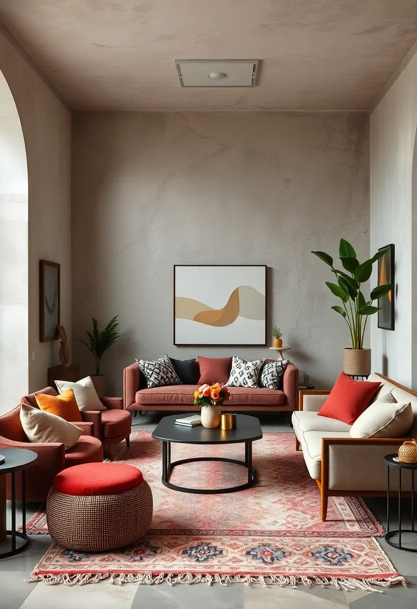
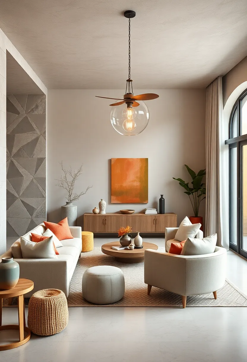
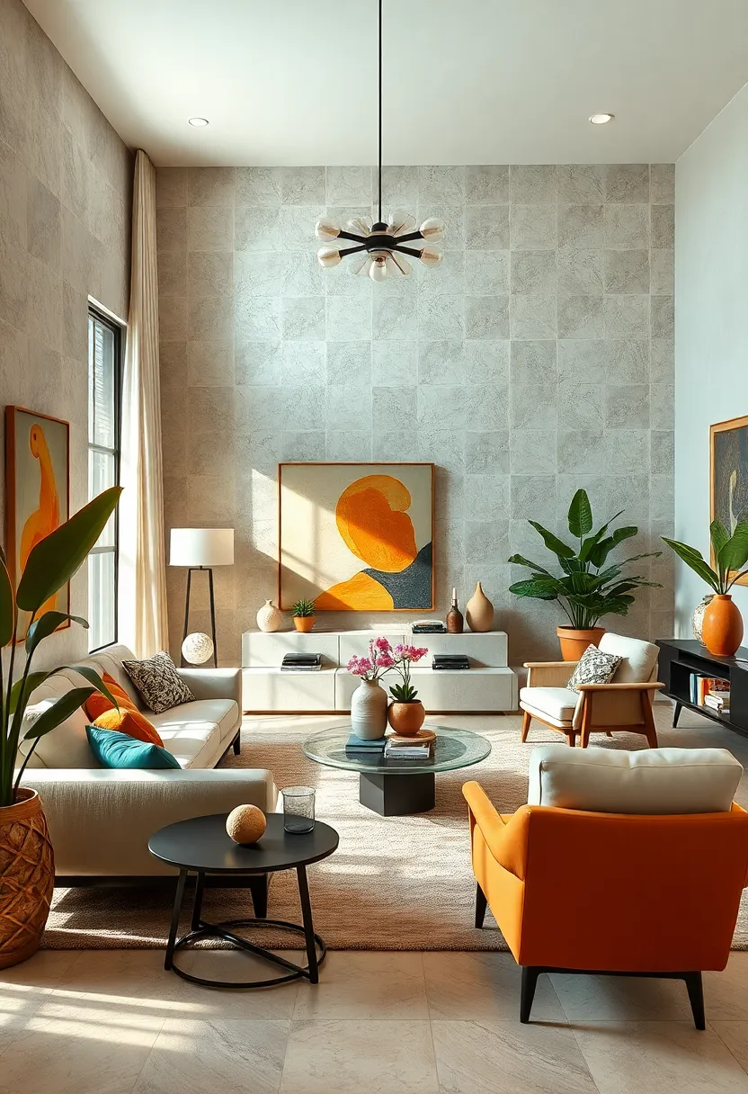
Introduce muted pastels as gentle pops of color within the neutral spectrum
Subtlety is the secret ingredient when incorporating color into a neutral palette. soft, muted pastels like dusty lavender, powder blue, or blush pink offer a delicate contrast that doesn’t overwhelm the space but rather enhances its calm, balanced vibe. These shades act as gentle accents, breathing life into the backdrop of whites, beiges, and greys, all while maintaining an understated elegance. Use pastel throw pillows, vases, or artwork to let these colors softly whisper across the room, creating a soothing rhythm that invites relaxation and thoughtful contemplation.
By layering these muted tones purposefully, you can develop depth and interest without sacrificing harmony. Consider pairing pastels with textures such as linen, suede, or unfinished wood to amplify their tactile appeal. Here’s a simple guide to mixing muted pastels within neutrals for maximum impact:
| Muted Pastel | Neutral Pairing | Recommended Texture |
|---|---|---|
| Dusty Lavender | Soft Grey | Velvet |
| Powder Blue | Warm Beige | Linen |
| Blush pink | Matte White | Raw Wood |
| Muted Sage | Light Taupe | Woven Cotton |
Select artwork that features earthy tones and abstract designs for balance
Incorporating artwork with earthy tones and abstract designs serves as a powerful anchor in a room layered with serene neutrals. These pieces evoke a grounded, calming presence while introducing visual intrigue through fluid shapes and muted palettes. Shades like ochre, clay, soft browns, and moss greens breathe warmth and texture into minimalist spaces without overwhelming the senses. Abstract art, with its interpretive freedom, balances the straightforwardness of neutral hues, adding dimension and a subtle narrative that invites reflection.
Consider the following elements when choosing your pieces:
- Color harmony: Opt for artworks that mirror the room’s natural tones but with slight variations to avoid monotony.
- Balance in composition: Select designs that complement existing patterns, whether geometric or organic.
- Material interplay: Mixed media or textured canvases introduce tactile depth,enhancing the eclectic vibe.
| Earthy Tone | Abstract Style | Effect on Space |
|---|---|---|
| terracotta | fluid Brushstrokes | Warmth & Soft Movement |
| Sage Green | Geometric forms | Calm Structure |
| Arid Brown | Layered Textures | Depth & Visual Interest |
Combine matte and glossy finishes to create contrast without color overload
Mixing matte and glossy finishes within a neutral palette injects visual intrigue without overwhelming your space with multiple colors. Imagine the soothing calm of a matte beige wall paired with the subtle sheen of a glossy ceramic vase or frame. This interplay of textures allows light to bounce dynamically, giving depth and dimension to minimalist tones. By focusing on finishing contrasts rather than additional hues, your home gains character while maintaining its serene ambiance.
To master this balance,consider these combinations:
- Matte walls + glossy furniture accents: A matte wall creates a soft backdrop,while a lacquered side table or glossy cushions add pops of light.
- Glossy tiles + matte cabinetry: Glossy kitchen or bathroom tiles reflect light and invigorate the space against muted, matte cabinetry.
- Satin fabrics + matte upholstery: Satin cushion covers layered over matte armchairs bring subtle luxe without competing colors.
| Finish Pairing | Effect in Room |
|---|---|
| Matte walls + Glossy decor | Soft backdrop with sparkling focal points |
| Glossy tiles + Matte cabinets | Brighten space with balanced warmth |
| Satin cushions + Matte upholstery | Touch of elegance without color chaos |
Opt for built-in shelving painted in off-white or soft gray for seamless storage
Seamlessly blending functionality with understated elegance, built-in shelving in soft neutrals like off-white or gentle gray becomes the unsung hero of eclectic interiors. These palettes act as quiet backdrops, allowing your treasured books, ceramics, and curated objets d’art to take center stage without overwhelming the visual harmony of the room. The subtle hues also create an illusion of expanded space by reflecting light softly, making your storage solution both practical and visually light.
To elevate the effect, consider styling your shelves with a mindful mix of textures and shapes that contrast beautifully against the muted tones.Combine wicker baskets,vintage books,glass vases,and sleek metallic accents to build an inviting tableau that’s as eclectic as it is indeed serene. This balance of form and finish ensures that each item tells a story,while the built-in design and gentle colors maintain a cohesive,restful atmosphere throughout your home.
Highlight architectural details like molding or beams with tone-on-tone painting
Bringing subtle depth to your walls can be effortlessly achieved by embracing tone-on-tone painting techniques that accentuate architectural features such as moldings and beams. Instead of contrasting colors, opt for varying shades within the same neutral palette—think soft greiges, warm ivories, or muted taupes. This approach draws attention to intricate details without overwhelming the serene environment, adding a sophisticated texture that invites closer appreciation. The interplay of light and shadow on these monochromatic surfaces creates a quietly dramatic effect, enhancing the eclectic charm of your space.
To get the most out of this style, consider pairing matte finishes on walls with a slightly glossier paint on moldings or beams. This subtle shift highlights their shape and craftsmanship while maintaining a harmonious look. Here’s a quick guide to popular neutral pairings that excel in tone-on-tone detailing:
| Base wall Color | Accent Trim Shade | Finish Suggestion |
|---|---|---|
| Soft Pebble Grey | Warm Stone | Wall Matte / Trim Satin |
| creme Brulee | Buttermilk | Wall Matte / Trim Eggshell |
| Light Taupe | Driftwood | Wall Matte / Trim Semi-Gloss |
- Enhances spatial depth while remaining understated
- Keeps a unified color story that soothes and balances
- Highlights craftsmanship without visual clutter
- Works beautifully with natural textures like reclaimed wood and linen
Incorporate cozy textiles like chunky knits and linen throws for tactile comfort
Embracing the tactile dimension of your neutral sanctuary can transform a simple space into a cocoon of warmth and style. Let plush chunky knits drape over sofas or armchairs, adding depth and inviting touch with their thick, textured loops. Linen throws, with their natural breathability and understated elegance, complement these knits perfectly—offering a lighter, breezier contrast that still feels grounded and organic. Mixing these textiles introduces a welcoming rhythm of softness and structure, encouraging you to linger and relax.
To maximize the cozy effect, consider layering textiles in various neutral tones from ivory to warm taupe. Here’s a quick guide to pairing cozy textiles for an eclectic yet serene vibe:
| Textile | Texture | Ideal Placement | neutral Tones |
|---|---|---|---|
| Chunky Knit | Thick, looped yarns | Over sofa arm or bed foot | Ivory, Stone, Taupe |
| Linen Throw | Light, slightly crinkled | Draped on chairs or nook corners | Oatmeal, Sand, mushroom |
| Wool Blanket | Soft, dense weave | Folded on shelves or basket | Clay, Mushroom, Soft Gray |
- Vary your textures: Combine chunky knits with smooth linens to elevate visual intrigue.
- Stay within neutrals: Maintaining tonal harmony preserves serenity amid eclectic layers.
- Incorporate natural fibers: Linen and wool breathe life into the tactile experience.
Choose lighting fixtures that combine minimalism with natural textures
Embrace lighting fixtures that reflect simplicity while celebrating the organic warmth of natural materials. Think sleek designs crafted from rattan, bamboo, or raw wood—these elements infuse spaces with tactile depth without overwhelming your serene neutral palette. Fixtures featuring open weaves or matte finishes allow soft light to filter through, creating inviting shadows and an effortless connection to nature. Such choices not only brighten rooms but also serve as subtle sculptures that harmonize minimalist form with earthy textures.
Consider incorporating these styles to elevate your space:
- Rattan pendant lamps with exposed bulbs for a cozy glow
- Wooden tripod floor lamps with clean-lined shades
- Bamboo wall sconces combining simplicity with organic accents
- Minimalist ceramic or stone base table lamps adding tactile contrast
| Material | Lighting Style | Effect |
|---|---|---|
| Rattan | Pendant Lamp | Warm, patterned light diffusion |
| Wood | Floor Lamp | Natural, sculptural presence |
| Bamboo | Wall Sconce | Subtle organic accents |
| Ceramic | Table Lamp | Textural contrast with soft glow |
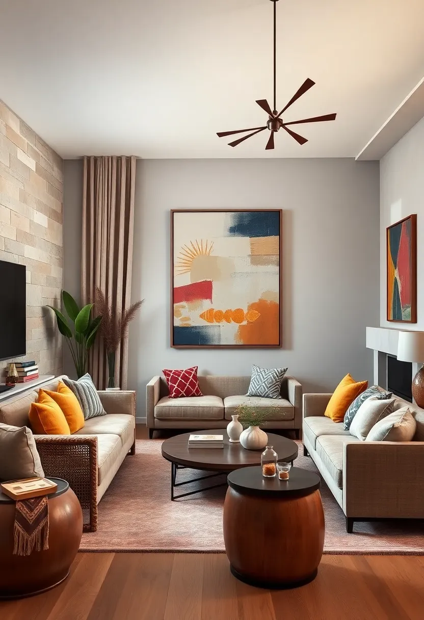
Mix and match neutral shades with varying intensities to avoid monotony
To infuse depth and character into a neutral-themed room, embrace the art of pairing shades that share a palette but vary in intensity. Combining a soft dove gray with a rich charcoal or layering warm beige with creamy ivory allows each element to stand out while working harmoniously. This subtle contrast prevents the space from feeling flat or sterile, rather transforming it into a textured haven where light and shadow play across surfaces. Using different finishes—matte walls with glossy accents or plush textiles against sleek wood—further enhances this multidimensional experience.
Try incorporating these ideas for a dynamic yet serene ambiance:
- Blend pale taupe upholstery with dark moody cushions for an inviting seating area.
- Balance crisp white walls with sandy, textured rugs to ground the space.
- Pair soft greige curtains with deeper stone-gray furnishings to frame natural light elegantly.
| Shade | Intensity Level | Best request |
|---|---|---|
| mushroom Gray | Light | Walls, ceilings |
| Smoky Charcoal | Dark | Accent furniture, trims |
| Warm Sand | Medium | Rugs, cushions |
| Off-White Linen | Light | Window treatments, bedding |
Decorate with sculptural elements to elevate the room’s artistic vibe
Introduce captivating focal points by weaving sculptural pieces into your decor,crafting a harmonious balance between texture and form. Choose abstract or organic shapes in muted tones that mirror your neutral palette, such as smooth ceramic vases, stone carvings, or matte metal figurines. These artworks not only draw the eye but also add depth and intrigue without overpowering the soothing atmosphere of the space. place sculptures on minimalist consoles, floating shelves, or alongside soft textiles to create a dynamic but tranquil visual story.
Consider mixing varying heights and materials to keep the aesthetic fresh and layered. Such as, pair a tall, slender wood sculpture with a low-profile concrete bowl or a clay abstract placed on a vintage brass stand. Use the table below as inspiration to blend different sculptural elements that serve both artistic and tactile purposes:
| material | Finish | Recommended Placement |
|---|---|---|
| Stone | Matte, natural | Entryway console or coffee table |
| Ceramic | Soft-glazed, neutral hues | Bookshelf corners or windowsills |
| Wood | Raw, lightly stained | Dining room centerpiece or mantel |
| Metal | Brushed brass or blackened steel | Side tables or built-in niches |
Use layered area rugs to define zones and add warmth underfoot
Layering area rugs is a subtle yet effective way to visually separate different zones within an open-plan space. By combining various textures, patterns, and sizes in neutral tones, you can create distinct areas—like a reading nook or a dining corner—without breaking the flow of your serene palette. Soft jute paired with plush wool or a crisp cotton weave layered beneath a sleek wooden coffee table instantly communicates different functional spaces while preserving a cohesive, tranquil atmosphere.
Beyond zoning, multiple rugs bring an inviting warmth and tactile richness underfoot. The tactile contrast between the smooth hardwood floor and the textured layers invites barefoot comfort and cozy gatherings. Consider mixing muted geometric patterns with solid-hued rugs in shades of beige, ivory, and stone for added depth without overwhelming the eye. this approach not only enhances the room’s layered look but also offers practical benefits like sound absorption and additional cushioning.
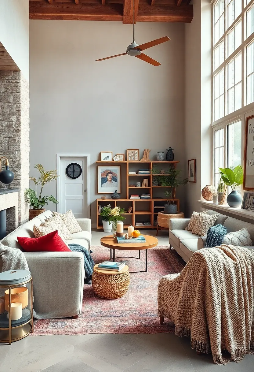
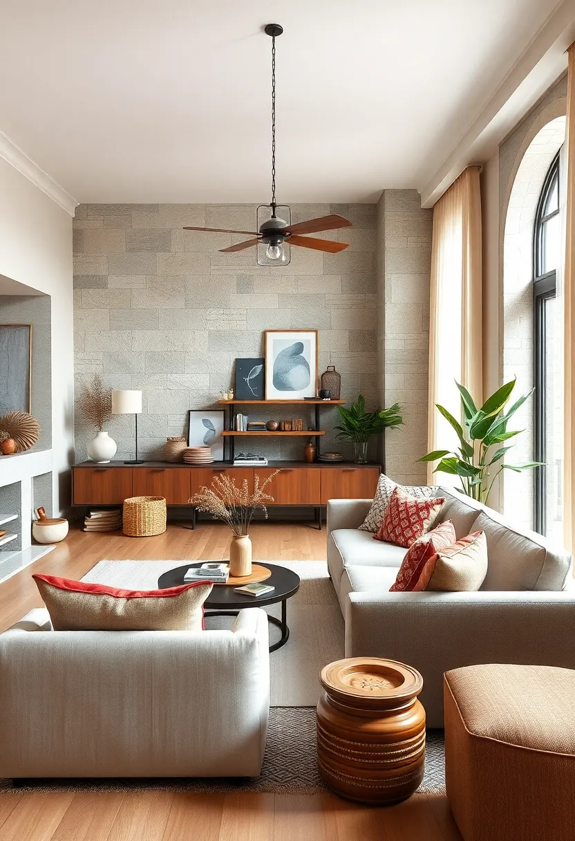
Include unique vintage finds as focal points amidst modern neutrals
Vintage treasures have a remarkable way of injecting personality and history into contemporary neutral spaces.Imagine a weathered leather armchair with brass nailhead trim or an ornate wooden mirror with intricate carvings subtly standing out against a backdrop of soft greys and muted beiges. These unique pieces don’t just fill space; they tell stories, evoke nostalgia, and create a tactile contrast that breathes warmth and depth into your serene palette. Instead of layering on bold colors,let these stand-alone artifacts become the centerpiece,allowing their patina and craftsmanship to shine amidst understated surroundings.
To balance these vintage showstoppers without overwhelming the senses, consider pairing them with minimalist décor elements. For example:
- Neutral-toned linen cushions and throws
- Streamlined ceramic vases in off-white hues
- Glass or matte metal lighting fixtures with simple silhouettes
This juxtaposition creates a harmonious interplay where modern simplicity complements the allure of aged beauty.By doing so, your room becomes a thoughtfully curated haven where every vintage find feels intentionally showcased, making the eclectic blend authentic and inviting.
Keep clutter minimal to maintain the serene ambiance of the color palette
In an eclectic home adorned with serene neutral tones, maintaining a sense of calm hinges on the art of restraint. Allow your furnishings and décor to breathe by consciously selecting only essential pieces that complement the palette rather than compete with it. Minimal clutter enhances the natural flow of soft beiges, gentle greys, and creamy whites, creating a visual sanctuary that invites relaxation. Embrace open surfaces and tidy storage solutions that keep daily essentials out of sight, ensuring that every element adds to the tranquil atmosphere rather than detracting from it.
Consider integrating smart organizational techniques that marry form and function. Stylish woven baskets, sleek trays, and hidden compartments serve as subtle storage allies, preserving the home’s understated elegance. Below is a simple reference table of clutter-control tools that blend seamlessly within neutral-themed interiors without disrupting the serene vibe:
| Storage Solution | material | Best For |
|---|---|---|
| Woven baskets | natural fiber | Blankets & magazines |
| Decorative Trays | Wood or metal | Keys & small items |
| Under-sofa Drawers | Wood or plastic | Seasonal items |
| wall-mounted Hooks | Brushed metal | Coats & bags |
Personalize your space with meaningful accessories that speak to your eclectic style
Surround yourself with accessories that tell your story, merging cool neutrals with vibrant personality. Consider layering vintage finds like delicate ceramic bowls, distressed leather journals, or rustic brass candle holders that contrast beautifully against soft beige walls. Let these curated treasures become conversation starters, with handwoven textiles, quirky sculptural pieces, and abstract framed prints adding depth without overpowering your calm color scheme. Embrace mismatched elements—think sleek modern clocks paired with timeworn wooden mirrors—to infuse unexpected charm and warmth into soothing surroundings.
To keep your sanctuary cohesive, use subtle accents such as matte stoneware vases or linen throw pillows in muted tones that complement your eclectic mix. A thoughtfully arranged vignette on a side table or floating shelf can anchor the room—try grouping objects by texture and height to create visual rhythm. below is a simple breakdown to balance your accessories effortlessly:
| Accessory Type | Material | Effect |
|---|---|---|
| Handcrafted Pottery | Clay, Matte Glaze | Organic & Earthy |
| Metal Accents | Brass, Blackened Steel | Industrial Edge |
| Textile Pieces | linen, Wool, Cotton | Softness & Warmth |
| Art & Prints | Paper, Canvas | Personal Expression |
Wrapping Up
Crafting an eclectic home grounded in serene neutral palettes offers a beautiful balance between calm and character. these 23 inspiring ideas serve as a gentle guide to mixing textures,shapes,and subtle hues,allowing your space to feel both harmonious and uniquely yours. As you embark on this creative journey, remember that serenity doesn’t mean simplicity—it’s the thoughtful layering of elements that brings your eclectic vision to life with quiet confidence. Here’s to creating a home that’s as soothing as it is indeed striking, where every corner tells a story in shades of calm.