
Transforming your bedroom into a serene retreat begins with the perfect palette. Colors have a unique way of influencing our mood, and choosing the right hues can turn an ordinary room into a calming sanctuary where stress melts away. In this carefully curated list, we explore 23 soothing bedroom colors that effortlessly bring tranquility and warmth to your personal space. Whether you prefer soft neutrals, muted pastels, or gentle earth tones, these shades are selected to inspire and guide you toward creating a relaxation haven tailored to your style. Dive in to discover how subtle shifts in color can refresh your bedroom ambiance and promote restful nights.
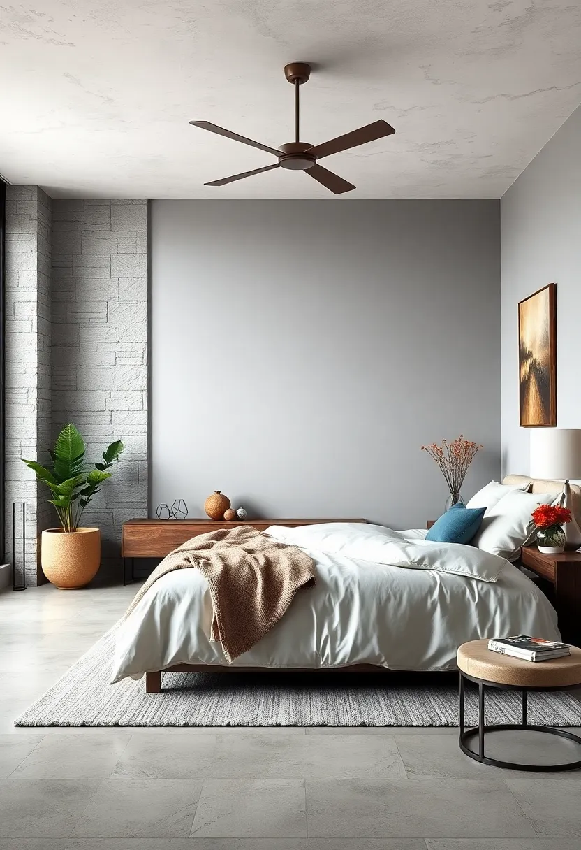
Misty Gray – A soft, muted gray that brings calmness and versatility to any bedroom setting
Misty Gray whispers tranquility with it’s soft, muted tone, perfectly blending serenity and style. this versatile hue acts as a neutral backdrop that harmonizes effortlessly with both warm and cool accents, letting you switch up your decor without the need for a complete overhaul. Whether paired with plush white linens for an airy feel or deep navy throw pillows for a touch of drama, Misty Gray creates a sanctuary where calmness prevails.
Beyond its aesthetic appeal, Misty Gray works beautifully to reflect natural light, making your bedroom feel brighter and more spacious. Its understated elegance invites layering through textures and materials, such as cozy knits, smooth linens, or natural wood finishes, offering endless opportunities to personalize your space. Consider these accent ideas to complement the color:
- Warm taupe or blush tones for subtle warmth
- Matte black metal fixtures for modern contrast
- Soft pastel blues or greens to deepen the tranquility
Powder Blue – This gentle shade instills a sense of tranquility and spaciousness, perfect for unwinding
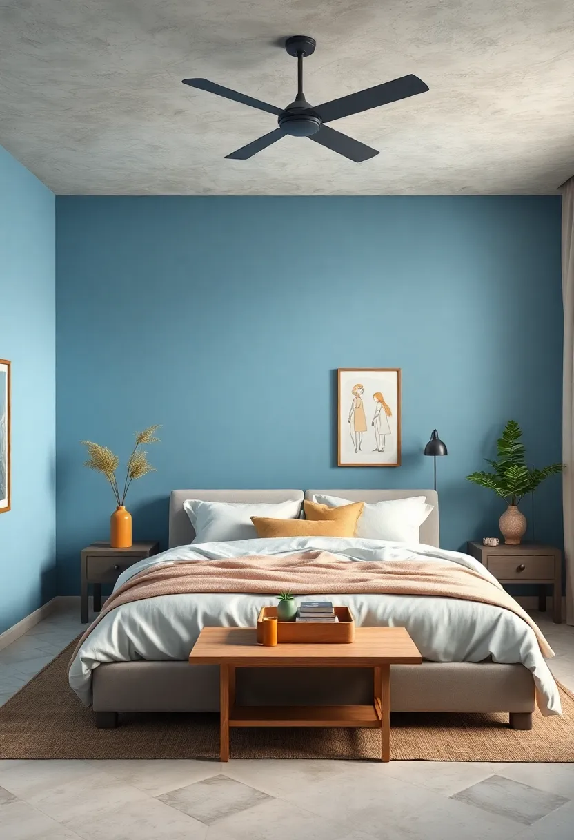
Soft and serene,this delicate hue effortlessly evokes a calm ambiance,making it an ideal choice for bedroom walls. Its subtle blue undertones mimic the sky on a clear day, inviting a peaceful atmosphere that helps to lower stress levels and ease the mind. When paired with natural woods and crisp white linens,it creates a harmonious balance that feels both refreshing and cozy,lending the space an airy openness perfect for unwinding after a long day.
To enhance this tranquil vibe, consider incorporating accents in muted creams, gentle grays, or even soft metallics like brushed silver. These complementary tones will amplify the room’s sense of spaciousness without overpowering the understated elegance of the shade. Whether you choose minimalist décor or layered textures, this color provides a versatile foundation that transforms your bedroom into a soothing retreat.
| Perfect Pairings | effect on Mood |
|---|---|
| White Linen Bedding | Enhances airiness |
| Natural Oak Furniture | Brings warmth |
| Soft Gray Accents | Adds subtle depth |
| Brushed Silver Lamps | Introduces gentle shimmer |
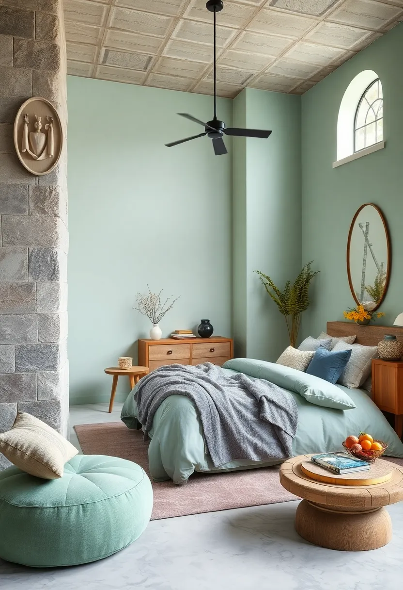
Sage Green – Evoking nature’s serenity, sage green creates a peaceful, grounded atmosphere
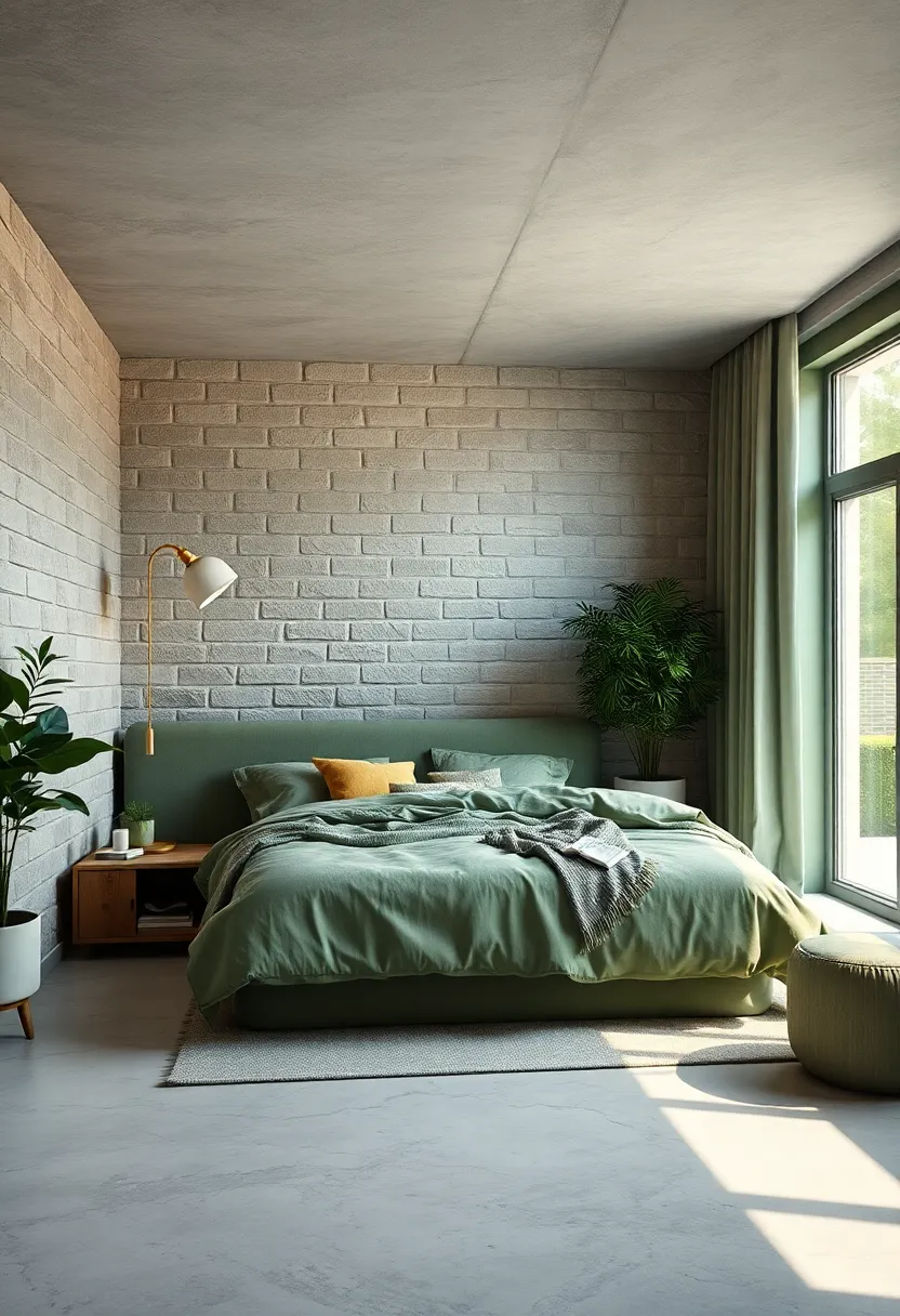
Sage green conjures the soft whisper of nature indoors, wrapping your bedroom in a tranquil embrace that encourages deep rest. Its muted green tones channel the subtle elegance of fresh herbs and dew-kissed leaves, fostering a sense of calm that’s both rejuvenating and grounding. Pairing effortlessly with natural wood furnishings and linen fabrics, this hue transforms your personal retreat into a sanctuary where the outside world feels miles away from your peaceful haven.
For a balanced look, combine sage green walls with creamy whites or warm taupes to enhance light and airiness, while adding texture through woven baskets or ceramic accents amplifies its organic charm. If you want to introduce a touch of contrast, consider soft blush pink or muted mustard in your bedding or throws; these hues complement sage’s serenity without overwhelming it. Below is a swift guide to styling your sage green bedroom for maximum relaxation:
| Element | Recommended Option | Effect |
|---|---|---|
| Wall Color | Sage Green | Calming & grounding |
| Accent Colors | Cream, Taupe, Blush Pink | Warmth & soft contrast |
| Textures | Linen, wicker, Ceramic | Organic depth & comfort |
| Lighting | Warm, diffused bulbs | Cozy glow |
Lavender Haze – A subtle purple tone that soothes the mind and encourages restful sleep
Lavender Haze embodies the perfect balance between gentle purple hues and soothing soft blues, creating an atmosphere that effortlessly eases the mind. Its subtle tone invokes a sense of calmness, making it an ideal choice for bedrooms designed with relaxation in mind. Unlike bold purples, this muted shade gently whispers tranquility, encouraging your senses to unwind and prepare for a restful night’s sleep. When paired with creamy whites or light greys, it elevates the bedroom into a serene retreat where stress melts away.
To maximize the calming effects of this tranquil color, consider incorporating natural textures and minimalistic decor. Light wooden furniture, plush throws, and soft ambient lighting complement the haze perfectly, adding warmth without overwhelming the space. Here are some quick tips to create harmony with this hue:
- Use sheer curtains that diffuse sunlight softly into the room
- Include potted lavender or eucalyptus for a subtle scent boost
- Choose matte finishes over glossy to keep the vibe understated
| Complementary Elements | Recommended Shades |
|---|---|
| Wall Color | Soft Grey, Creamy White |
| Textiles | Light Lavender, Pale Blue |
| Accent Pieces | Silver, Light Wood |
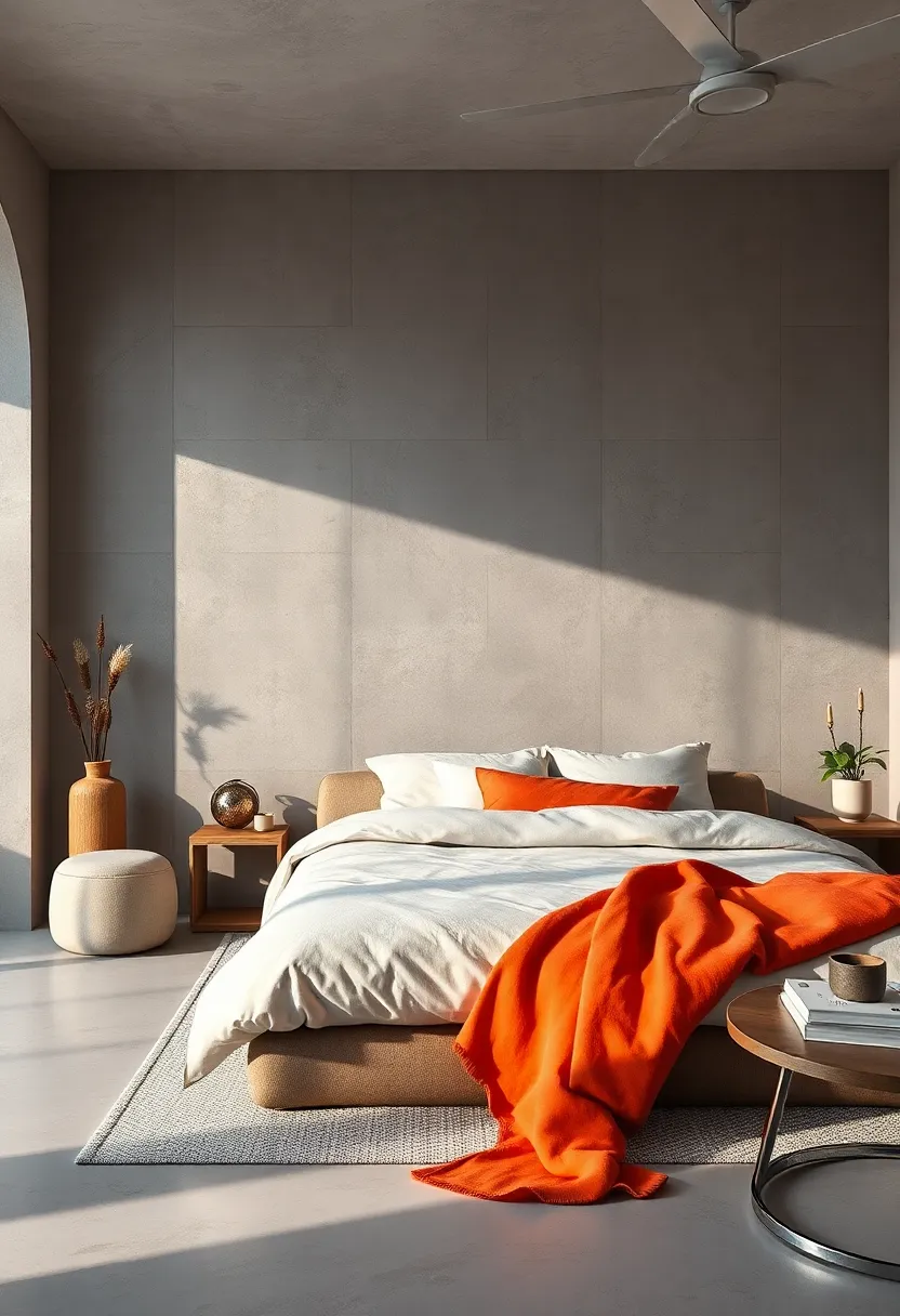
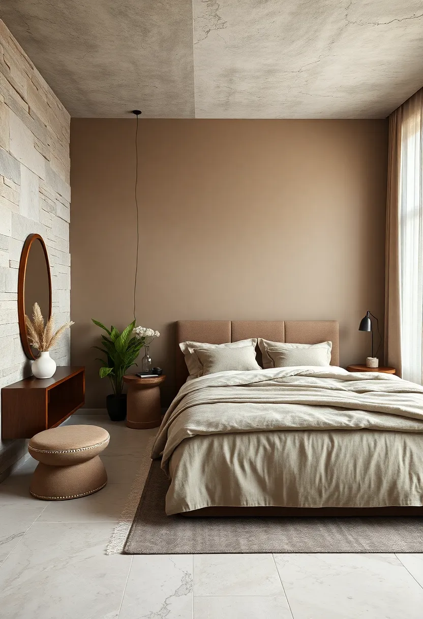
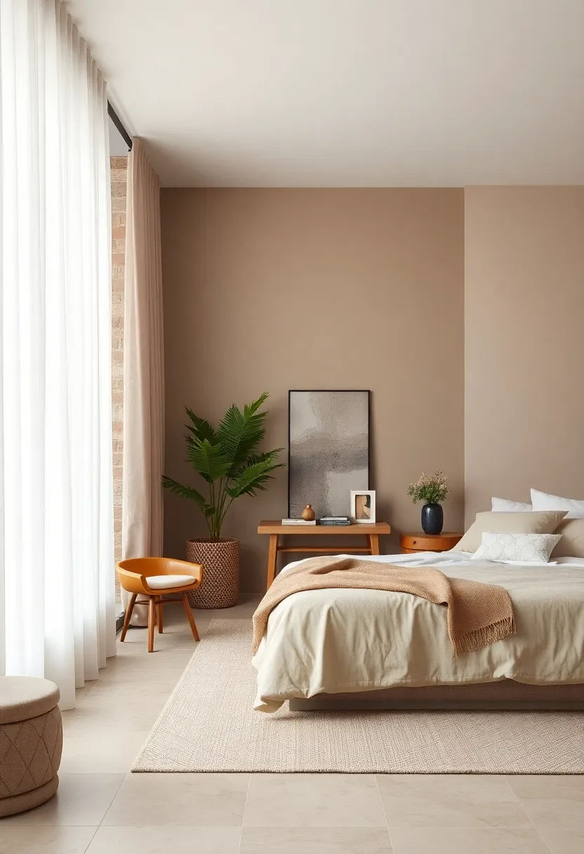
Warm Beige – Inviting and neutral, warm beige radiates cozy comfort without overpowering the senses
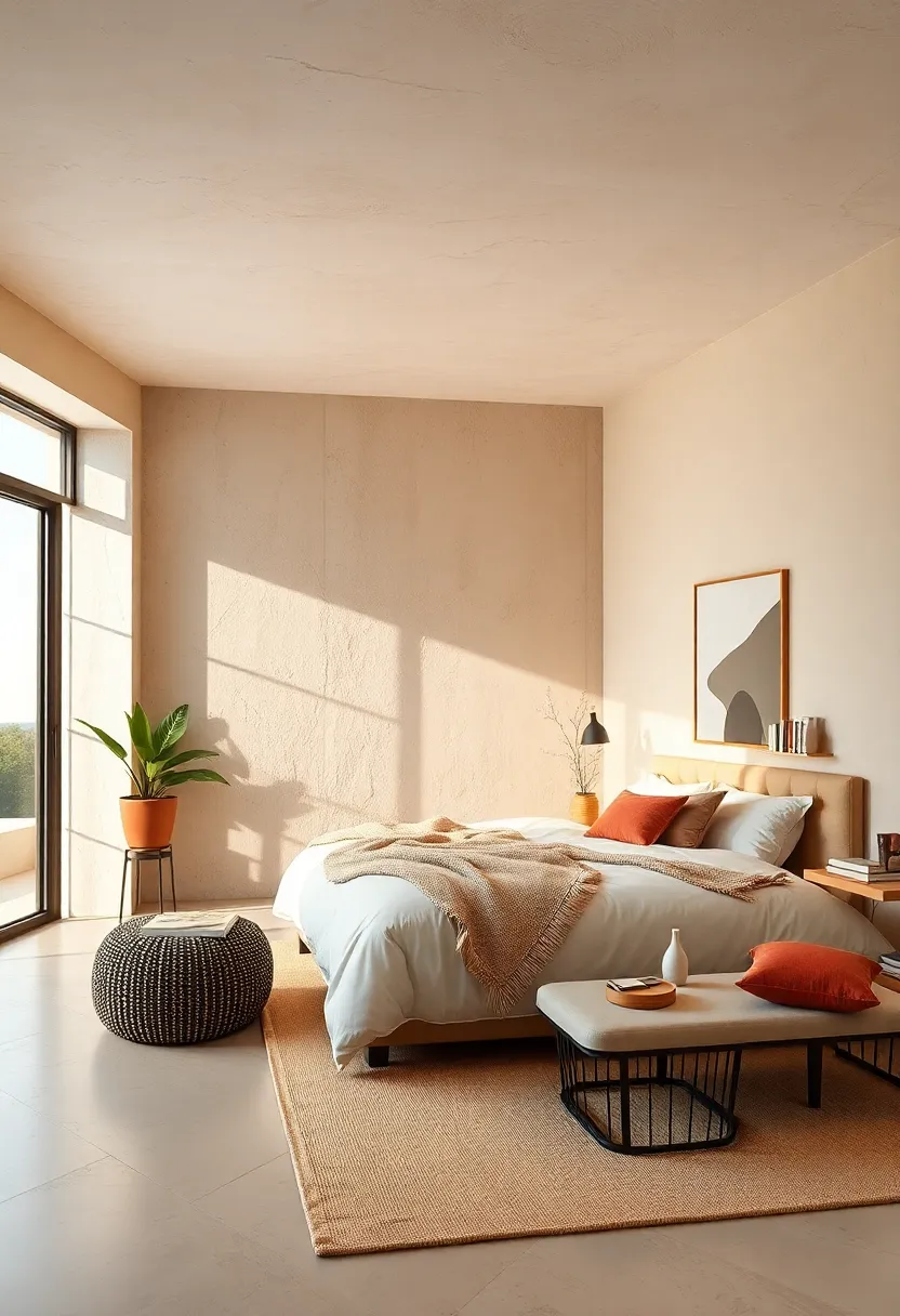
Bathed in a gentle glow, this shade embraces your bedroom with an effortless charm that feels both timeless and inviting. Its subtle golden undertones create a warm sanctuary where you can unwind after a hectic day, making it an ideal canvas for layering textures and natural elements. Pairing beautifully with soft linens, wicker accents, and rustic woods, it cultivates a space that breathes calm and quietude without overwhelming your senses.
Why opt for this hue?
- Flexibility to complement both modern and traditional decor styles
- Enhances natural light,making the room feel more spacious
- Neutral enough to allow pops of color through accessories or artwork
- Creates a cozy,inviting atmosphere perfect for restful sleep
| Color Pairings | Effect |
|---|---|
| Soft white | Brightens and expands space |
| Terracotta | Adds earthy warmth |
| Sage Green | Introduces calming greenery vibes |
| Muted Blues | Brings subtle tranquility |
Pale Peach – Whisper-soft peach hues add a gentle warmth to create an inviting retreat
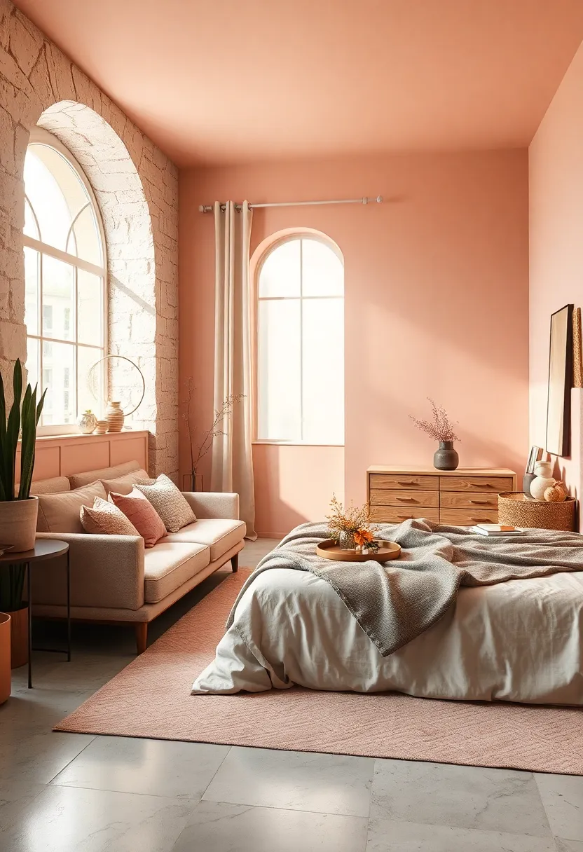
Soft and subtle, this delicate shade introduces a touch of understated elegance without overwhelming the senses. Its muted warmth is perfect for bedrooms aiming to strike a balance between calm and cozy, fostering an surroundings where stress naturally melts away. Pairing beautifully with neutral linens and natural wood accents, it creates a canvas that feels both fresh and intimately inviting.
To maximize the serene vibe, consider complementing this color with accents in creamy whites, muted golds, or sage greens. These tones work harmoniously,adding depth while preserving tranquility.Here’s a quick guide to styling with this hue:
- Textiles: Linen curtains, fluffy throw pillows, and soft area rugs in beige or ivory
- Furniture: Light oak, rattan, or painted white pieces for an airy feel
- Decor: Potted plants, minimalist artwork, and warm metallic elements like brushed brass
| Color Pairing | Effect |
|---|---|
| Soft Sage Green | calming natural contrast |
| ivory White | Brightens and opens space |
| Muted Gold | Touches of understated luxury |
Soft White – Clean and crisp, soft white enhances light while maintaining a calm, restful vibe
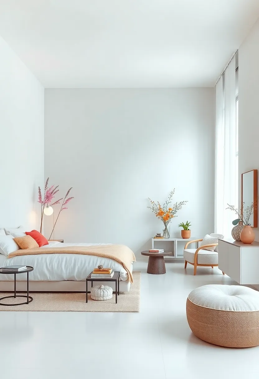
Soft white serves as a flawless backdrop for a bedroom that craves both brightness and tranquility. Unlike stark whites that can feel cold or clinical, this gentle shade offers a subtle warmth that enhances natural and artificial light, creating an airy atmosphere without overwhelming the senses.It perfectly balances clarity with comfort,making your space feel spacious yet intimate—a serene canvas where every element from furniture to textiles can shine.
Pairing soft white with muted textures and natural accents can deepen its calming effect. Think cozy beige linens,light wood finishes,and touches of greenery for a fresh organic feel. Below is a quick guide on complementary decor choices that harmonize with this hue:
| Decor Element | Why It Works |
|---|---|
| Beige & Cream Linens | add warmth and softness without clashing |
| Light Wood Furniture | Brings natural texture and subtle contrast |
| Soft Pastel Accents | Enhances calmness with a gentle hint of color |
| Greenplants & Botanicals | Introduce freshness and vitality |
Dusty Rose – this muted pink lends a delicate, nurturing ambiance that’s both elegant and soothing
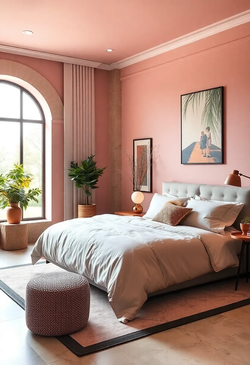
Embracing the subtle charm of dusty rose introduces a tranquil warmth that effortlessly balances sophistication with comfort. This muted pink hue whispers calmness, wrapping your bedroom in a gentle embrace that promotes rest and rejuvenation. Pair it with soft creams or light grays to amplify its nurturing quality, creating a serene sanctuary that feels both inviting and refined.
Not only dose dusty rose soften the atmosphere,but it also elegantly complements natural textures and organic materials. Think linen bedding, wooden accents, and plush rugs to elevate the cozy vibe. Here’s how to incorporate dusty rose seamlessly into your bedroom décor:
- Accent Walls: Use dusty rose on a single wall to add depth without overwhelming the space.
- Textile Choices: Opt for throw pillows, blankets, or curtains in dusty rose tones for subtle pops of color.
- Metal Accents: Rose gold or brushed brass fixtures blend beautifully, enhancing the gentle warmth.
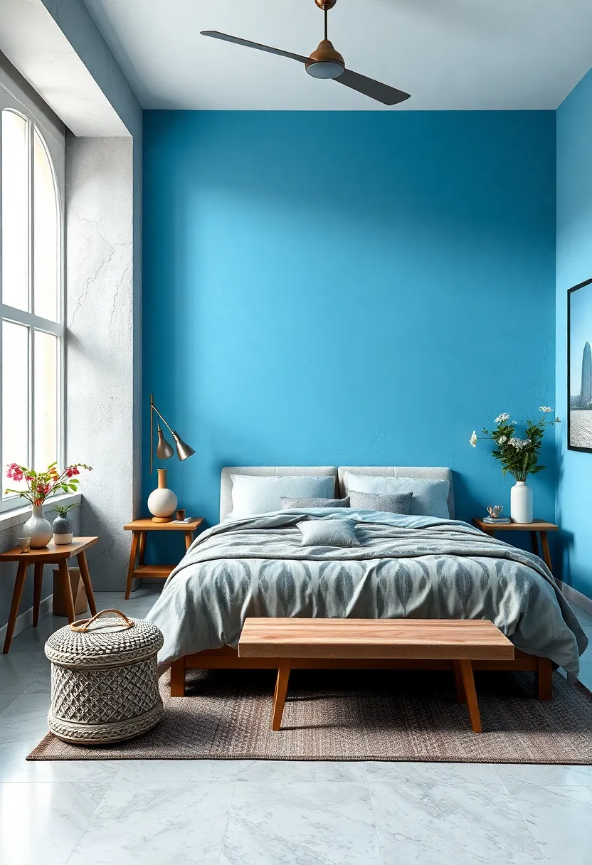
Sky Blue – Bright yet gentle, sky blue opens up the room with a peaceful, airy feeling
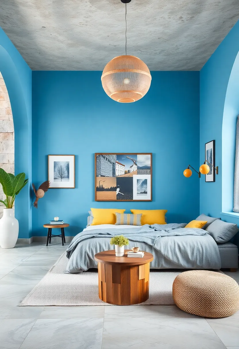
Invoking the Tranquility of an Open Sky, this gentle blue shade offers the perfect balance between brightness and calm.It reflects natural light beautifully, making smaller bedrooms feel more expansive and inviting. The subtle vibrancy of sky blue creates a serene atmosphere that’s both uplifting and restful, ideal for resetting your mind at the end of a long day.Pairing this color with crisp white linens or soft sandy neutrals enhances its airy effect while keeping the space grounded and cozy.
To create harmonious designs, consider combining sky blue with the following accent colors:
- Soft grays – for a modern, sophisticated vibe
- Warm beige – to keep the mood inviting and natural
- Muted coral – adding a subtle pop of warmth without overpowering
- Matte gold – for elegant touches in light fixtures or decor
| Complementary Materials | Effect on Atmosphere |
|---|---|
| Light woods (oak, pine) | Enhances warmth while maintaining airiness |
| Breezy sheer curtains | Lends softness and filters sunlight beautifully |
| Textured cotton or linen | Adds cozy but light tactile appeal |
Seafoam Green – A fresh, cool color inspired by the ocean, ideal for a rejuvenating escape
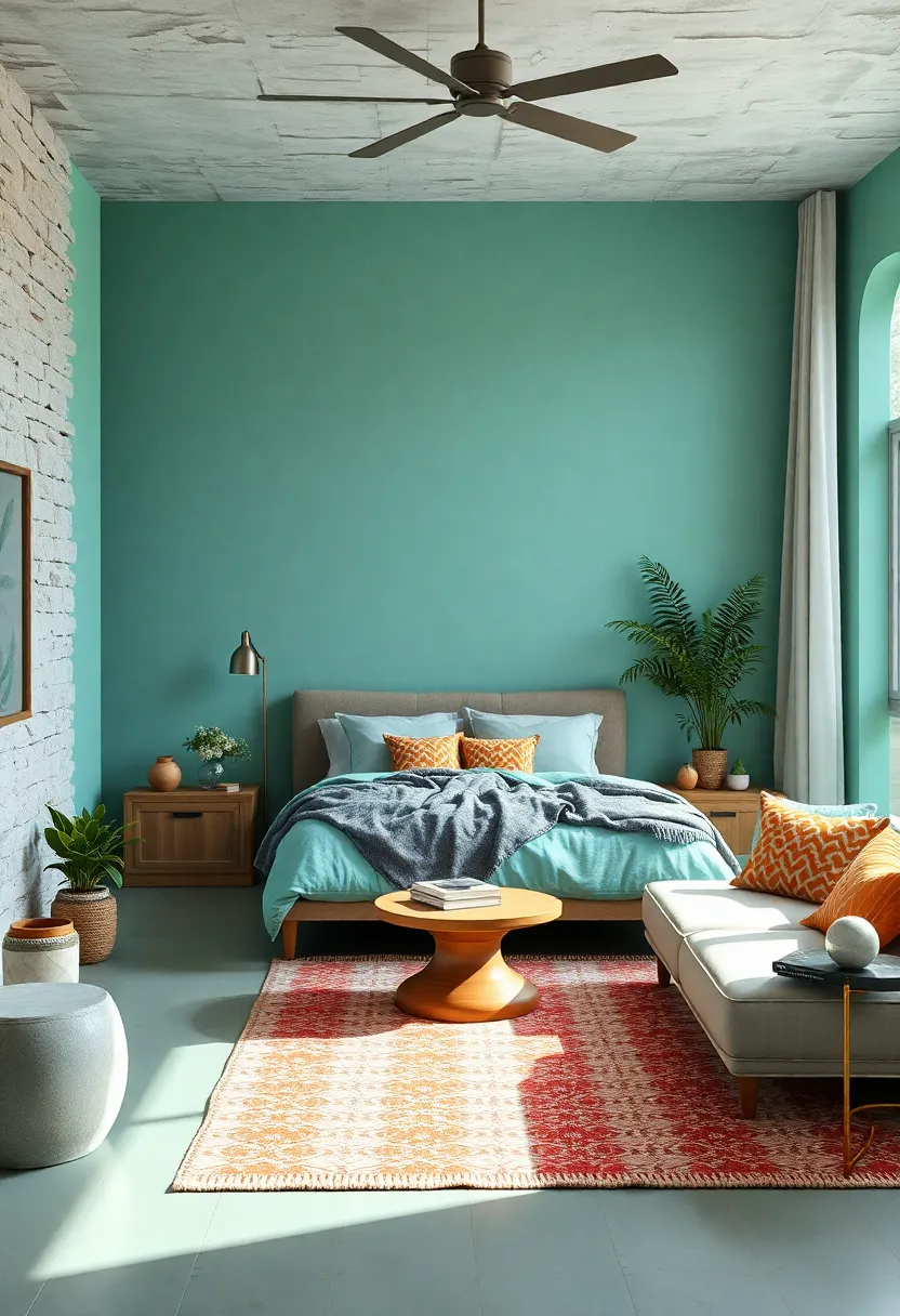
Seafoam green effortlessly evokes the tranquil essence of the ocean, making it a perfect choice for bedroom walls, accents, or textiles.This cool, subtle shade combines refreshing hints of blue and green, creating an atmosphere that feels both airy and serene. When paired with natural materials like light wood, rattan, or linen, seafoam green amplifies the sense of a rejuvenating coastal retreat right inside your home. It’s a color that gently calms the mind, helping to wash away the stresses of the day and promote restful sleep.
To enhance the soothing impact of this hue, consider layering soft whites, sandy beiges, or delicate gold tones. The versatility of seafoam green allows it to complement both minimalist modern decor and more eclectic, bohemian styles. Incorporate elements such as leafy plants, subtle ocean-inspired artwork, or textured throws to deepen the connection to nature.Below is a quick color pairing guide to help you create your ideal seafoam sanctuary:
| primary Color | Complementary accents | Texture Suggestions |
|---|---|---|
| Seafoam Green | Warm White, Sand, Soft Gold | Light Wood, Woven Fabrics, Linen |
| Soft Aqua | Driftwood Gray, Cream, Brass | Jute Rugs, Cotton Throws, Ceramic |
Mushroom Taupe – Earthy and understated, this shade blends sophistication with calm
Mushroom taupe offers a graceful fusion of earthy undertones and subtle sophistication, making it an ideal choice for bedrooms seeking a peaceful retreat. This versatile hue carries a muted warmth that visually expands the space while enveloping it in a gentle embrace of calm. Its understated elegance pairs beautifully with natural textures like linen, wood, and stone, creating a sanctuary that feels both modern and timeless.
When styling with mushroom taupe, consider layering in soft creams, dusty pinks, or sage greens to enhance its soothing qualities without overwhelming the senses. It’s also perfect for bedrooms with ample natural light, as it adjusts effortlessly throughout the day—from soft, warm glow in the morning to cozy, muted tones by nightfall.
| Complementary colors | Decor Elements |
|---|---|
| Cream, Sage green, Dusty Pink | Natural wood furniture, Linen bedding, Clay pottery |
| Charcoal Gray, Soft White | Textured rugs, Woven baskets, Matte ceramics |
Pale Aqua – Light and refreshing, pale aqua promotes relaxation with a splash of cool energy
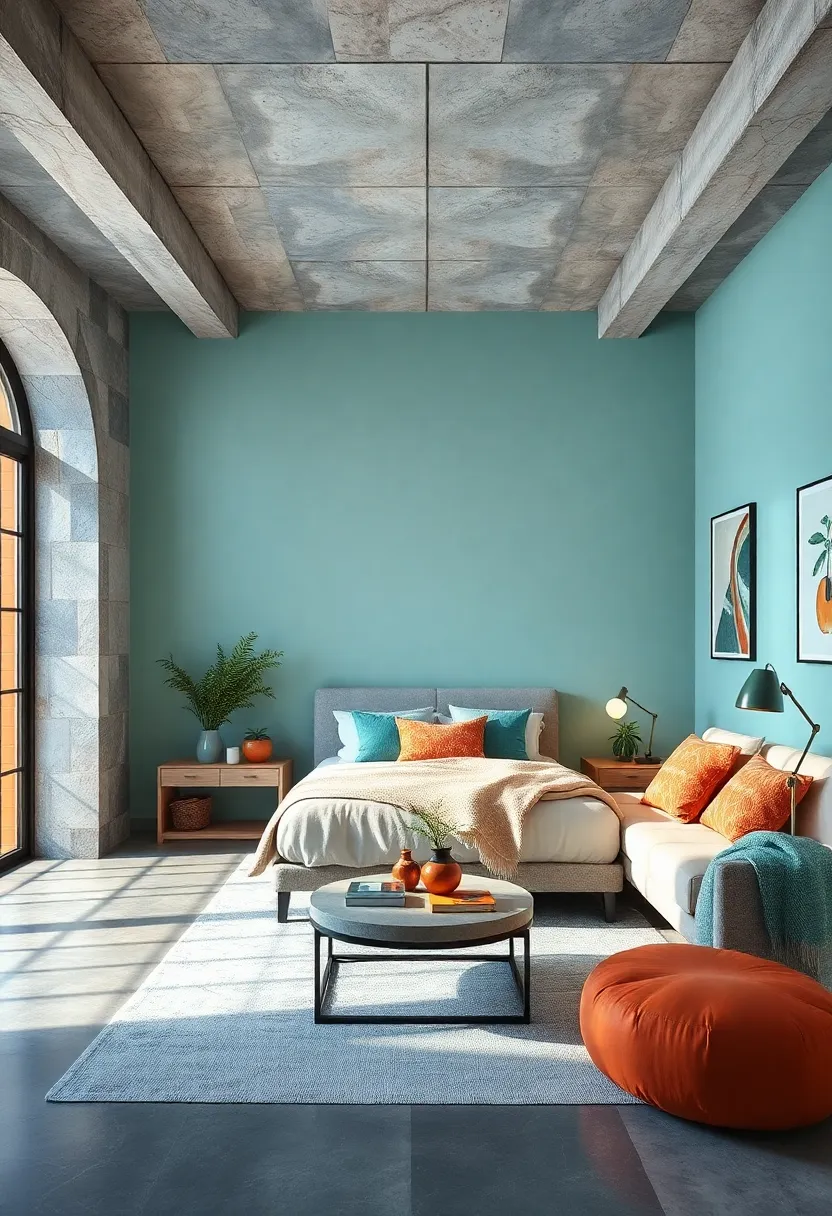
Pale aqua emerges as a perfect blend of serenity and vitality, offering your bedroom a fresh, rejuvenating aura without overwhelming the senses. This soft hue carries the gentle essence of a clear morning sky or the tranquil waves of a calm sea, making it an ideal choice for spaces meant to soothe your mind and body. Its subtle coolness subtly energizes, encouraging deep relaxation while hinting at a breezy, uplifting vibe that keeps the atmosphere from feeling too static or dull.
Incorporating pale aqua into your bedroom palette opens up a range of styling possibilities. Pair it with crisp whites and natural wood elements to enhance its airy, spa-like feel or mix in muted grays and soft taupes for a more grounded, contemporary aesthetic. Here’s a quick guide on how to layer this color for maximum effect:
| Complementary Elements | Effect |
|---|---|
| White Linen Bedding | Enhances brightness and crispness |
| Light Oak furniture | Adds warmth and natural texture |
| Silver or Chrome Accents | Introduces modern, reflective touches |
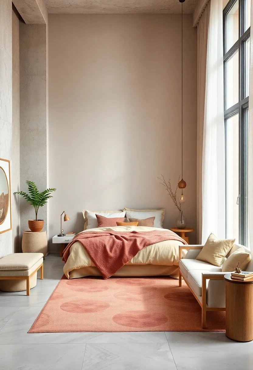
Soft Coral – Like a blush from nature, soft coral introduces warmth in a subtle, comforting way
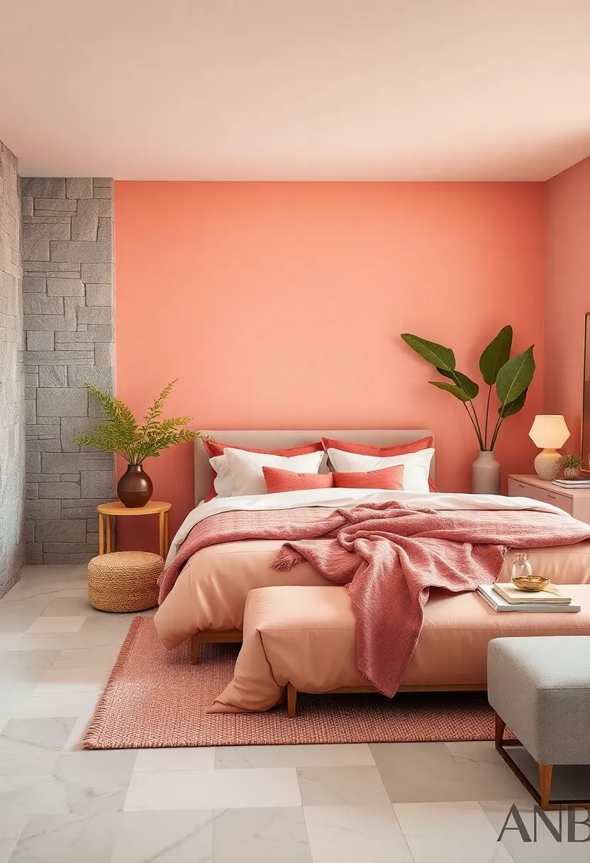
Soft coral paints your walls with a gentle, inviting glow that feels like a warm embrace at the end of a long day. Unlike bolder hues, it whispers comfort rather than shouts, making it ideal for crafting a sanctuary where stress effortlessly melts away. Its peachy-pink undertones infuse the room with subtle energy, balancing tranquility with a hint of life. For bedrooms craving a touch of warmth without overwhelming the senses, this shade serves as the perfect backdrop for natural wood accents, cream linens, and muted metallic touches.
pairing soft coral with calming neutrals and organic textures enhances its soothing qualities, creating a layered look that’s both modern and timeless. Consider accentuating the color with cushions in soft beige, light taupe, or sage green for a palette that soothes at every glance. Below is a quick guide to complementary hues that harmonize beautifully with soft coral’s tender charm:
| Complementary Accent | Effect | Ideal Use |
|---|---|---|
| Muted Sage | grounds and cools | Throw pillows, rugs |
| Warm Ivory | Brightens without harshness | Bedding, curtains |
| Soft Gold | Adds subtle luxury | Light fixtures, décor |
Light Lilac – A tender, serene hue that encourages calm contemplation and ease
Light Lilac effortlessly weaves a soft, whispery touch into your bedroom’s atmosphere, inviting tranquility with every glance. This gentle shade strikes the perfect balance between cool lavender and subtle gray undertones, creating an aura that soothes the mind and eases away the tension of the day. Its muted elegance pairs beautifully with natural woods and plush textiles, making it an ideal backdrop for moments of quiet reflection or reading before bedtime.
Beyond its calming visual appeal,light lilac boosts the perception of spaciousness,ideal for compact rooms craving an airy feel. Layer it with accents of cream, pastel blush, or soft sage to cultivate a harmonious palette that encourages deep relaxation. Consider incorporating these complementary shades to enhance the serene vibe:
- Soft Ivory – Elevates light lilac’s purity and keeps the overall look fresh.
- misty Green – Adds an organic, restful contrast that grounds the palette.
- Dusty Rose – Brings gentle warmth without overpowering the room’s calm essence.
Sandstone – Grounded and natural, sandstone creates a warm, tranquil environment
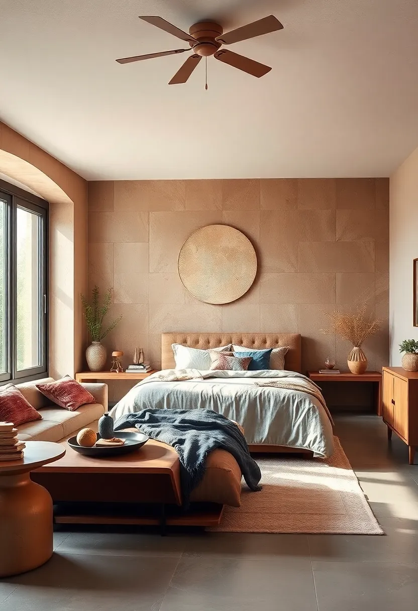
Embracing the gentle hues of sandstone in your bedroom palette invites an organic warmth that feels both timeless and deeply comforting. This earthy shade blends soft beige and subtle hints of pink or orange, fostering a grounded atmosphere that encourages relaxation and mindfulness. Whether paired with natural textures like linen, wicker, or reclaimed wood, sandstone enhances a space with a soothing tactile quality that calms the mind after a busy day.
Design Tips to Incorporate This Hue:
- Use sandstone-colored walls as a neutral backdrop to showcase greenery or copper accents for added warmth.
- Layer with cream or soft gray textiles to maintain balance and prevent the room from feeling too muted.
- Introduce minimalist décor with organic shapes to complement the natural essence of sandstone.
| Element | Effect |
|---|---|
| Soft Beige Walls | Creates cozy, inviting ambiance |
| Wooden Furniture | Adds natural warmth and texture |
| Copper Light Fixtures | Introduces subtle metallic shimmer |
| Green Potted Plants | Enhances freshness and life |
Icy Blue – Crisp and clean, icy blue cools the atmosphere, perfect for hot summer nights
Icy blue breathes a sense of freshness and serenity into your bedroom, effortlessly evoking the crisp chill of a mountain glacier. This shade is ideal for creating a tranquil retreat where the mind can unwind, especially during those sweltering summer nights when you want a slice of cool comfort. Its subtle yet invigorating undertones refresh the atmosphere, making the space feel open and airy without feeling cold or sterile.
Pair this calming hue with natural textures and soft neutrals to enhance its cooling effect. Consider incorporating:
- Light wooden furniture to add warmth without overpowering
- Sheer white curtains that allow gentle summer breezes to flow
- Plush, pale-hued linens that invite relaxation
- Minimal metallic accents to reflect light and amplify the crisp vibe
| Element | Effect in Icy Blue Room |
|---|---|
| Natural wood | Balances cool tone with warmth |
| Sheer curtains | Softens light, enhances flow |
| Soft linens | Adds tactile comfort |
| Metallic accents | Introduces subtle shine |
Creamy Almond – Smooth and nurturing, this off-white shade feels soft and enveloping
Creamy Almond wraps your bedroom in a gentle hug, offering a soft backdrop that feels both nurturing and inviting. This off-white shade carries subtle warmth, lending an understated elegance to any space while promoting a calm atmosphere. Its muted undertones blur the line between beige and ivory, making it a versatile choice that works harmoniously with natural textures and wood finishes. Whether paired with plush linens or minimalist décor, Creamy Almond creates a cocoon-like environment perfect for unwinding after a long day.
Embrace the comfort this shade brings by combining it with complementary accents:
- Soft greys and pastel blues for a cool, tranquil effect.
- warm terracotta or muted sage to add subtle earthiness and depth.
- Metallic gold or brass finishes to inject a touch of understated luxury.
- Textured fabrics like velvet or linen to enhance the room’s tactile comfort.
| Complement | Effect |
|---|---|
| Soft Grey | Soothes and cools |
| Pastel Blue | Calming and airy |
| Terracotta | Warmth and grounding |
| Brass accents | Quiet elegance |
Muted Mint – A light green wash that revitalizes without overstimulating the senses
Soft and sophisticated, this gentle shade brings a breath of fresh air to any bedroom without overwhelming the senses. It strikes a perfect balance—offering just enough color to energize, while maintaining a calm, tranquil vibe. Ideal for those seeking serenity paired with a subtle touch of nature, it complements minimalist décor and organic textures beautifully.
Consider pairing this hue with:
- Natural wood furniture to amplify its earthy undertones.
- White linens for crisp contrast and light reflection.
- Mossy green accents to deepen the sense of calm.
- Soft metallics like brushed brass or matte gold to add understated warmth.
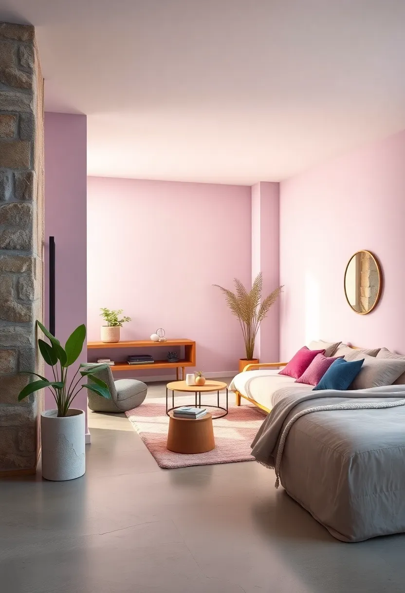
Blush Pink – Gentle and calming, blush pink adds a touch of comforting softness
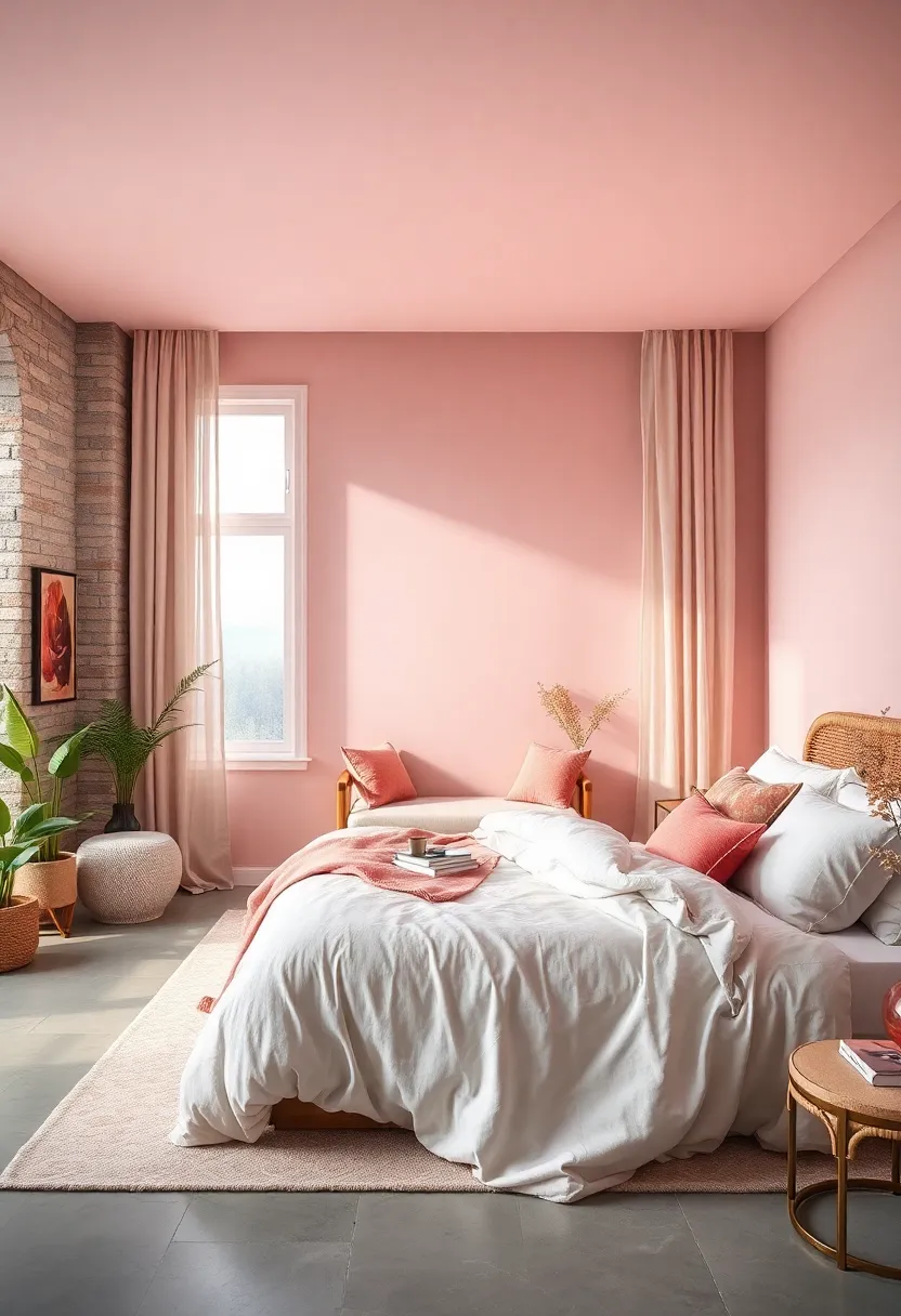
Soft and understated, this delicate shade creates a sanctuary that feels both inviting and serene. Its subtle warmth evokes a sense of tenderness, making it ideal for bedrooms where comfort reigns supreme. Pairing blush pink walls with textured linens and natural wood accents builds a harmonious atmosphere that soothes the senses without overwhelming the space.
To bring out the best in this gentle hue, consider incorporating elements that emphasize its calming nature:
- Muted metallics like brushed gold or rose gold provide a subtle shimmer that complements blush tones beautifully.
- Soft whites and creams balance the pink by adding brightness and depth to your bedroom design.
- Natural greenery introduces life and freshness, enhancing the restorative vibe blush pink fosters.
Pale Yellow – Cheerful yet gentle, pale yellow warms the space with subtle optimism
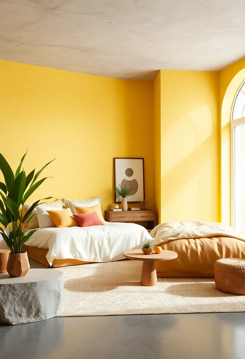
Infuse your bedroom with a gentle aura of warmth by incorporating pale yellow hues. This soft, sun-kissed shade reflects light beautifully, creating a luminous and inviting atmosphere without overwhelming the senses. Ideal for rooms seeking a quiet boost of energy, pale yellow inspires subtle optimism, making your space feel both fresh and comforting at the same time. Pair it with natural materials like light wood or linen textiles for a harmonious, airy retreat that whispers calm and positivity.
Beyond its visual appeal, pale yellow supports mental clarity and a peaceful mindset, perfect for unwinding after a long day. Enhance this palette by layering touches of muted greens or soft grays to maintain balance and sophistication. To help you customize your scheme, consider the following combinations that work seamlessly with pale yellow:
- Soft Gray: Grounds the brightness and adds modern elegance.
- Muted Sage: Complements with an earthy, tranquil vibe.
- Creamy White: Boosts lightness and maintains serenity.
- Natural Wood Tones: Brings warmth and texture variety.
Dove Gray – Elegant and peaceful, dove gray offers balance and simplicity
Dove gray embodies a gentle sophistication that enriches any bedroom with a serene aura. This subtle shade strikes the perfect balance between cool and warm tones, making it incredibly versatile for various design themes—from minimalist modern to rustic charm. Its understated elegance allows other decor elements to shine while creating a peaceful backdrop that encourages rest and rejuvenation. Pairing dove gray walls with soft whites, muted blues, or pastel accents can amplify its calming effect and bring out a harmonious, cozy atmosphere.
When styling with dove gray, consider these complementary features to enhance its tranquil nature:
- textured fabrics: Velvet cushions or chunky knit throws add tactile warmth.
- Natural wood: Light oak or driftwood furniture enhances the color’s organic feel.
- Soft lighting: Warm-hued lamps create a gentle glow against the subtle gray.
- Greenery: Potted plants introduce freshness and a touch of nature.
| Accent Colors | Design Impact |
|---|---|
| Misty Blue | Enhances serenity with subtle depth |
| Blush Pink | Adds warmth and gentle romance |
| Charcoal | Creates dramatic contrasts for modern flair |
| Soft White | Brightens space while maintaining calm |
Soft Taupe – A versatile neutral that blends effortlessly with various textures and tones
Soft taupe offers a perfect balance between warm and cool undertones, making it an exceptional foundation for creating a serene bedroom palette.Its understated elegance allows it to pair beautifully with a variety of materials — from rustic wooden furniture to plush velvet cushions.By serving as a gentle canvas, this shade encourages layering of textures, inviting tactile contrasts that enhance comfort without overwhelming the senses.
Consider complementing soft taupe with accents in muted pastels or deep jewel tones to introduce depth and personality. The color’s adaptability shines whether your decor leans modern minimalism or cozy farmhouse chic. Here’s how soft taupe works wonders in different bedroom aesthetics:
- Bohemian charm: mix with woven rattan, macramé, and rich textiles.
- contemporary sleekness: Pair with glass, metal, and monochromatic shades.
- Classic elegance: Combine with cream linens, brass accents, and hardwood floors.
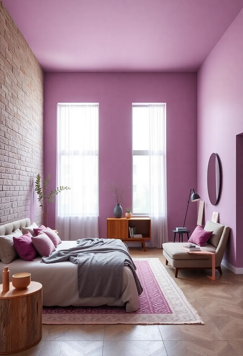
Powdered Plum – A muted plum shade that balances depth with a calming grace
Imagine a shade that gently whispers tranquility while wrapping your bedroom in subtle sophistication. This muted plum hue does just that,offering the perfect balance between depth and calm. Its soft undertones prevent it from feeling overpowering,making it an excellent choice for walls,accent pieces,or cozy textiles. Not only does it create a serene atmosphere, but it also adds a layer of visual interest through its rich yet understated character. Pairing this gentle plum with light neutrals like warm beige or soft gray enhances its soothing qualities, while hints of gold or brass in hardware and décor introduce a touch of warmth and luxury.
Wondering how to style your space with this elegant shade? Consider the following ideas:
- Bedding: Soft linens in cream or blush tones complement the muted plum perfectly, providing a restful canvas for sleep.
- Accent Walls: A single wall in powdered plum creates a focal point without overwhelming the room’s tranquility.
- Mix & Match: Add textured throws or cushions in muted sage or dusty blue to infuse layers of calming color contrasts.
| Complementary Colors | Effect in Bedroom |
|---|---|
| Soft Gray | Enhances calm and minimizes distractions |
| Blush Pink | Adds warmth and gentle femininity |
| Muted Sage | Introduces earthy tranquility |
| Warm Beige | Creates balance and cozy ambiance |
In Retrospect
Transforming your bedroom into a sanctuary of calm begins with the perfect palette. whether you lean toward soft neutrals,gentle pastels,or muted earth tones,these 23 soothing colors offer a spectrum of choices designed to bring tranquility and balance to your personal space. Embrace the hues that resonate with your sense of peace, and watch as your bedroom evolves into the ultimate relaxation haven—a place where rest comes naturally and every moment feels a little more serene.